A Bootstrap grid is, as we have seen, made up of 12 columns. The columns are contained in rows which themselves are framed by a <div class = "container">. Each column has a relative width in percentages. It is essential to include them in a div that has a fixed width in pixels, otherwise how would you calculate percentages? Using our mockup, we can see that the width of the grid is 1230px. However, the Bootstrap container has a 1170px width on desktop.
Our first task will be to change the width of the container so that it matches our mockup. The columns will adjust automatically.
The first step is to target the selector of which we want to change the value. We can use our browser inspector to find the selector to change. No need to know all the Bootstrap classes by heart!
Right-click any column of your page and click Inspect. On the left, select the div with class "container". Then look in the right column that shows its CSS, and you'll notice a value refers to the width of the element.
The rule that interests us is max-width. This rule gives a maximum width to the element but also allows it to have a small width if necessary (it's quite flexible)!

We'll copy the selector and the rule in order to change the value.
/*##################################*/
/*############# GRID #############*/
/*#################################*/

 .container {
   width: 1230px;
 }
You'll notice that the screen sizes appear in your inspector. They are identical to the breaking-points used by Bootstrap to change the grid display.

You will also notice that the "max-width" rule is repeated below and takes a different value depending on the screen size. Your browser has recognized that its width was greater than 1200px. It therefore applied the rule that applies to this screen size and discarded those that correspond to other widths.
Since we want the container to have a width of 1230px only on its desktop version, we will have to account for all screens that have a width greater than 1200 px. We will use a media-query to do this. If this doesn't mean anything to you yet, let's find out!
Mozilla's definition tells us everything:
"A media query consists of a media type and at least one expression that limits the style sheets' scope by using media features, such as width, height, and color. Media queries, added in CSS3, let the presentation of content be tailored to a specific range of output devices without having to change the content itself."
A media-query lets:
A browser detect the page width;
Search for media-queries that match the width;
Apply rules contained in corresponding media-queries.
Here's an example:
/*##################################*/
/*############# GRID #############*/
/*#################################*/

@media (min-width: 1200px) {
 .container {
   width: 1230px;
 }
Save the document and reload your page. You'll find that the container width is larger. Nice!
Background colors
Sometimes you want to change components of the Bootstrap grid, like columns. The easiest and most flexible way to do this is to create a class that you can add directly to the item you want to change.
Take the example of a grid composed of different items. The columns have different background colors.
We will create more classes to change only the background of the columns:
.pink {
    background-color: #f5989d;
}

.blue {
    background-color: #615f7d;
}

.green {
    background-color: #09a298;
}
Then, add the class in the column to be changed:
       <div class="container">
         <div class="row">
           <div class="col-md-4 pink">
             <h1>Design quality</h1>
             <p>Lorem ipsum dolor sit amet, consectetur adipisicing elit, sed do eiusmod tempor incididunt ut labore</p>
             <a href="">Find Out More   <i class="fa fa-long-arrow-right"></i></a>
           </div>
           <div class="col-md-7">
             <img src="img/phone.svg">
           </div>
         </div>
       </div>
This approach is very flexible because you can reuse the class in other elements. It also represents another great practice: DRY.
The less you have to code, the easier it is to maintain long-term! Imagine you pause and resume a project in six months. You want to replace the current blue with a new shade. You certainly don't want to have to change it in a thousand places!
Finishing touches
You have many adjustments to make, but you have all the tools to handle them, from structuring your mockup's HTML, to manipulating its layout, to writing specific CSS for smaller elements! Here's my final advice: adopt a mentality of working from more general elements to smaller ones, and from the top of your mockup to the bottom.
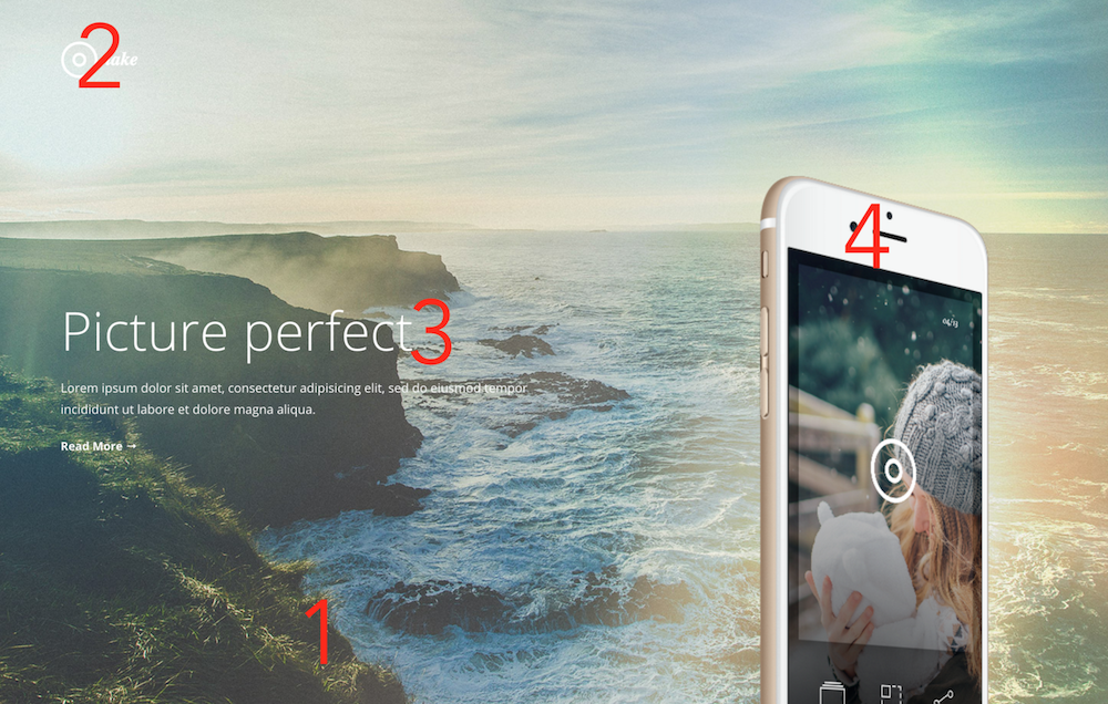
Specifically, start with the first section and, specifically, its background photo. Then position the logo to your liking and change the size of the main title. Finally, be interested in positioning the image on the right.
Continue for all sections down to the footer!