In the last chapter, we simulated our test page and the New York Times on an iPhone 6. However, it's important to bear in mind that not everyone is going to access your web pages on iPhones with Retina screens and 4G capabilities. That's why it's important to test the experience of multiple connection speeds or pixel ratios, to see how well users are either seeing or receiving your content.
You may have noticed, while previewing the test page (or any other website) on a different device, a button with three dots (see below). Clicking this will pull up a menu with additional device options.
Go ahead and pull up that menu if you haven't already!
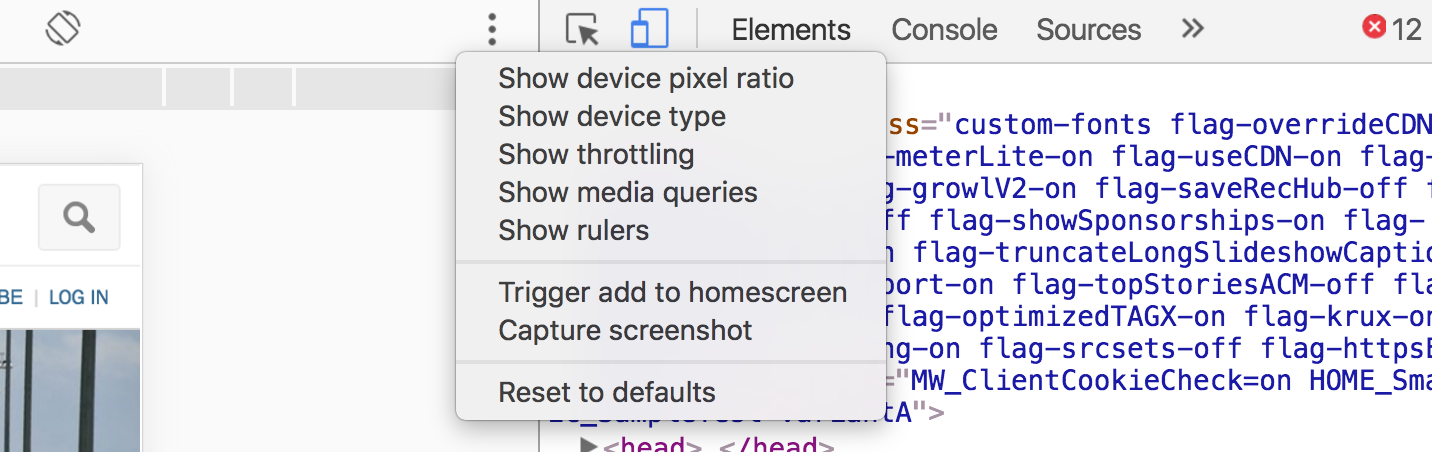
Show device pixel ratio
This option will allow to change the pixel ratio of the screen. Mostly, it will just allow you to experience a Retina experience on a non-Retina screen or vice versa.
Show device type
This option lets you choose between four display types: Mobile, Desktop, Mobile (no touch), and Desktop (no touch). You can simulate the experience on any of these devices! Note that if you choose to preview a site on a predefined device, like an iPhone, you wouldn't adjust this setting because specific devices already have these criteria defined.
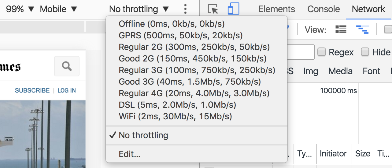
Show throttling
Developing for all different connection types is a major part of making great web pages. Think about it: you build on your own projects on your computer on your theoretically okay wifi connection. What about the person who accesses your page while they have bad reception in the subway, or what about all your users in country where 3G and 4G connection speeds aren't widely available yet?
The Show throttling option lest you simulate these different network speeds. You can choose from many different options, and the web page you're accessing will behave like you're on that type of connection!
Show media queries
Media queries are bits of code that take into account a screen size and display the right style rules for that screen size.
You can see the media queries at play on any website within the developer tools. For example, let's take a sneak peak at the media queries on OpenClassrooms!
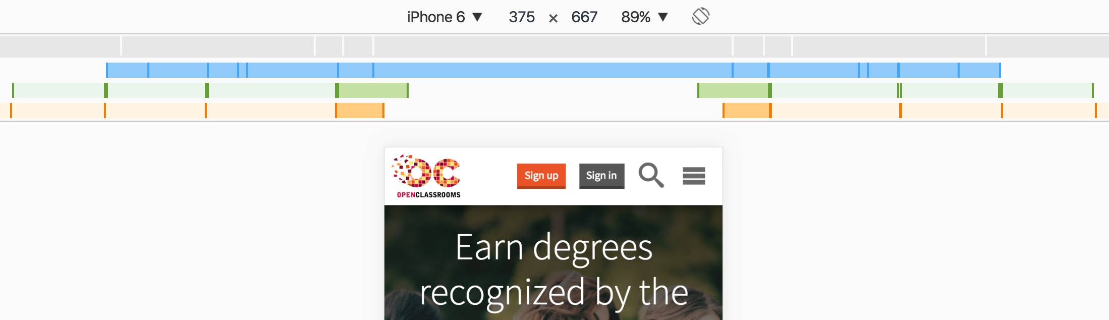
Blue bars show queries that target a maximum width. Green bars show queries that target widths within a range. Can you guess what orange bars represent? Queries that target minimum width!
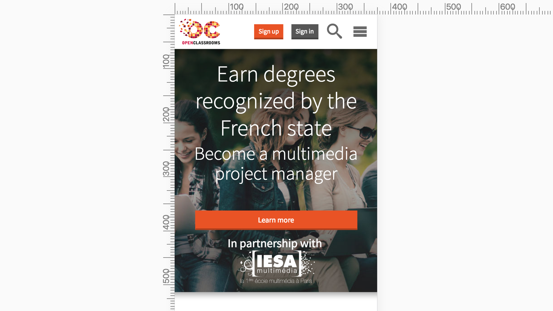
Show rulers
This option simply displays two rulers (horizontal and vertical).
Try simulating websites you know on different devices to see who's put in the time to make them look nice!