Table of contents
- Part 1
Examine the core foundations of UI
- Part 2
Bring digital products to life through visual design
Table of contents
- Part 1
Examine the core foundations of UI
- Part 2
Bring digital products to life through visual design
Determine the visual direction of a project
Design is not always a perfect, clean process. As a designer, you'll likely find yourself working on several different projects or features at once. As a designer you want to keep perspective, continuously zooming in and out. (Remember the painting analogy? 🎨🖼)
Using existing design as a jumping off point
Not all clients or stakeholders think like a designer so you will have to be their guide. One of the best ways of doing this is with a game of "show and tell." 🤗 It will likely involve more of you showing, but you'll be able to tell by the reactions of the people in the room whether they like something (which means it's a good direction to pursue).
The best way to go about this is to pull together around twenty or so different examples of websites and visual design, including from competitors, that can help serve as inspiration and points of conversation. This can be as simple as putting them together in a powerpoint. Context is less important for this exercise.
For your meeting, make sure you invite the right people into the room. This could include everyone from key decision makers to junior designers. It helps get everyone on the same page. You only need to show each example for 20 seconds or so. What you care about are first impressions.
One idea is to have participants score each example. From there you can tally the most popular, least popular, and the ones that elicit the most reaction. You can use this exercise as a way to get a sense of the visual direction you will take as well as what to avoid.
Style Tiles
I know, I know, you thought with all this talk about design that you were actually going to start designing your app or website. Almost. I promise all this work up front will help you out later.
Style tiles are a concept developed by Samantha Warren to help communicate what a website may look and feel like. She felt like moodboards were too vague and comps were too literal (the conversation gets focused on too many details before nailing down the key pieces).
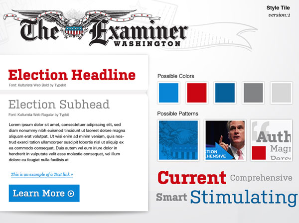
Style tiles present colors, fonts, and interface elements that communicate the essence of the visual brand without having to define the layout. Her inspiration came from the interior designer world where designers would present furniture and paint colors to a client. The goal is to help foster conversations and understand client goals and preferences without investing a lot of time and money up front.

Sample style tile by Samantha Warren that is starting to resemble what a website may look like through showcasing a headline, button, colors, and possible patterns. The evolution of the tiles and the end result can be viewed on the homepage of styletil.es.
To create her style tiles, Samantha Warren's steps include:
Listen to the client, host a kick-off meeting, ask questions.
Interpret and break down feedback in terms of principles of design and various elements (line, shape, space, color, form, etc.) in the form of adjectives.
Define a visual language and determine themes based on the adjectives. Compose a style tile to serve as a visual reference for you and the client.
Iterate and revise based on your conversations with clients. (Don't expect to nail it the first time.) You can also create a couple variations of the style tiles as a reference.
The idea is that you create a version of a design system without being fixed to a layout from the start.
Element Collages
Building on the idea of style tiles, creative director Dan Mall has a similar approach that he takes a step further called element collages. He also feels that moodboards and wireframes are too abstract. The goal of element collages is to establish the visual identity by trying out different treatments on UI elements and components, or as he calls them, "an assembly of disparate pieces without specific logic or order."
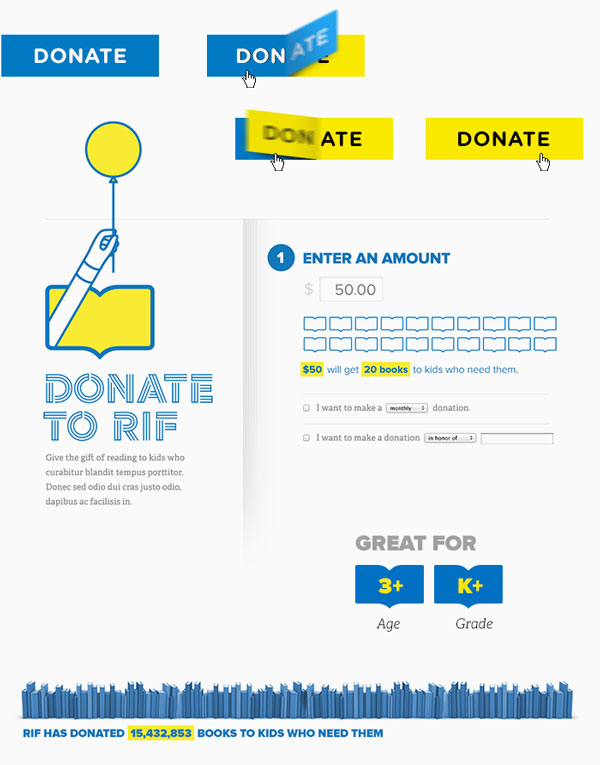
This could mean designing anything from the look of buttons and forms to progress diagrams of how you move through a site. For some sites, this won't be too exciting, but it's also an interesting challenge to consider how you can design more interesting components; see the examples Dan Mall created for the literacy non-profit Reading Is Fundamental. He sees element collages as a tool to make design more tactile and less abstract.

As a creative director, Dan Mall took more creative liberty in trying to imagine how donations could be collected for Reading is Fun in this element collage. There is no code involved in this phase, just trying to imagine what components could look like.
Design Principles
Design principles are standards that guide and dictate the decisions you make as a team. They are beneficial for helping you work towards a shared vision. Whenever something is up for debate, they can turn to their design principles to help determine the best solution. You'll often encounter design principles as part of design systems. There's a reason for this: they help guide and dictate the decisions you make as a team.
Check out these resources for design principles, and you'll see many different approaches and how the principles reflect the brand and their values:
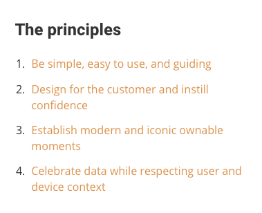
Design principles for Intuit have been distilled down into four principles.
Inuit's principles distilled into four key ones. The expanded version can be viewed on Design Principles FTW.
Let's Recap!
Sharing visuals with clients is a good way to gauge the direction you should take a project as it gives you a place to start the conversation.
Style tiles are one method to pull together inspiration for a client without having to address the layout.
Element tiles are a way to explore different components that will help bring a website to life before having to address the full layout.
Design principles are guiding principles to help inform your design decisions.
Ever considered an OpenClassrooms diploma?
- Up to 100% of your training program funded
- Flexible start date
- Career-focused projects
- Individual mentoring
Find the training program and funding option that suits you best

