Summarize data quickly with pivot tables
Pivot tables help turn our data from raw numbers into something organized and summarized, making it easier to read and quickly make decisions or ask that next question.
A pivot table is especially useful with large amounts of data. They are a well-known and widely used spreadsheet feature.
Grasp the potential of pivot tables
Pivot tables take a sheet of data and summarize it for you. Take a look at what one looks like:
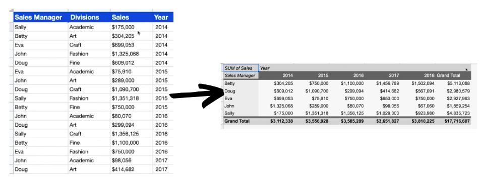
It will set up an empty template which you can decide to fill in with parts of your data, typically totals, and present you with a summarized arrangement.
You can then edit and rearrange the contents as much as you like.
In the example below, you can see that the Sales Manager's names are in the rows, while the years are in the columns. Organized this way, it’s easier to see how much each manager had in sales, with the totals generated automatically thanks to theSummarize byoptions.
Prepare your data beforehand
A pivot table won’t work well unless your initial data is properly structured. There are a few things you have to look out for:
Avoid blank rows or columns.
Avoid subtotals.
Each column needs to have a unique name for their title.
All titles all need to be on the same row, typically the first one.
Columns need to only hold data from the group of data referenced in the title. This means you can’t tuck two sets of data below each other in your source sheet.
Create a pivot table
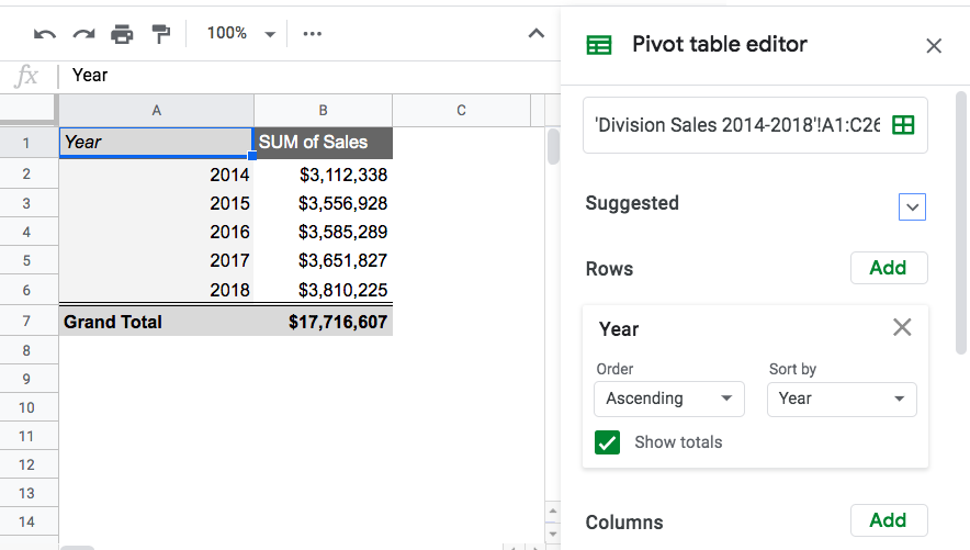
To get started creating a pivot table, navigate to Data > Pivot Table. From there, a new sheet will automatically open, and will be named Pivot Table 1. The data range is often automatically identified, but it’s a good idea to check that it’s correct.
As you select parts of your data to fill in the table, and you'll see new summarized information appear in the new Grand totals cells. These are often sums, but can also be averages, maximums, minimums, etc.
Let’s see this in action:
Edit a pivot table
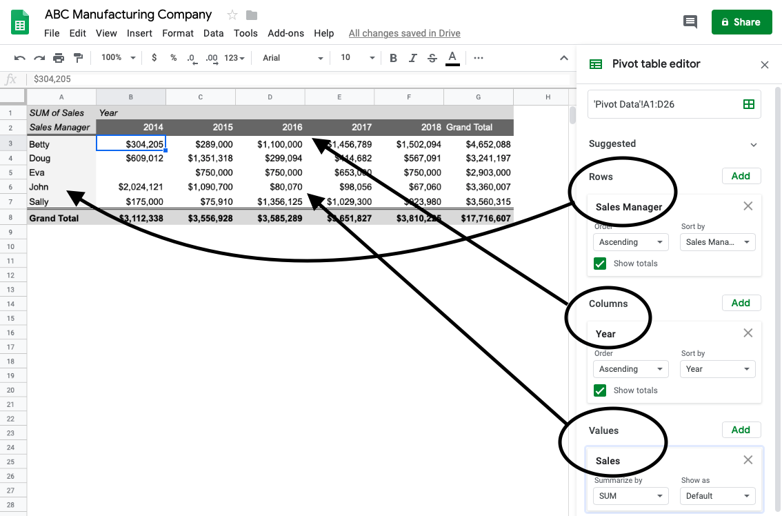
As shown in the screencast above, you need to play around with the pivot table editor. This is where the magic happens!
You can play around with adding rows or columns and fill the table with values. This is a little different in Google Sheets vs other spreadsheet programs.
In Google Sheets, the dropdown menus include all of the titles you added to your raw data in the source sheet to the pivot table; either as rows, columns, or values.
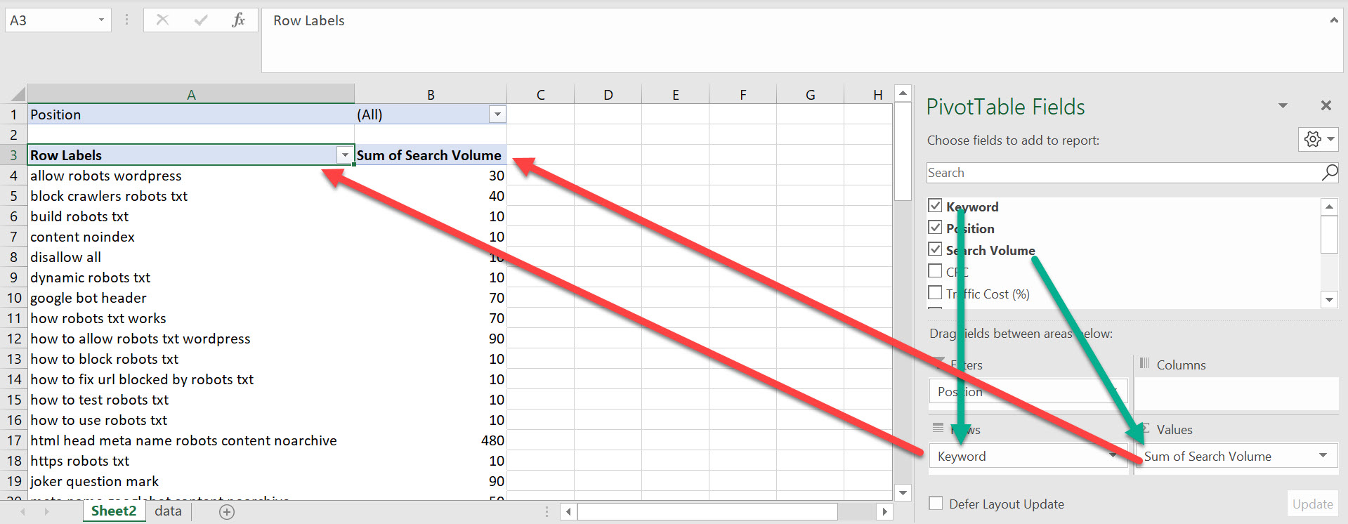
In Numbers and Excel and Calc, this process is a little different, but follows the same principle. You need to drag and drop your groups of data into the different fields for them to appear in your pivot table, as shown in the following screenshot.
Format the pivot table
Note that you can also format the pivot table just like we did in the formatting chapter of this course. Get rid of the standard gray and add some colors which match those used in other sheets. 🌈
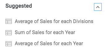
Check out the suggested pivot tables
“Suggested pivot tables” is a neat feature in Google Sheets. These are shown at the top of the pivot table editor. They are generated automatically from your data. Often the spreadsheet knows what you are looking for before you do!
In the screenshot below, the spreadsheet offered three different suggestions I might like to look at: comparing the average division sales, totals of sales for each year, and average sales for each year.
Totals can be hard to compare at a glance, especially if the numbers are long. Here is a quick video which explains how you can transform the new data into percentages of the total, using the Shown as feature:
Create a two-dimensional pivot table
So far, you've seen how pivot tables can generate totals or other results quickly, but this is simply a quicker way of producing this information than using functions. We could have used the =SUM() function for all of this after all.
The wider potential is comparing several layers of data, which means creating multi-columns or rows, otherwise known as two-dimensional pivot tables. They aren’t a lot more complicated than basic ones; you just need to add more fields in the right places!
Two-dimensional pivot tables allow you to extract even more information from a large, detailed data set.
For example, what if you wanted to view the sales managers by division, to see which one had better sales for their respective divisions?
To do this, simply add another row for divisions in the row section of the pivot table editor. Check out the example below:
Update a pivot table
Your data could evolve, and pivot tables in Numbers and Excel don’t take this into account automatically. If the data your pivot table is built on changes, the table needs to be refreshed.
To refresh, right-click anywhere in the pivot table, then select Refresh.
The good news is that this isn't necessary in Google Sheets. Your data will update automatically!
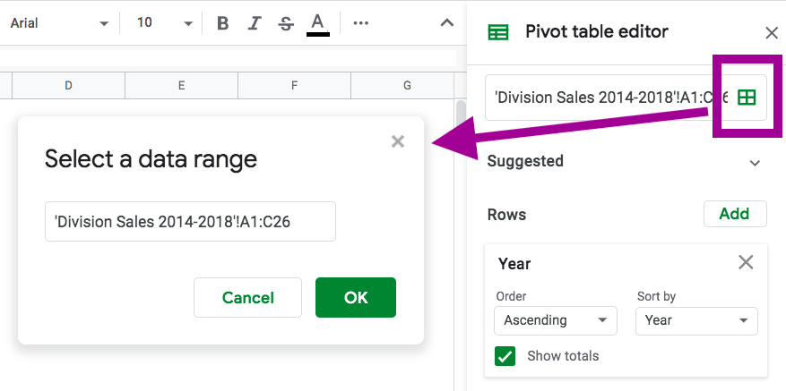
Locate the data sources for pivot tables
You may need to verify you’ve selected all the right data to include in the pivot table; for instance, that the entire range of data is selected.
To check the date source or to change it, click on the grid isolated in the screenshot below.
Let’s recap!
Pivot tables help turn data from raw numbers into something organized and summarized.
You can fill in the empty template with parts of your data and you'll see new summarized information appear in the new Grand totals cells. These are often sums, but can also be averages, maximums, minimums, etc.
You need to add data into the pivot table editor as rows, columns, and values to fill the table.
The wider potential lies in comparing several layers of data, which means creating multiple columns or rows - otherwise known as two dimensional pivot tables.
Now that we’ve seen how to create basic pivot tables, let’s move on to charts! Often an even clearer way to visualize data!
