In this chapter, we will dive deeper into something I alluded to earlier: the iterative process of designing a dashboard.
If you look at the notes in the above table, you'll notice there are a few details that were not mentioned in the initial and follow-up meeting that you saw earlier.
Usually, you will meet with the stakeholders more than once to get all the information you need. After the first few meetings, you have a chance to review the data and determine what measures you'll be looking at. Or perhaps the stakeholder follows-up with another source of data for the dashboard.
Look at the early draft of a section of the final deliverable presented in the previous chapter.
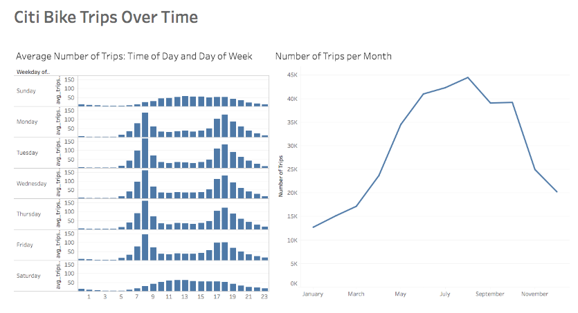
Early Draft
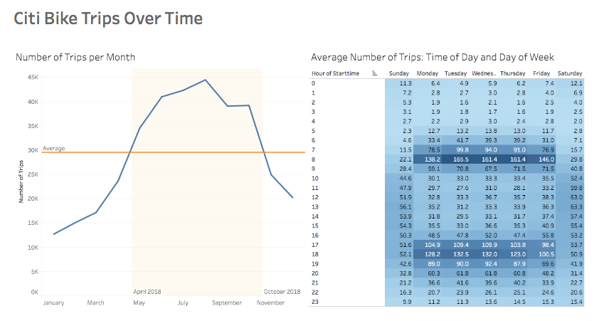
Current Version
Let's review some of the differences between the early draft and the current version:
The two main visuals are switched—the line graph went from the right side to the left. One of the stakeholders stated in a follow-up meeting that it was more helpful to see the monthly data first, and then the hourly/weekday data. This feedback prompted the change.
A few chart elements were added to the line graph—a reference line for the average number of trips per month in 2018 and a highlighted area. The stakeholders stated that they needed to see the total number of trips per month in comparison to the average per month (in 2018). Also, stakeholders needed to be able to infer at a glance which months were above the norm.
The series of bar graphs that we had in the earlier draft changed into a table heat map in the current version. This change was requested by the team director, who stated that she prefers a tabular visual than the series of bar graphs. The table visual is showing the exact same information as the series of bar graphs, but displaying the data differently and using a monochromatic color-scheme to help visualize the compared values.
Summary
A dashboard is only as good as it is useful to its users.
Ensure that stakeholders have a chance to provide feedback throughout the process of creating a dashboard.