Table of contents
- Part 1
Get the Most Out of This Course
- Part 2
Discover Business Intelligence and Power BI
- Part 3
Make Data Visual Using Power BI
- Part 4
Organize Your Data to Help With Decision-Making
Table of contents
- Part 1
Get the Most Out of This Course
- Part 2
Discover Business Intelligence and Power BI
- Part 3
Make Data Visual Using Power BI
- Part 4
Organize Your Data to Help With Decision-Making
Choose the Best Visualization for Your Project
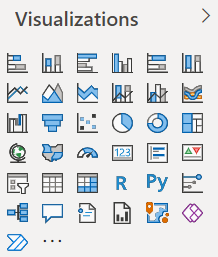
Basic Visualizations in Power BI
With Microsoft Power BI, you have lots of options for visually presenting your data!

Here are the visualizations that you’ll use the most:
Graphs
Graphs are the most common type of data visualization. You’re probably already aware of different types, such as:
Pie charts. These show how parts of the data relate to a whole. For example, loan amounts applied for in 2018 in relation to all loan applications.
Line charts. These show how a series of values has changed over time-for example, changes in mortgage applications by branch, for comparing business volumes.
Column (and bar) charts. These are used to visualize specific values in different categories, e.g., mortgage applications by branch. In Power BI, you can select stacked versions of these graphs. This would let you show the mortgages granted or rejected by year, for example. There are also versions that are normalized to 100%. This could be useful if you wanted to visually respond to the question, “How has the rate of application approval changed between 2019 and 2020?”
Treemap charts. Treemaps are a useful alternative to pie charts. They are better for showing larger amounts of data organized by size—such as the number of loan applications per branch.
Tables and Matrices, Slicers
You can choose the dimensions you want to display and even do groupings (e.g., sums or averages) or selections (e.g., displaying maximum values).
A table can be used to compare dimensions from different tables.
A matrix makes it easier to display data meaningfully across multiple dimensions: it supports a stepped layout like with a pivot table (for Excel fans 😉). The matrix automatically aggregates the data and lets you drill down.
Slicers are not visualizations but filters! They let you play with the other visualizations on your dashboard by selecting a subsection of data. Tip 1: You can select several items at the same time by holding down the CTRL button on your keyboard. Tip 2: By default, the list of slicer items are sorted in ascending order. To invert the sorting order and use descending order, click on the ellipsis (…) at the top right of the slicer, and select Sort by descending.
Cards
A single-number card lets you clearly display the number of loan applications awaiting processing, for example, as a key indicator of how far behind (or ahead) the business is.
A multi-row card lets you show more than just one value. You could display a formatted customer profile, for example, containing name, surname, and family circumstance.
Maps
You can play with the size of the bubbles, maybe to display the location of the branches and their respective customer volumes.
They help your users envisage their environment and are very effective for displaying complex information in a simple way. Give them a try!
Advanced Visualizations in Power BI
Let’s now take a look at some of the advanced visualizations:
Decomposition Tree
The decomposition tree lets you explore the link between a dimension and its explanatory variables.
You could, for example, analyze mortgage applications by branch and their customers. It is a useful tool for root-cause analysis.
Q&A Visual
The Q&A visual lets you ask questions about your data using natural language and automatically produce a visualization.
This is a great tool for you and your end users who want to produce new visualizations themselves.

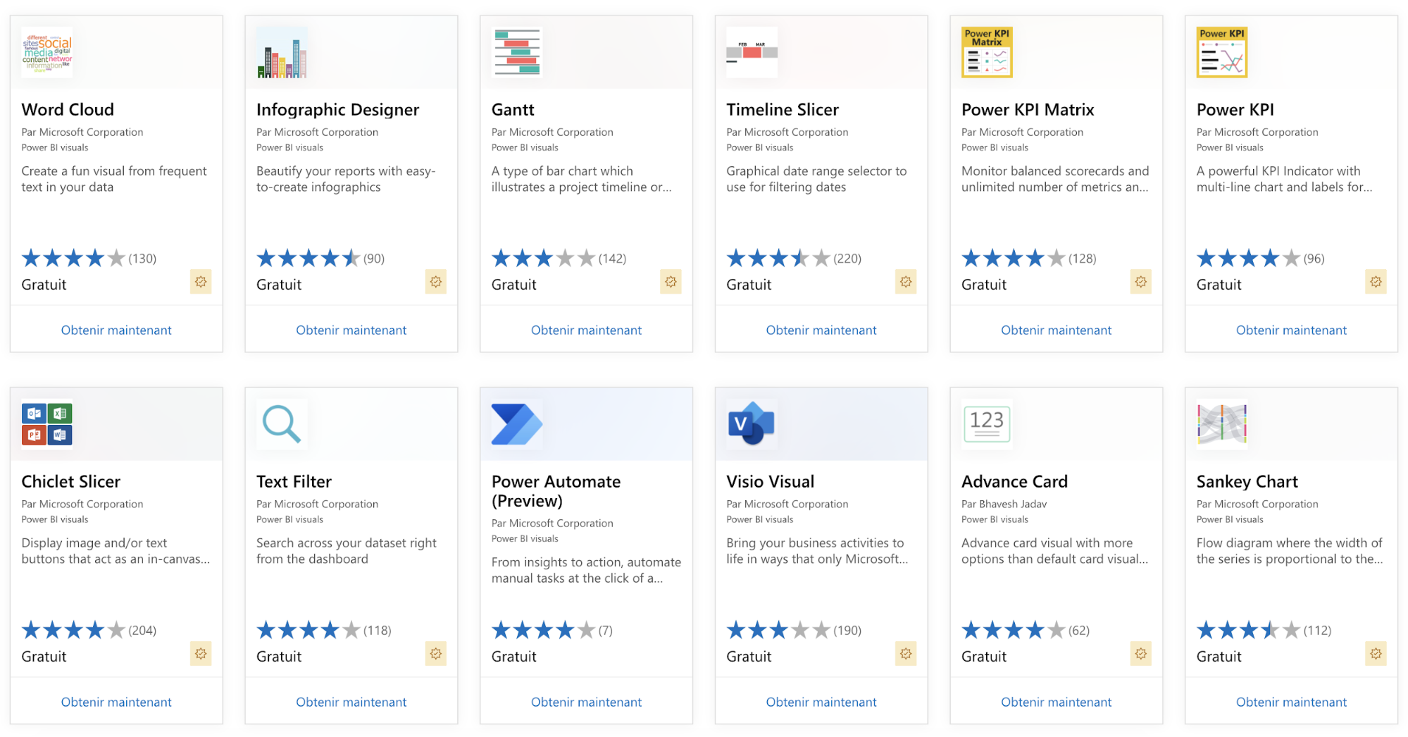
Most visualizations are free – all you have to do is download them and import them to Power BI, just like in the next video:
Over to You!

You’re now going to use the data you have to create several visualizations for Global Bank.
Visualization 1 – User Story 5
Global Bank wants to visualize past real-estate transactions. This is an indicator of the bank’s commercial activity, as the more customers you attract, the more mortgage applications you’ll get. You already created this visualization in the last chapter, using a column chart.
Visualization 2 – User Story 6
Global Bank’s strategy is to focus their activity on customers with a better profile and on larger transactions, so fewer loans but higher amounts. Your task is to visualize how the average loan size has evolved by branch.
Add a line chart visualization. Insert the Application Date dimension to the Axis field, and then Approved to the Legend field, and finally Amount to the Value field. Filter to only show approved mortgage applications.
Select the corresponding aggregation in the variable’s context menu to calculate the average.
To filter, use the filter pane to the right of your screen.
Watch the following video to follow the different steps:
Visualization 3 – User Story 7
Global Bank wants to visualize how the loan approval rate has evolved to answer the question: “Has the quality of application files improved over recent years?”
Visualize mortgage applications per year with a 100% stacked column chart and add the Approved dimension to the visualization in the Legend field.
We’ll do just that in the following video:
Pros and Cons of Each Visualization
One challenge you’ll encounter over your first few projects working out the best visualization for your data and your context.
Pie Charts
✅ Easy to use for representing a whole as the sum of its elements.
⚠️️ Hard for the eye to compare the size of the different slices of the pie.
⚠️️ If divided into more than four parts, they become impossible to read.
Line Charts
✅ Practical for showing how a numerical variable has changed.
⚠️️ When too many lines are involved, you risk the “spaghetti effect”.
Column Charts
✅ The most effective graph for representing numerical values by category.
⚠️ Data is often grouped together, which may impact the way your end user interprets it.
⚠️️ If the data is not sorted, these can be hard to read.
Treemaps
✅ The best use of space for presenting lots of information at the same time.
⚠️️ If there is no variance in the data, these are not much use.
Maps
✅ These let end users picture their environment.
⚠️️ Illegible if there are too many bubbles.
⚠️️ Maps are often colored in (to show sea, continents, etc.), so take care with managing your colors.
Let’s Recap!
Power BI has 34 different visualizations on offer, including graphs (column charts, scatter charts, etc.) and maps.
There are resources available to help you select the best visualization, such as the flow chart on From Data to Viz.
It’s easy to import new visualizations from the AppSource online-visualization catalog, or you can import your own visualizations developed in R and Python languages.
In the next chapter, we’ll look at how to improve visualizations using formatting options!
Ever considered an OpenClassrooms diploma?
- Up to 100% of your training program funded
- Flexible start date
- Career-focused projects
- Individual mentoring
Find the training program and funding option that suits you best
