Table of contents
- Part 1
Get the Most Out of This Course
- Part 2
Discover Business Intelligence and Power BI
- Part 3
Make Data Visual Using Power BI
- Part 4
Organize Your Data to Help With Decision-Making
Table of contents
- Part 1
Get the Most Out of This Course
- Part 2
Discover Business Intelligence and Power BI
- Part 3
Make Data Visual Using Power BI
- Part 4
Organize Your Data to Help With Decision-Making
Navigate Around Your Dashboard

Explore Different Levels of Granularity
Microsoft Power BI lets you explore your data at different levels of granularity using the hierarchies.
Let’s go back to Visualization 1 on real-estate transactions to change the Axis and reinsert the Mortgage Application Date dimension in the form of a hierarchy:

When you drag in the Application Date field, it automatically defaults to a date hierarchy (Year, Quarter, Month, or Day).
Easily Navigate Within Your Power BI Report
In the last chapter, you saw that Power BI lets you use action buttons to interact with your report.


Navigation Buttons
These buttons are, in fact, nothing more than shapes, to which you can add specific actions using the format menu:
Back |
|
Bookmark |
|
Drillthrough |
|
Page Navigation |
|
Web URL |
|
Q&A |
|
Explore Active Selections Using Drillthrough Buttons
At times, when analyzing your data, you’ll need to explore it in more detail.
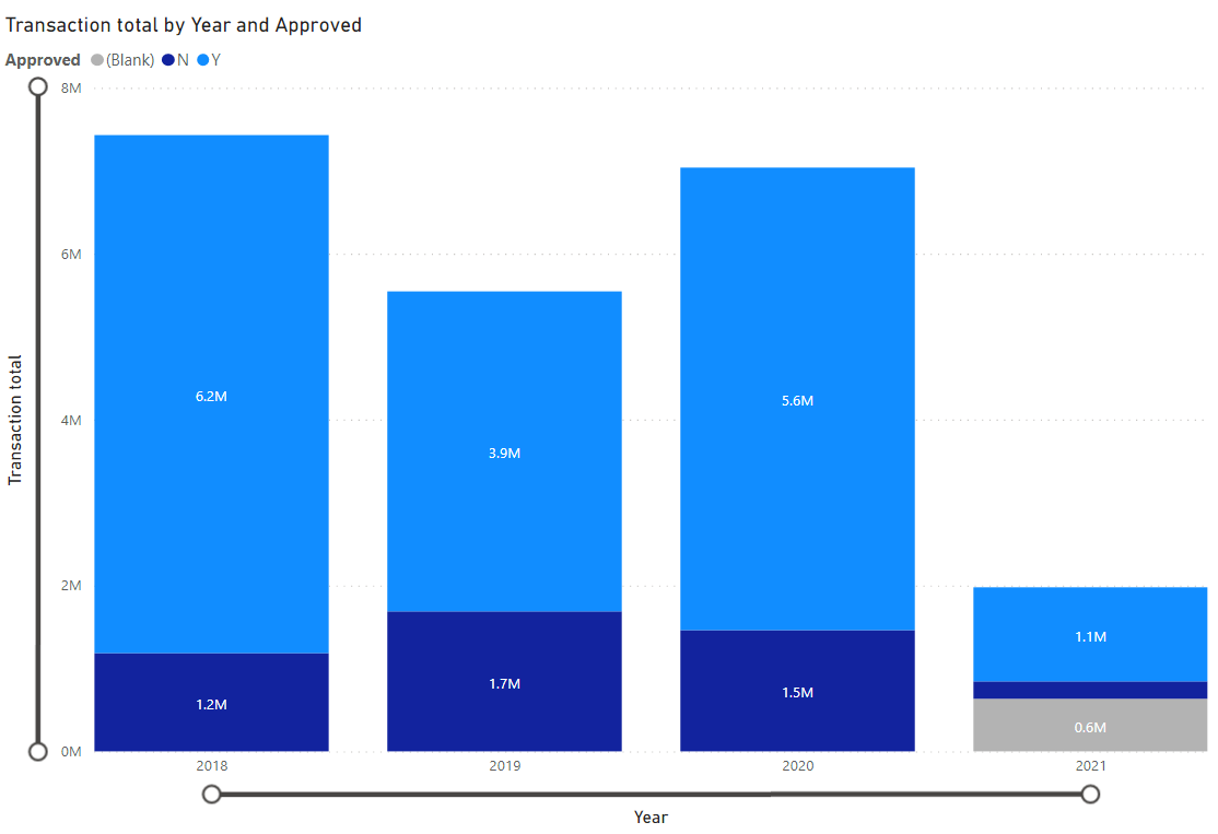
To illustrate this with an example, imagine you’re a branch manager for Global Bank, and you’re visualizing mortgages approved last year using the column chart that we’ve already created.

Now imagine you want to get a list of the customers who had their applications approved in order to send them a message telling them about a new offer, for example. It would be handy if you could click on the chart and simply select “Show customer list”.
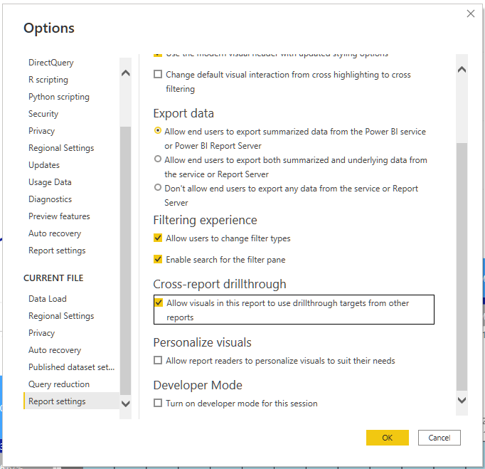
Start by enabling the option in Power BI Desktop (it’s not enabled by default):
In Power BI Desktop, select File > Options and settings > Options.
In the Options window left navigation, at the bottom of the Current file section, select Report settings.
At the bottom right, under Cross-report drillthrough, select “Allow visuals in this report to use drillthrough targets from other reports”.
Select OK.

In the video, you’ll see how to configure your drillthrough.
Organize Progress Reports With Your Client
You’re making great progress!
It’s time to check in with Jane to make sure everything is moving in the right direction. Use this opportunity to check everything you still have to do before delivering the final product:
What needs to be corrected or improved.
What remains to be done.
This is also an opportunity for Jane to ask any questions she might have about the prototype. You can read how it could play out here.
Let’s Recap!
Buttons are a simple and effective way to create navigation links within your report (to other pages, websites, etc.).
When your data includes a hierarchy (e.g., dates), you can explore it at different levels of granularity in your visuals (e.g., displaying your graphs by quarter or month).
Using cross-report drillthrough, you can explore your data from one graph on another page in order to carry out more detailed analysis on a selection of data.
Don’t forget to enable cross-report drillthrough to use this option. Power BI regularly makes new features available, and you have to manually enable them.
We’ve reached the end of the second part of this course. I’d encourage you to take the quiz before moving on to the next part!
Ever considered an OpenClassrooms diploma?
- Up to 100% of your training program funded
- Flexible start date
- Career-focused projects
- Individual mentoring
Find the training program and funding option that suits you best
