Table des matières
- Partie 1
Identify key design elements through wireframes
- Partie 2
Apply the design process to create your own rapid prototype
Table des matières
- Partie 1
Identify key design elements through wireframes
- Partie 2
Apply the design process to create your own rapid prototype
Create and test your clickable prototype
The best way to test if you’ve successfully considered all the steps you need in your user flow is to take your wireframes and make them into an interactive prototype. Prototypes give you a better idea of how something like an app may look and feel.
Prototypes are used in order to test ideas. It's much easier (and cheaper) to make changes earlier in the process, so that's why you want to test early and often to help keep you on track. Also, it can be a way to build early interest in your app with users.

Prototyping is most valuable if you don't wait to start testing. You can even do this with paper prototypes.
Fancy tools don't make your prototype good! [2:52 min]
For this course we're going to focus on interactive prototypes you can easily create with a smartphone!
Create an interactive prototype with sketches
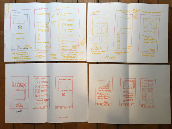
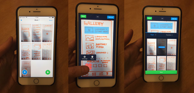
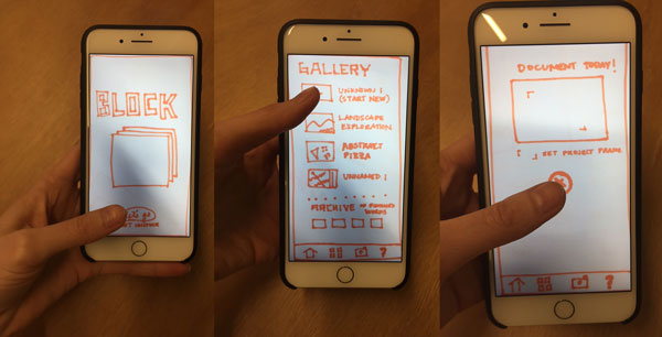
There are lots of different tools for creating clickable prototypes, but for this exercise we’re going to use Marvel. All you need is a smartphone and your sketches. Once you’ve downloaded the free app, photograph each of the screens you have created and add hotspots to make the prototype interactive. (I’m not going to give you step by step instructions, because I want you to pay special attention to the onboarding process which makes the user experience as simple as possible for you.)

Once you have your app ready, make sure you test it out on yourself before testing it on anyone else. In these first usability tests it doesn’t really matter who you test on because your main concern is getting the right user flow.
With the help of a tool like Marvel, you can test your app with users in a couple different ways. First, you can sit next to a friend and say something like, “Hey, I’m working on an app, would you mind testing it out? It’s still an early prototype, so don’t worry if you get stuck, I won’t be offended”. Watch them use it. Ask them if they have any questions at the end.

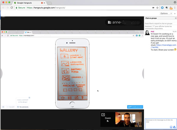
Marvel also provides you with a link which you can email to friends. This is most effective in the context of a remote usability test, by sharing the link over a Google Hangout, Skype, or Zoom. Ask them to share their screen with you so you can watch and listen to them test out your prototype.

Once your usability test is complete, you can then take this feedback and revise your wireframes or draw new ones. You have entered the iteration phase of the design process, where you will likely find yourself going in circles for a bit as you continue to make improvements to your prototype and test it along the way.
Mini Challege: Make a clickable prototype
Now it's your turn to create a digital prototype from your sketches! Take your sketches, photograph each screen, add hot spots, and test your app out on a friend!
Make note of the feedback you receive, and re-draw those screens. Then update your prototype and test again!
Et si vous obteniez un diplôme OpenClassrooms ?
- Formations jusqu’à 100 % financées
- Date de début flexible
- Projets professionnalisants
- Mentorat individuel
Trouvez la formation et le financement faits pour vous
