Decide on an approach to present information
There are many types of charts and graphs. Depending on your data set, and the type of information you want to display, some formats are better for certain uses than others. Throughout this chapter, we'll explore different types of graphs. We'll look at creating your own in the final chapter.
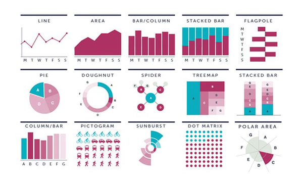
Different types of graphs illustrated by Graphic Digital Agency for The Guardian.
Line graphs
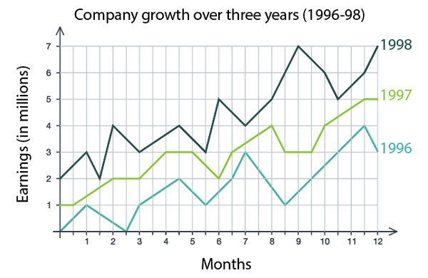
Line graphs are a valuable tool for showing continuous variables, such as change over time. They are a useful way to show company growth (or decline). Through peaks and low points, trends become more visible. You can share multiple levels of information on one graph, but try to limit yourself to five lines per graph because otherwise it's hard for the viewer to know what's going on.
Viewers also need to know what each line represents. Are they different years? Different departments? Different countries? You'll always need to include a key or labels so that viewers know what they're looking at.
Bar graphs
Bar graphs (also known as column graphs) can have horizontal or vertical bars, and are good for examining comparisons across categories. The length of each bar represents the value of what is being plotted. Each bar graph should have a scale that starts at zero to ensure you are not manipulating the length of each line.
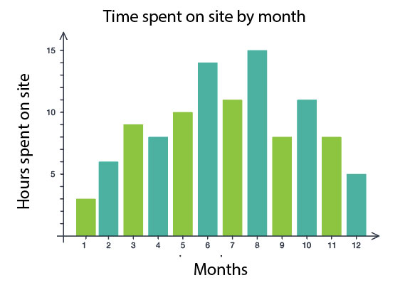
Bar graphs are the most common when graphing usability data. If you're tracking task completion rates, you could include the time required to complete a task on the Y-axis (vertical axis), and the task on the X-axis (horizontal axis). Labeling each specific task is more effective than naming them task 1, task 2, task 3. (We'll look this in action in the next chapter.)
Pie and donut charts
Pie and donut charts are good for representing parts of a whole, where the parts add up to 100%. In Google Analytics top referral sources (channels), new vs. returning users and gender demographics are three types of information that are presented as pie charts to give a quick visual breakdown of the information.
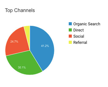
A donut chart is a pie graph with its center cut out. In a donut chart, the lengths of the arches become more obvious, while in a pie chart, the proportion to the whole is more prominent.
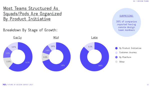
Donut charts show early, mid, and late stage companies in relation to product initiatives from the NEA Future of Design report (2017). Note that the typography was designed for full screen presentations, not to be embedded in blog posts. Consider these factors when designing and selecting type faces. Also consider how you may need to adapt labels for different contexts.
When using pie and donut charts, avoid having too many segments because it will be hard for the viewer to make sense of it. It's best to use a flat view. As soon as you make a pie graph 3D, it starts to distort the information.
This 3D pie chart from wtfviz.net is an example of what NOT to do. This collection of data visualizations makes no sense. There are so many small slivers of information that it's better to see if there is a way to group them in a different category title. The site can can be entertaining to look at, but is also a good reminder of what to avoid.
Stacked bar graph
A stacked bar graph is essentially a combination of bar graphs and pie charts. They're a way to show multiple pie charts in column form, which is helpful when you’re looking at a series of data sets. One way they could be used is to show task completion status for various tasks.
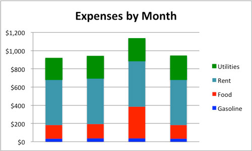
Expenses by month in a stacked bar graph by Smartsheet. (Note: there is not enough contrast between the green and blue colors for those with reduced vision.)
Charts and other graphs
This chapter covered the basics of graphs, but there are numerous other styles and variations that you may encounter or want to attempt yourself. The website datavizcatalogue.com is a helpful tool for examining different types of graphs. They also have a section that allows you to search by function, so depending on whether you're looking to show comparisons between values, distribution that displays frequency, relationships between data, or some other aspect, they'll give you a good idea of which types of graph you will want to consider, as well as alternatives.
Often showing a chart or table can be just as effective as presenting a graph. Once again, make sure it's clear what you're showing on the graph. Using bold headings will make it easier for the viewer to interpret. Consider your word choice too, so there is less room for confusion.
Declutter and keep it simple
Cole Nussbaumer Knaflic shares tips for creating strong data visualizations in her book Storytelling with Data. Her approach involves critical thinking about data (and the audience and context), as well as a simplification or decluttering of data visualizations.
Declutter Your Data Visualizations [28:46 min]
The five steps to decluttering data visualizations are:
Leverage how people see
Employ visual order
Create clear contrast
Strip down and build up
Don't over-complicate
Let's recap!
Select the type of graph you use based on the goals of your visual representation.
Simplicity is best when determining graph types (flat, not 3D!).
Consider your labels and placement in order to communicate the information to the viewer.
Bar graphs are the most common type of graph you'll use when charting usability test results.
