Design with patterns
It can be overwhelming to think about all the different aspects of an experience that need to be designed. Using patterns can help speed up the design process while also ensuring consistency. Using design patterns can be thought of as a best practice for design. At first, working with patterns may feel a bit like you're cheating, but trust me, they'll make your life easier!
Working with patterns
Patterns can be found on products and services and across the web, so they become familiar to the user as well ensuring they don't need to learn how to do something in order to accomplish their goal. You may feel pressure as a designer to be creative, but also realize that you don't need to reinvent the wheel! There is a benefit to using what users are already familiar with.
Patterns can help designers consider how to approach navigation, menus, images, social interactions, onboarding, checkout systems, confirmation screens, filters, and more. UI-patterns.com is a great resource to explore different treatments, or patterns, that are commonly used in web and mobile design. It's important to realize that even with "patterns" there are lots of variations and approaches that can be applied to the overarching idea.
Jenifer Tidwell's book Designing Interfaces is another helpful resource for understanding interface and interaction design, structured as a pattern language. The book also has a companion website featuring select patterns and examples, along with context of when, how, and where to use them.
Spending some time with pattern libraries is also useful for ensuring you speak the language of web and product. For instance, do you know what an according menu, breadcrumbs, or a wizard refer to? Cards are one of the more common patterns you'll encounter because text and images are often grouped together.
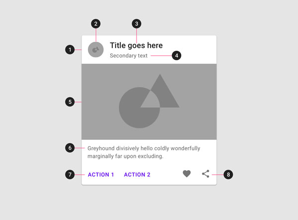
A sample card style in Material Design, which includes: 1) container 2) thumbnail 3) header 4) subhead 5) media 6) supporting text 7) buttons 8) icons. Cards can be adapted and many of these features are considered optional.
Cards also "translate" nicely between mobile and web layouts and can be easily customized according to the project needs. New patterns are added as the web develops so it's good to stay up to date with industry news and trends.
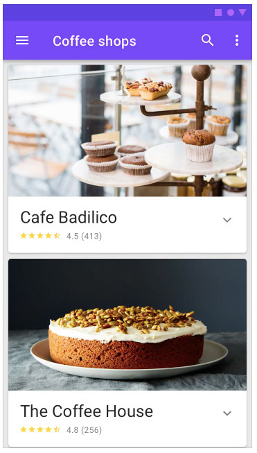
Example of a mobile screen from Material Design that shows two cards.
Adapt ideas from UI kits
UI kits are pre-designed interface patterns that can be copied and pasted into your own files. Different UI kits exist depending on which software you use, but Sketch and AdobeXD both have many options, and designers are releasing more kits all the time.
When you open a UI kit, it often may feel like you're looking at the screens of an app that has already been designed. Take a closer look and you'll see that there tend to be countless different elements that you could use in various design projects. Sometimes there are almost too many options so you need to be clear on what's useful for your own project.
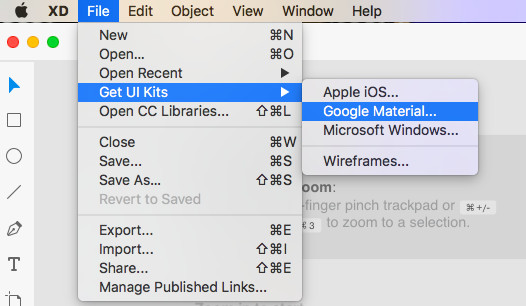
Screenshot from Adobe XD. Some software includes UI kits into the menu.
Wires UI kit from Behance linked in the menu of AdobeXD.
Some UI kits may have a particular theme such as travel , finance, or smartwatch specific. It's worth doing a search and seeing what the free versions of UI kits have inside. Different designers have designed different kits for different software and for different devices. When you're first starting out, these kits are useful for exploring the files to see how they were made and playing around with how the different elements fit together. UI kits can be particularly useful if you're starting to imagine what a messaging system or map may look like. Instead of getting distracted by all the possibilities, you can start with an existing file and adapt and refine it for your needs.
UI kits are also useful for finding the basics from menus to checkout flows, settings, sample profiles, activity feeds, filters, search, charts, maps, and more. There are loads of resources online, but here are a few to start:
Wires for XD (mobile and web)
Sometimes you may need the basics such as the operating system icons (including time and battery power) that appear at the top of screens, which both Apple and Google provide.
Apple UI design resources for Sketch, Photoshop, and XD (It's also worth exploring their human interface guidelines with additional resources for developers and designers)
Material Design sticker sheets of components, system icons, product icons, and icon library for Sketch, Photoshop, Illustrator, and XD
Another thing you may want to include in certain designs are cursor arrows to help communicate to clients or stakeholders how an interaction works if you can't be there.
Designing interactions and state changes
A button isn't just a button. It's not a static element that does nothing. There is the button as we see it, and there is the change that's supposed to happen when the cursor hovers over it or when you click it. These are state changes and are important clues for the user to understand how to move through a product.
While a button is a fairly simple example, a table can get more complicated. The UI designer needs to have a sense of what exactly is going inside the table so that they can keep those constraints in mind. If there are long titles or additional factors to consider, the visual designer needs to know that up front so they can plan. This is where annotated notes and documentation is useful. It ensures the designer is approaching the problem with the user in mind.
Benchmarking
Benchmarking is a helpful exercise, particularly when you're looking to build a new product or add a new feature. Benchmarking involves looking to other sites or apps to see how other companies are approaching a similar challenge. You may be looking directly at competitors or platforms doing completely different things; you can find inspiration anywhere!
One approach is to create a spreadsheet. This can be a useful document so you have all the links and competitors in the same place. You could create different fields to compare anything from business models and pricing to the number and type of product offerings or how companies tell their story on the about page.
When it comes to UI, as with the inventory audit, sometimes doing visual benchmarking can be more effective than a text document. Screenshots let you easily compare different approaches, from what buttons and branding look like to marketing efforts such as sponsored posts that have appeared in your social media feed (brands are an ecosystem beyond the site itself, after all). It's also possible to add screenshots to a spreadsheet document to make it more visual.
There are countless different aspects of a project you can benchmark so consider your goals in order to prioritize what you're looking for. There's no one way to approach benchmarking so consider what would be most useful to add value to your work.
Let's Recap
Patterns are a tool for saving time when designing and creating more consistent designs.
UI kits are digital files you can pull from - select the elements you want to explore in your product.
Don't forget to design for when experiences go wrong - the user will need to be able to get back on track ASAP.
Benchmarking is an activity you can do to examine what others are doing to solve similar challenges.
