Choose the Right Typography
Love Beautiful Letters
The word calligraphy comes from Greek and means beautiful writing. It is the art of writing/drawing beautiful letters. When we talk about calligraphy, we refer to something we do by hand with writing materials (ink, brush, feather, etc.). Applied to print, office automation, or computer graphics, we are referring to typography.
When you buy a computer today, there are a series of fonts available. Some of them are default in many software programs, that's why you know Calibri, Arial, Time New Roman, Verdana, etc.
Did you know that this wasn't always the case? Initially, there was only one boring font.
Steve Jobs studied calligraphy in college and was passionate about it. He decided to offer many fonts on his Apple computer, and the competition soon followed. 😏
If you'd like to learn more about this, I recommend watching Steve Jobs' 2005 commencement speech at Stanford University, in particular from minutes 3:25 to 4:50.
Discover the Difference Between Typography, Typeface, and Font
In the graphic design world, typography, typeface, and font are often confused and used as synonyms. But that’s a mistake. There's a subtle difference! 🤓
Typography
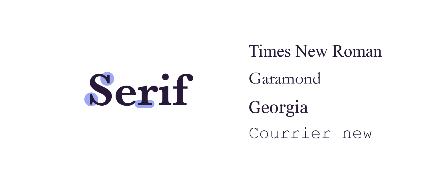
Typography is the style and appearance of printed matter. Serif and sans serif typographies refer to the decorative lines or feet in a font.
Serif
Serif typographies have these feet.
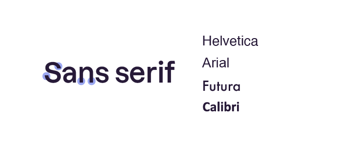
Sans Serif
Sans serif typographies don't have these feet.
Typeface
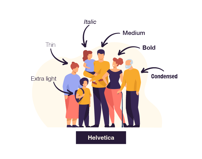
Typeface refers to a set of characters of the same design. I'm sure you've seen the words Arial, Helvetica, and Verdana before? They're typefaces.
Font
A font is more specific and refers to the style of a typeface: thin, bold, small, etc. Use the family metaphor to help you visualize:
To sum up:
Helvetica is a typeface.
The typeface Helvetica is part of a non-serif and proportional typographic group.
Helvetica Bold 15pt' is a font.
Choose the Font Which Suits You Best
Traditionally, serif has a more traditional look and implies history, reliability, and trust. Audiences are attracted to the serious and established look as it is an older typography that dates back centuries. Serif fonts are great for law firms or financial institutions.
Sans serif is more minimalist and considered modern and simplistic. It's often used by creative institutions like fashion houses or startups.
Follow Trends in Typography
Certain print and web graphic designers follow trends because they look modern and elegant:
A typography without serif ( sans serif), because it's easier to read.
Light or even ultralight fonts, because they're more elegant.
Variation of boldness in fonts. Or moving from bold to thin, because it's more readable.
These trends are mainly driven by Apple.
Here are two resources to help you find fonts:
Google Fonts is a catalog of free and open source fonts.
Dafont also provides free fonts you can download.
Let's Recap!
Calligraphy refers to something that you do by hand with writing materials, while typography refers to writing used in computers, graphics, and printing.
Typography, typeface, and font are not the same thing.
Using serif gives you a more traditional and conservative look, while sans serif can make your writing more modern and out of the box.
Never use Comic Sans! It's outdated and not a good look for a modern presentation slide.
Now you've figured out your fonts from your typefaces, it's time to look at putting everything together on a slide. Let's get to the next chapter.
