
The first interactions we’ll look at closely are forms.
Forms are used all over the web (they are pretty much as common as images).
You use forms to:
Register and log in to your favorite sites.
Research information, such as articles or cooking recipes.
Create content using admin spaces.
Send private messages directly from a site.
Sign up for newsletters and notifications.
Forms are used in many contexts, so they must be accessible, understandable, and usable to as many people as possible.
Let’s look at:
How to build an accessible form.
How to indicate the type of information expected in the different fields.
How to give feedback to users.
Structure Your Form
To create an accessible form, you need to do the following:
Consider different interaction modalities. Touch targets such as buttons should be big enough to see and operate, and the controls should be usable with a keyboard without having to rely on a mouse.
Programmatically label all inputs. It will make forms understandable for people who rely on assistive technologies.
Provide clear instructions and error messages. It will make the forms more usable for everyone!
Ensure that color is used in a way that doesn’t exclude users. Indicating which fields are incorrect by highlighting them in red won’t help those who are color blind.
Create the Skeleton of Your Form
Let’s start with the following form template:
<form method="post" action="treatment.php">
    <fieldset>
        <legend>Your contact information</legend> <!-- Title of the fieldset -->
        <label for="last name">What is your last name?</label>
        <input type="text" name="last name" id="last name" />
        <label for="first name">What is your first name?</label>
        <input type="text" name="first name" id="first name" />
        <label for="email">What is your email?</label>
        <input type="email" name="email" id="email" />
    </fieldset>
    <fieldset>
        <legend>Your wish</legend> <!-- Title of the fieldset -->
        <p>
            Make a wish that you would like to see come true:
            <input type="radio" name="wish" value="rich" id="rich" /> <label for="rich">To be rich</label>
            <input type="radio" name="wish" value="famous" id="famous" /> <label for="famous">To be famous</label>
            <input type="radio" name="wish" value="intelligent" id="intelligent" /> <label for="intelligent">To be <strong>even</strong> more intelligent</label>
            <input type="radio" name="wish" value="other" id="other" /> <label for="other">Other...</label>
        </p>
        <p>
            <label for="precisions">If "Other", please explain:</label>
            <textarea name="precisions" id="precisions" cols="40" rows="4"></textarea>
        </p>
    </fieldset>
</form>
This form already contains elements that make it accessible. Note the use of the following:
labeltags, which are connected to the associated input through theforandidattributes.fieldsetandlegendtags, which are used to group elements of the form (in this case, the contact information).Placeholder text, which provides a visual hint of what type of data is required.
This form provides a good foundation to ensure accessibility to a number of users, but we can go further to make it even more accessible. 😁
Provide Instructions Regarding the Expected Data
To enhance the accessibility of the form, let’s include some additional information to make it more clear.
Use ARIA Attributes
Labels allow you to provide basic information about the nature and type of information you expect in a field. You can go further by adding an aria-describedby attribute by providing additional instructions or associating inputs with errors.
For example, for the date input, you can use the aria-describedby and id attributes to provide additional information about the format. The screen reader or braille display will first announce the label, and then the content that the aria-describedby attribute points to.
<label for="birth-date">Date of birth:</label>
<input type="text" name="birth-date" id="birth-date" aria-describedby="birth-date-format" placeholder="MM/DD/YYYY" />
<span id="birth-date-format" class="hidden">MM/DD/YYYY</span>Hidden Labels
The label tag is compatible with most browsers and assistive technologies. However, in some mockups and the example below, there is no label visible on the screen.
Even though a label isn’t visible, you still need one to describe the purpose of the input to assistive technology users. You can create one and then hide it using CSS.
<div role="group" aria-labelledby="contact information">
    <p id="contact information">Your contact information</p> <!-- The group made with divs and ARIA attributes -->

    <label class="hidden" for="last name">What is your last name?</label>
    <input type="text" name="last name" id="last name" />
</div>
.hidden {
height: 1px;
left: 0;
overflow: hidden;
position: absolute;
top: -10000px;
width: 1px;
}In the example above, we link the input tag to a label tag that we hide visually using the CSS .hidden class.
Use ARIA Attributes to Group the Controls
You might have noticed that thefieldset tag is used to group elements together. There is, however, another method that takes advantage of ARIA attributes instead.
You can use the ARIA role = group attribute to group form elements and add an aria-labelledby attribute to label this group of elements.
Because HTML solutions tend to be better supported, the fieldset and legend approach is preferred. The choice of method depends on the development context (i.e., if you use a framework or not).
<div role="group" aria-labelledby="contact information">
    <p id="contact information">Your contact information</p> <!-- The group made with divs and ARIA attributes -->

    <label for="last name">What is your last name?</label>
    <input type="text" name="last name" id="last name" />

    <label for="first name">What is your first name?</label>
    <input type="text" name="first name" id="first name" />

    <label for="email">What is your email?</label>
    <input type="email" name="email" id="email" />

</div>
In the example above, we group inputs with a common theme. Although we’re using a div, we’re indicating that these inputs are related using ARIA attributes.
Validate the Data and Provide Feedback
When a user submits a form, it may be filled out incorrectly and fail validation. In this case, you should indicate which fields contain errors and why.
ARIA attributes offer an excellent solution for forms: some can indicate your inputs’ condition when properly used.
Indicate That a Field Is Required Using HTML Attributes
Often, one or more form fields are mandatory such as the email field when subscribing to a newsletter.
You can indicate that a field is mandatory using these attributes:
required- this HTML5 attribute lets all of your users know that the field is required.aria-required=true- informs assistive technology users that this field is required.
Indicate That a Field is Invalid Using ARIA
Once a user has submitted a form containing errors, you can indicate that one or more fields are invalid using the aria-invalid attribute.
This attribute can have a value of true or false . It can also indicate more specifically that the error is grammatical or related to spelling, with the values grammar and spelling, respectively.
Allow the Validation of a Form With a Submit Button
Before continuing, a short note on the validation of forms.
You can use either a button or an input tag to submit a form. The input will need to have the type = submit attribute to indicate that this tag allows the submission of a form.
Once the form is submitted, the data will be validated on the server-side. If these do not meet expectations, you will often have to display an error message on the front end.
Here is an example of an error message:
<div class="col-md-3 mb-3">
    <label for="validationCustom05">Postal code</label>
    <input type="text" class="form-control" id="validationCustom05" required>
    <div class="invalid-feedback">
        Please provide a valid postal code
    </div>
</div>
You don't have to do much with HTML for these error messages - just play with CSS and the display property.
Associate Inputs With Errors
Remember how we used the aria-describedby attribute to associate an input with some additional information? You can also use this attribute to link inputs to error messages. The aria-describedby attribute can point to the id of the error message.
<div class="col-md-3 mb-3">
    <label for="validationCustom05">Postal code</label>
    <input type="text" class="form-control" id="validationCustom05" required aria-describedby="feedback-message">
    <div class="invalid-feedback" id="feedback-message">
        Please provide a valid postal code
    </div>
</div>
This attribute can point to multiple values to be associated with both instructions and error messages when they appear. All you have to do is separate the ID values it references with a space.
Tonight in Gotham: Investigate an Accessible Form
Our "Tonight in Gotham" project has a form element: the search bar in the page header. Take a moment to investigate it on your own and see how many accessibility practices you can identify before scrolling down.

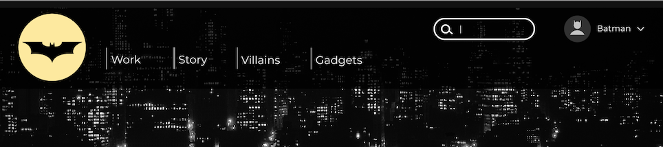
As you can see, this form integrates several of the practices that we covered in the chapter:
It has a focus and hover state to give visual feedback.
The text label is only visible for assistive technologies, thanks to the
sr-onlyclass, which has rules that visually hide the label.The input is also visually labeled with the search icon and uses SVG. It's hidden from assistive technologies using the
aria-hidden="true"attribute and allows assistive technology users to skip this content since they already know this information from the label.
Also, a form tag encloses the form indicating that a form is present allowing assistive technology users to navigate to it quickly.
Finally, it has the ARIA role="search" attribute. This indicates that the function of this form is to search content.
Let’s Recap!
As with other elements of a web page, forms require accessibility practices, such as the proper use of HTML tags.
The label, even if it is not visible on the screen, must be linked to an input field. Each element of the form must have an associated
labeltag.Use
aria-requiredandaria-invalidto indicate the status of the form.Use the
aria-describedbyattribute to associate inputs with errors.
In this chapter, you saw how to add accessibility features to forms. Next, let’s have a look at modal dialogs and carousels. See you in the next chapter!