Many developers handle layouts in different ways because there are so many different ways to position elements. In recent years, though, there has been a major focus on making CSS easier to write.
It's become much more pleasant to create layouts using native CSS instead of having to use external tools, though! One such recent development in CSS is called CSS Grid. It's a set of CSS properties that allow creation of two-dimensional layouts defined by columns and rows.
Instead of having to manually set an element's position using pixel distances and complicated math (which is the way things used to be!), you can simply set the number of columns and rows you want and let Grid position them for you.
Most websites are, after all, based on grids. It may not be apparent at first glance, but websites often have columns and rows which determine how elements are distributed on the page. Check out the following websites:


Once you start noticing the rows and columns engineered into website layouts, it's hard to unsee them. CSS Grid will let you create this same type of structured layout in your own projects.
To get a sense of what CSS Grid allows you to create, check out the following layouts, all of which were all written with several simple lines of code:
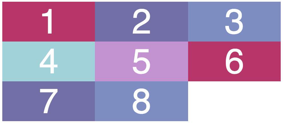
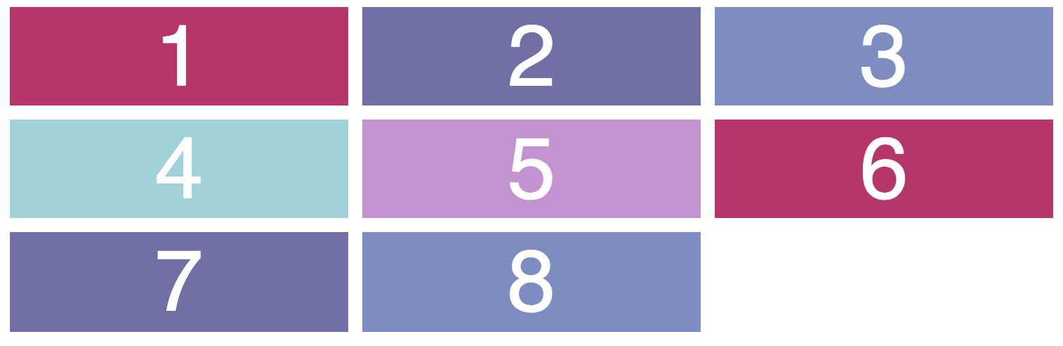
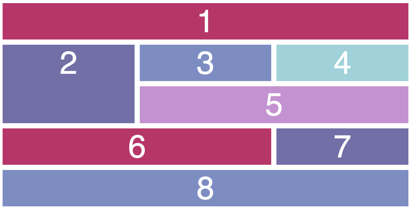
As you can see, CSS Grid is very powerful. It can also be used in combination with the concepts you've already seen in this course, like padding, borders, and margins.
Browser compatibility
The only reason anyone might hesitate to use CSS Grid is because, like many new features, it was incompatible with certain browsers. However, CSS Grid is now integrated into all browsers, so you can use it with relative certainty.
Just one note: in order for it to work with Internet Explorer, you must preface your grid rules with -ms .
Here's a great excerpt from the MDN article:
As with any front-end technology choice, the decision to use CSS Grid Layout will come down to the browsers your site visitors are typically using. If they tend to use up-to-date versions of Firefox, Chrome, Opera, and Safari, then it would make sense to start using CSS grids once those browsers update. If your site serves a market sector that is tied to older browsers, however, it may not make sense yet.
I agree with this summary of how to make a decision regarding layouts in CSS. You should remember, though, that you can write CSS Grid code and fallback code for older browsers in the same code base. They're not mutually exclusive!
Without further ado, we'll check out how to integrate CSS Grid into your project with one line of code in the next chapter.
Recap
CSS Grid is a set of CSS properties that allow you to create of two-dimensional layouts via columns and rows.
Columns and rows are the basic layout building blocks for most websites.