Improve User Experience With Modals and Tooltips
Add Legal Notices With the Modal Component
Similar to the offcanvas component, Bootstrap also provides a modal component.
How is modal different from offcanvas ?
The two components have a similar function, but their format is different.
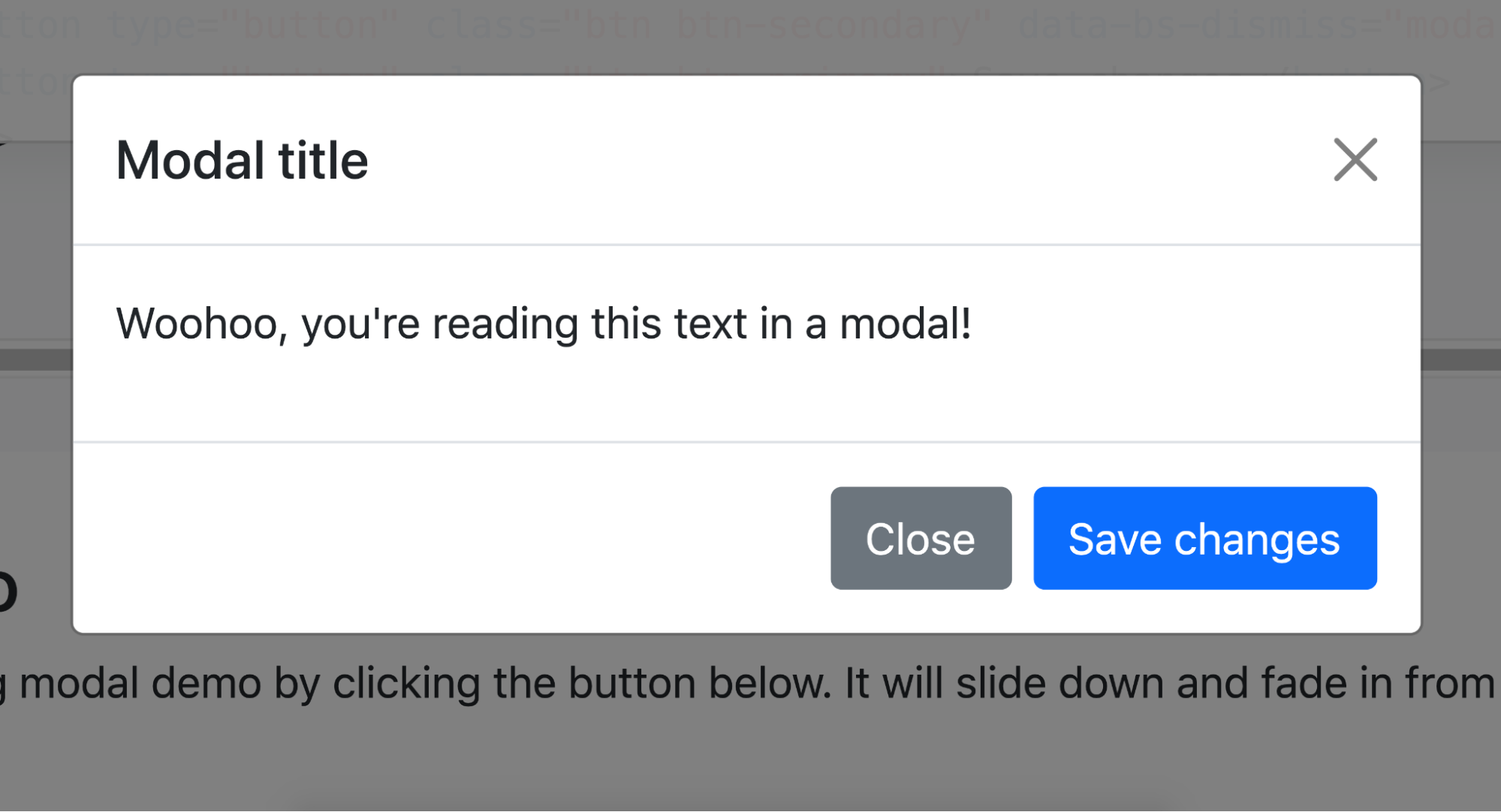
The modal component is a popup window that is displayed over a page and is often used to validate an action (i.e., “Are you sure you want to delete XX?”) or to show extra information (as in our case).
First, take a look at the Bootstrap documentation on modals, and then we’ll look at how they’re structured.
<!-- Button trigger modal -->
<button type="button" class="btn btn-primary" data-bs-toggle="modal" data-bs-target="#exampleModal">
    Launch demo modal
</button>
<!-- Modal -->
<div class="modal fade" id="exampleModal" tabindex="-1" aria-labelledby="exampleModalLabel" aria-hidden="true">
    <div class="modal-dialog">
        <div class="modal-content">
            <div class="modal-header">
                <h5 class="modal-title" id="exampleModalLabel">Modal title</h5>
                <button type="button" class="btn-close" data-bs-dismiss="modal" aria-label="Close"></button>
            </div>
            <div class="modal-body">
                ...
            </div>
            <div class="modal-footer">
                <button type="button" class="btn btn-secondary" data-bs-dismiss="modal">Close</button>
            <button type="button" class="btn btn-primary">Save changes</button>
            </div>
        </div>
    </div>
</div>
Here again, Bootstrap uses the same logic in the structure of its components. At the top, you can see the button that activates the modal. The data-* attributes act as a link with Bootstrap’s JS.
The modal itself is made up of:
A general
divwith the .modal and .fade classes (“fade” is the way the popup appears) and a uniqueid.Another
divwith the .modal-dialog class wraps the threedivsproviding the structure of the modal content.Three identical
divs(on the same hierarchical level) with the classes.modal-header,.modal-body, and.modal-footer.Finally, other content including an element with the .modal-title class.
We need a classic modal, with a div.modal-header and a div.modal-body . The most important aspects of using modals in Bootstrap 5 are the div.modal and the div.modal-dialog , as the internal structure can be changed as required.
Over to You!
Your mission:
Create a modal that appears when you click on the “Legal notice” button.
The modal should be composed of a header containing a title and a cross to close it and a body containing dummy text (lorem ipsum).
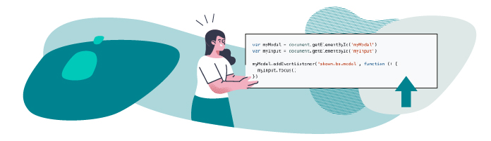
Unlike in the example, you need your modal to open with the “Legal notice” link, which is an anchor (a). The most important thing to get right is the data-* attributes, which trigger the modal.
Once you’ve made these changes, watch the screencast below to compare your work with ours.
Make Your Website More Accessible with Tooltips
Tooltips are a useful little component that you will have encountered before on websites.
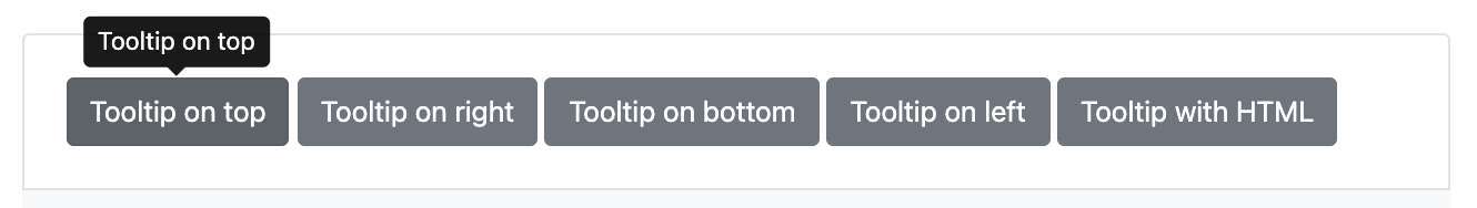
A tooltip is a little message that appears when the mouse is moved over an element (an icon, for example) to provide more information.
This component works with the JS library Popper JS, which you saw right at the start of the course. Don’t worry; this library is already added to Bootstrap, as we chose the “bundle” solution.
Tooltips need to be set up in JS, which you have to code yourself. It shouldn’t be too tricky, as it’s all explained in the Bootstrap documentation (as usual), and the code you need is here:
var tooltipTriggerList = [].slice.call(document.querySelectorAll('[data-bs-toggle="tooltip"]'))
var tooltipList = tooltipTriggerList.map(function (tooltipTriggerEl) {
   return new bootstrap.Tooltip(tooltipTriggerEl)
})
The general idea of the script is to pick up all the elements with a [ data-bs-toggle=”tooltip” ]in the HTML page (the DOM) and link them with the rest of the JS provided by Bootstrap 5.
This piece of code allows you to use tooltips on any page where it’s present.
This is what an icon with a tooltip looks like:
<a href="#" class="text-decoration-none text-dark" data-bs-toggle="tooltip"
   title="LinkedIn">
   <i class="fab fa-linkedin fa-2x"></i>
</a>
Over to You!
You’re now fully equipped to add tooltips to non-text elements in your portfolio:
Links for the social network icons in the footer.
Percentages for the progress bars.
Once you’ve made these changes, watch the screencast below to compare your work with ours.
Let’s Recap!
You can use modals in Bootstrap 5 to add content that only becomes visible after clicking a button.
Modals can contain any HTML element you like.
Tooltips are a way of adding text to a non-text element.
Tooltips need a customized JS code to function, as they depend on the Popper.js library.
You now have a complete website with structured and accessible content for your users! In the next part, it’s time to create your own features and themes. 😎 Don’t forget to test your skills with the quiz before moving to the last part of this course!
