Observe psychological principles in action
Psychology is often talked about in UX design because it is a way to explain behaviors and how, and why users interact with a product. A designer often has to justify their design decisions. Being able to point to psychology will help get others on board to understand WHY you made certain choices. It’s never enough just to create something that looks nice, it needs to function too.
One of the benefits of deconstructing websites and apps as wireframes is that when we break down the components into the essential parts we can see how things like grouping information and alignment are implemented. Not only is there visual appeal, but there's psychology behind it too!
Let's look at some principles and laws to see how we can start to spot psychology at work in design.
Gestalt principles
The Gestalt principles allow designer to creative better experiences to meet user needs and behaviors, as psychology helps influence visual perception and understanding. Gestalt is the German word meaning form or shape.
Here are some of the most common principles you'll encounter:
Focal point – creates visual hierarchy so the eye knows where to look
👉 This is often happens on landing pages where there's a call to action, so the user knows what's going on. Similarly, newspapers and magazines use headlines to call attention to the most important information.Figure-ground – makes apparent which information is in front, and which is in back
👉 Look for product placement in photography.Proximity – items grouped near each other have a relationship
👉 If you have to scroll for 10 minutes to find the BUY button, chances are that product will never go in the cart!Continuity – there is a relationship between information
👉 Consider the grouping of information on Pinterest vs. a site like AmazonSimilarity – elements that look alike (or have same text) should have similar functionality
👉 Buttons that look similar should act similar.Closure – even if a shape or form isn't closed, they eye knows to make sense of it
👉 Have you ever seen a sign where parts of the letters are cut off but you still know what it says? The WWF logo is another example of closure. Where despite missing lines, you still know the form is a panda.
The Gestalt principles are helpful for considering how information is organized on a page or screen so that it can easily be understood by the user – and quickly.
Laws applied to UX
Laws are another way of exploring how design and information can be used to improve and enhance the user experience.
Miller's Law was thought to say the magic number is 7 plus or minus 2. It turns out this was a bit of a misinterpretation of his research. Still, the idea is that the brain can't handle too much information at once without feeling overwhelmed. The law suggests "chunking" information into digestible groups.
👉 Look for things like lists, headlines and paragraphs that help break up information so it's less overwhelming.
Hick's Law says that the more choices users are presented with, the longer it will take them to reach a decision.
👉 Look for clear categories, the logical (not overwhelming) flow of information, and the exclusion of unnecessary information.
Tesler's Law is also known as the law of conservation of complexity. Every application has an inherent amount of irreducible complexity. You will need to consider who will have to deal with it: the user or the developer?
Wireframing Challenge
As you work through your wireframes of existing products, start to look for examples of these principles "in the wild" to add to your analogue library of sketches.
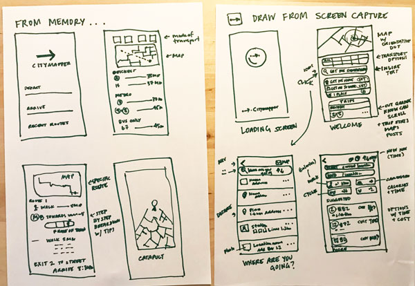
The challenge for this chapter is to wireframe one of the websites or apps you use the most (that you haven't wireframed, yet), but this time you'll do it from memory to see which elements you recall. Don't overthink it. Make it quick. Remember, wireframing and prototyping is meant to be a fast exercise. See how many screens you can remember.
When you're done, open the app or website and compare your wireframe to the real version. Take a different colored pen to note the areas that you may have forgotten or didn't quite get right. This will help show you that so much of user experience design is invisible, and we don't always think, we just do.