Table des matières
- Partie 1
Identify key design elements through wireframes
- Partie 2
Apply the design process to create your own rapid prototype
Table des matières
- Partie 1
Identify key design elements through wireframes
- Partie 2
Apply the design process to create your own rapid prototype
Annotate examples of interaction design
In this chapter we'll examine interaction design as a series of changes that communicate what is happening to the user in order for them to accomplish a task or achieve a goal. We'll examine some key ideas including navigation, gestures, state changes and feedback. How they are used can affect the user experience. Wireframing interactions will help you become more observant about the online products and service you use every day.
This chapter is just a quick overview exploring key concepts to get you thinking critically about the role of interactions in the effectiveness and success of a product as we explore products through wireframes. Take advantage of the resources linked in the text to dive deeper.
Navigation
Navigation in the sense of interaction design can be examined in a couple ways. First there is the structure of the website and how the information is organized. Users can't do something if they can't find it.
Navigation can can come in various forms, using hyperlinked words (like "Menu", "about," "contact"), drop down menus, or the "hamburger menu" which is a series of three lines that serves as a minimalist system of navigation. The problem with a hamburger menu is that it decreases the "discoverability" of the navigation system. Overall, it's the context and how it is used which is most important. Users also want to be able to know how to get "home" or to get help.
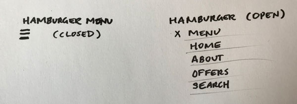
There is also the navigation in terms of the experience of the user along a path. They should never reach a dead end. Even if it is the last step of a task, such as purchasing something online, there still needs to be a key option to continue navigating on the site. This could be the option to explore similar products, discover new products, or view your purchases. The more you think of this, you become aware of how these interactions are good for business. For instance, consider how Amazon.com suggests other books you may enjoy based on your search, but also after you add something to your card. This online functionality works very much like an "impulse buy" when you're standing the check-out line at a shop. When you stand in line, there are often shelves of candy or other items next to the register which can tempt you to add something to your basket that you didn't set out to buy. You better believe that users spend more money because of features like these!
Gestures
Gestures are simple, physical movements and motions by the users, where their fingers can help control how we interact with and achieve specific outcomes on touch screens. Gestures can signal a state change, and initiate an action. Touch screens mean that more gestures are available to the user than when devices were limited to tactile buttons or rollerballs. Gestures can also be applied on laptops using the trackpad or touch bar.
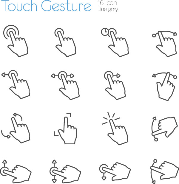
Examining gestures in the context of a device or product is important, because the context can affect how it is used. For instance, a mobile phone is designed to be held in your hands, so the size and scope of the gestures needs to be taken into consideration.
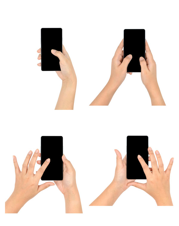
Gestures are dependant on the platform and device (for instance, iOS vs Android), but in general, similar gestures result in similar interactions. Gestures have become part of the language of how we use touch screens through simple movements:
Tap
Double tap
Swipe
Drag
Fling
Flick
Touch and hold / long press
Pinch open/closed
Rotate
Shake
Tilt
Be aware of gestures as you sketch your wireframes. Look for creative uses that you hadn't considered! You can add annotated notes to screenshots, or create a list of gestures (and reactions) that you discover in different apps. Once you are aware of gestures, you'll start to become more attentive to how you can implement them in your own designs.
State changes
State changes serve as a guide to help users move through a user flow. The help indicate progress and forward movement in achieving a goal or task. Think about state changes as the interactions that help you get to point A to B.
State changes may involve entirely new screens, or subtle changes to color or text/copy to signal a shift. One of the most common state changes you'll encounter are in button design. From color, to shape, size, labels, and clickablility, the user knows what is required of them in order to complete the task thanks to their appearance. (Google's Material.io has an entire section devoted to designing buttons).
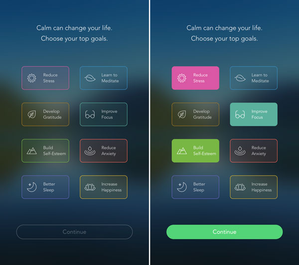
The iOS app "Calm" was voted the top app of 2017. After downloading the app it prompts you to select the areas you are interested. Notice that the "continue" button is not clickable until you select at least one goal. Once you click a button, it adds color to signify that is selected. The "continue" button turns green to signify that you can click it.
Designer/developer Vince Speelman explores the nine states of design, which he breaks into:
Nothing – what happens before a component exists or starts
Loading – an indicator that content is loading
None (empty) – what the user sees before they add any content or data
One – one item is treated differently (one added, one left)
Some – enough content for an ideal experience
Too many – too many results so that it's overwhelming
Incorrect – error occurs
Correct – indication user is on the right track
Done – goal is achieved (user receives confirmation, or is rewarded)
Empty states are the "before" moments in the user's journey that may not have content for the user to interact with, however, can still provide an opportunity to educate and inform the user, or encourage an interaction to take place. Emptystat.es is a collection of these different screens – some are quite clever! Material.io has their own as well.
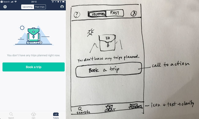
Pay close attention to button states as you sketch your wireframes!
Feedback
UX expert Nick Babich describes visual feedback as what "holds the entire experience together." Feedback is essential to showing life in your product and aids in a positive experience for the user. Without proper feedback, users are bound to be confused by what is going on, or if the app or site is even working.
Feedback can express itself in many ways including:
Spinning wheel (or similar) to signal loading/processing
Clear indicator/signal that a feature has been turned on/off or a button has been clicked
Number of items in cart (or the fact that your cart is not empty)
Confirmation of purchase or goal
Color or treatment change to indicate a state change
Text (or color red) to signal error message
Haptic response (such as a buzz or vibration) to signal something has happened
Nick Babich shares more examples on how details matter when showing visual feedback in design.
Wireflows
Annotated wireframes are a tool for communication. They are helpful for sharing with developers as they'll be the people bringing your designs to life and putting these interactions into place. Never assume they know what is supposed to happen unless you clearly communicate it to them. Clear, direct notes in the column of a document can achieve that easily.
The other benefit of documentation is that it helps inform your next steps clear in the design process.
It can also be helpful to share a clickable prototype (stay tuned for part two) that shows these interactions in action with developers. It's always frustrating having to go back to a project you think is already finished only to realize it was done wrong. Clear communication up front, and in multiple formats is very beneficial for working with developers (they'll also love working with you too because of it – no one is a mind reader! ).
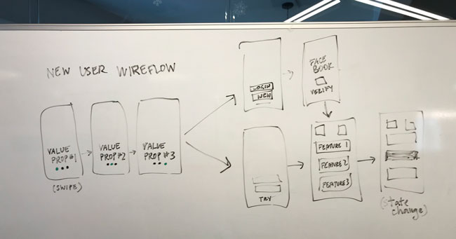
Wireflows are another approach suggested by the Nielsen Norman Group for being able to see the big picture of screens and when, where, and why interactions. With wireflows you can quickly get a sense of what is happening within the context of the wireframe to quickly see how screens are connected and which interactions take place.
Mini challenge
As you examine existing websites and apps, in addition to the device, format, and layout, start to add notes about interactions that stand out or make the product stand out. (In the next chapter we'll examine micro-interactions which are proof that even the smallest details can have a big impact!).
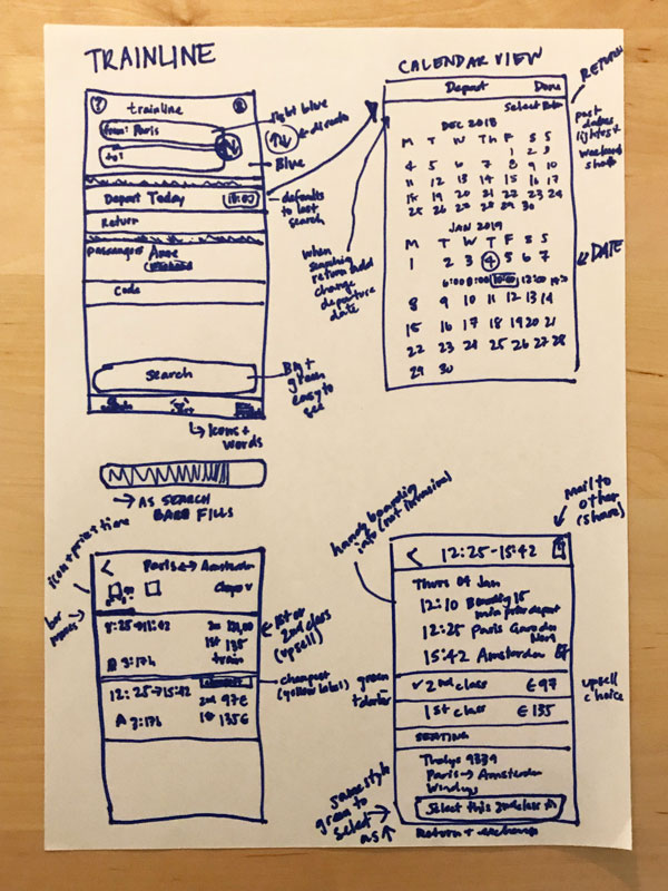
Wireframes capture screens and layouts in a flat and static form. Often multiple wireframes need to be drawn to communicate different , and more complex ideas. Annotated notes can be added outside the frame in order to communicate what is happening. For this chapter look specifically at aspects of interaction design as you build your library of sketches.
Et si vous obteniez un diplôme OpenClassrooms ?
- Formations jusqu’à 100 % financées
- Date de début flexible
- Projets professionnalisants
- Mentorat individuel
Trouvez la formation et le financement faits pour vous
