Make note of microinteractions
"The details are not the details. They make the design.” Charles Eames
Microinteractions are nearly invisible interactions in the design process that serve a function. You likely don't notice them until something goes wrong. But the true delight often happens at the micro level.
As the back of Dan Saffer's excellent book Microinteractions: designing with details says, "it's the little things that make the difference between a good digital product and a great one." It definitely opened my eyes to see these details in new ways; in fact it's one of my favorite party conversations now to point them out. 😂 (You can read a couple excerpts and Don Norman's forward to the book online.)
Microinteractions can be explored as followed:
triggers that are set off the moment a microinteraction begins
rules which provide parameters in which the microinteractions can take place
feedback to ensure the rules are understood by users
loops and modes that determine when microinteractions are integrated and how long they last
Case study: Microinteractions on Slack
Let's take a very close look at the communication tool Slack. The whole idea of Slack is that these quick exchanges can spare unnecessary emails from clogging your inbox and speed up conversation. While channels are used to share ideas and ask questions to the wider team, direct messages allow you to have exchanges with one (or more) person. It took me 6 moths of using the platform (and reading the book Microinteractions) to fully appreciate the nuance of the microinteractions. This is just one tiny section of Slack, but it's rich with examples. But what does it all mean??
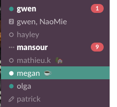
Each small detail or symbol to the left of the user's name signifies a different status:
The green bar signals the conversation I currently have open on the main screen.
A bold name means that there is a message from the person I have not read yet (the white number in the red oval signals how many messages are waiting for me; hahaha – the red oval means that the messages are unread 😂 - ha red/read! Not sure if that play on words was intended or not 😉).
The small animated dots signal that the person is currently typing a message to me (if that screen was open on the main screen it would say "XXXX is typing..." under the message box).
Green circles mean the user is currently online and active.
Empty/outlined circles means the person is offline or not active. Their name is also a lighter shade of grey to visually differentiate the user as they are not available.
The number to the left of the name shows how many people are part of the conversation (2 = 2 people, 3 = three people).
The pencil indicates that I have typed a message but have not sent it yet (🙋🏻 I'm so guilty of typing but not sending text messages!).
The emojis to the right of the user names are selected by the user. The house often means someone is working remotely, but sometimes people pick one because they like it. (I've also been guilty of forgetting to update my status in Slack!).
None of these small details will make or break the user experience, but they definitely enhance it. They communicate information with the user to help them know when something is (or is not) happening. I can still send a message to someone offline, but I don't expect them to respond. On the flip side, if I see someone is typing, I'm probably going to finish that conversation before walking away from the computer.
Each of these settings has a trigger which determines when one happens. Some triggers are manual, such as changing your Slack status to "away" so no one bothers you while you work on a deadline, which changes the icon next to their name to an empty circle. Some triggers are automatic – Slack will change my status to away if I leave my computer open for a long time without touching it.
Similarly there are rules when microinteractions take place. The three animated dots only can appear when someone is actively typing a message to me. If it happened at any other time it would confuse the user. (When someone is done typing and they have sent the message, their name changes state to bold white, and the red oval with the number appears).
Feedback is how users understand what is taking place. I didn't start using Slack knowing these details. Little by little as I used it, I started to notice them. I first observed that someone else was typing when it was written under the message box while I was communicating with another user. Then I looked to the column and noticed the change there. The three dots are animated too so it feels like an active occurrence and that the person on the other end is still writing me. I know they've finished writing when the feedback – the dots – stop.
Loops and modes help determine how long a microinteraction lasts. In this example, all of the state changes have a particular role. The status or state will change when the action of the user changes. It makes sense in the context of Slack, but you can imagine some microinteractions or animations may get annoying if they continue looping forever.
Other ways microinteractions can express themselves
The goal with microinteractions is to express as much as possible in the simplest way possible. You're striving to delight, not distract.
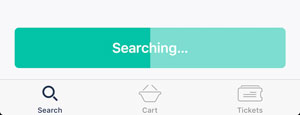
Animation is a key way that microinteractions can be communicated. Once again, these are just subtle ways to communicate a change, or that something is happening, to the user. Loading or progress bars/status are where you're most likely to encounter these microinteractions as they provide context and explain what is happening in a clear and simple way. Animation is one way of showing feedback.
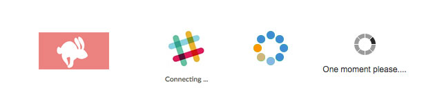
Hopper travel app [left] has the bunny running while you wait for the results of the search, on Slack [resembles #] the icon animates between dots and the logo with the word "connecting", and JetBlue uses animated dots to match their brand colors. The three examples on the left are more visually interesting and related to the brand than the one on the right.
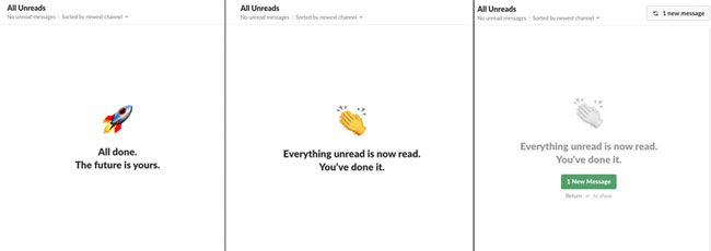
Microcopy – or the small bits of text – is another way to add a bit of joy to the user experience. Slack does this to communicate that you're up to date on all your messages. There are different messages that rotate with each category. I clicked on one while writing this chapter and kept clicking because it was fun to see the clever ways that they communicated the empty state.
Mailchimp is also known for adding their personality to the brand through copy and interactions. (Did you know if you click Freddy's [Mailchimp's mascot] hand after you click send on your email – to give him a high five – a secret game opens? Is this necessary? No. Is it fun? Definitely, yes!)
A few more favorite microinteractions that you may have encountered:

As soon as you add an item to your Amazon cart the microinteraction is triggered to show you exactly how many items are in your cart. The number is orange making it stand out from the rest of the cart icon. This icon is always at the top of your page as you shop.
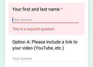
Consider form fields. A common example is when you're creating a new account. How do you know the requirements – particularly for a password – unless they are specified? Think about what information would be useful to the user from the start. Often you receive error messages before you even know what the requirements are. (Have you ever been told you need to compose a password with numbers, capitals and punctuation?) Having "in line" text prompts can also be useful to help the user know how to respond to a form field.
As you visit your favorite websites and apps, look for the details which set it apart and come to life! Chances are these are microinteractions.
Design with intention
Microinteractions tend to be designed last, and are often overlooked. That doesn't mean they're not important. That's why we're looking at them now in the process, so you can start looking for the smallest details to inspire you for your future designs. Before you start designing your own, spend time learning from the best and figure out when and why they're implemented.
Microinteractions can influence your user journey, so keep them in mind in part two when you'll be designing your app! Not everything has to appear when the user first joins the app. Instead, Adaptive Path suggests "the long wow" where customer loyalty is gained by systematically impressing your users over time.
Collect your own
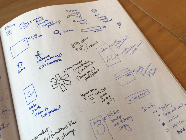
Start to build your own library of microinteractions that have sparked your attention and record them through screenshots or sketches. They may seem fresh in your memory now, but it's easy to blank when you have a big deadline looming in front of you. It's always handy to have a collection of your own favorites.