Use digital tools to visualize data
Don't assume that just because a graph is beautifully designed from a graphics perspective that it's accurate or effective. Infographics can look impressive, but the viewer may not be able to interpret them. Keep in mind that the simplest graphs can be the most effective when engaging your audience and making a point.
Use digital tools
When it comes to making charts and graphs it helps to use the right tools. Excel, Numbers (Mac only) or Google Sheets all allow you to create visual representations.
To start, make sure the data you've collected has been entered into a spreadsheet. In order to create graphs, it's important to make sure that you've labeled your columns and rows, so it is clear where the data is coming from. From there, highlight the content, and then select the option to create a chart/graph.
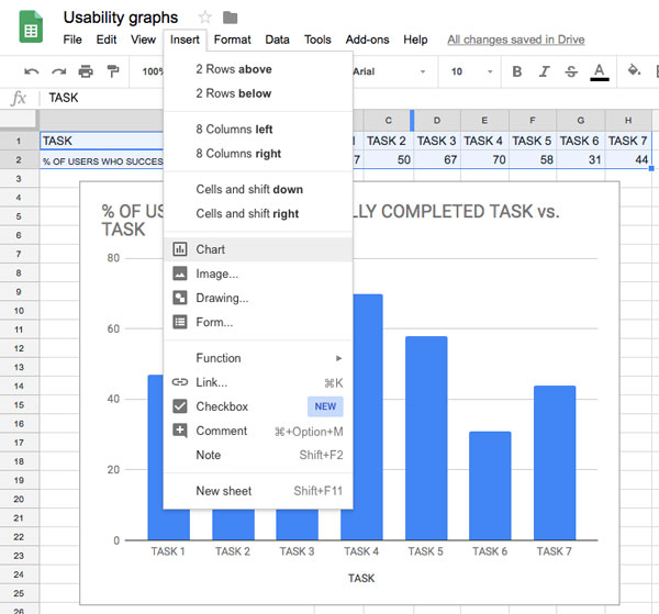
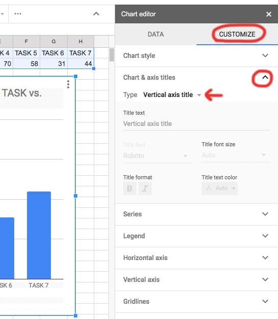
Digital tools can default to certain display views and styles, so it's important to have a good understanding of what graphs work best in which situations in order to customize them. You'll also want to add labels, units, and a title for your graph. (Hint: if you're using Google Sheets, inside the customization panel look for the downward arrow toggle buttons.)
If you want to add polish to your data visualizations, you can take them into Illustrator or Sketch to work with vector graphics and better fit the look and feel of the brand.
Platforms like Google Analytics, Periscope, and Amplitude will generate their own graphs, so they do the work for you. Tableau and RAWgraphs are other platforms used to create professional-looking graphs and data visualizations.
Consider color and typography
Color is a tool to enhance any data visualizations, but at the same time, it can be distracting. Taking into consideration color blind and visually impaired audiences, clearly differentiated color in visual graphics displays can be beneficial.
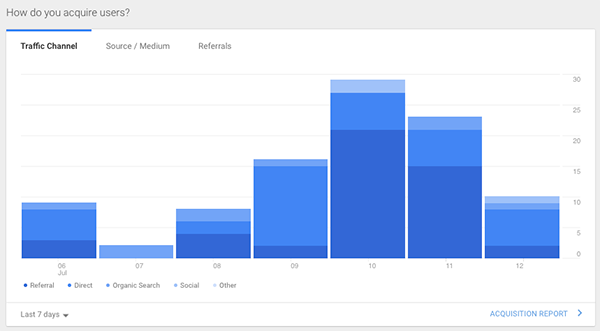
One could argue that the colors in the version of Google Analytics [above] depicting user acquisition don't have enough contrast between the blues. Additionally, the dots in the key below the bars are so small they're hard to even see what color is being represented! There's no reason the colored circles in the key couldn't be bigger.
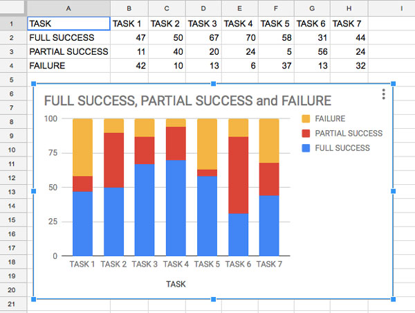
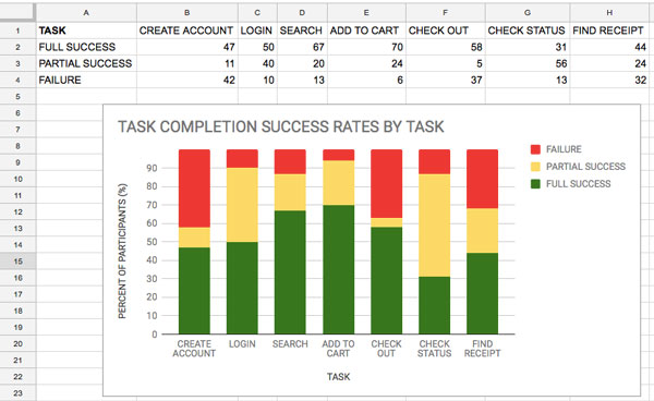
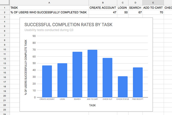
A few changes can go a long way. In the example of the stacked bar graphs above, several aspects have been updated (using the customization panel in Google Sheets) between the top and bottom graph. The title was updated to better describe the data shown. Axis labels were added to both the X and Y axis so the viewer knows what they're looking at. Rather than using the labels task 1, task 2, etc., they were renamed to reflect the task being tested. The color was updated as well to reflect what each color represented. For instance, red (typically an error color) makes more sense to represent failure, than partial failure. Finally, the units of measure on the vertical axis were broken down into smaller increments to highlight that the scale is out of 100%. The use of a stacked bar graph is effective for this graph because it only shows three types of information related to success. When there are too many types of information, it can be difficult to differentiate the colors on the graph.
You can use the information presented in graphs to help prioritize your next steps. The "check status" bar on the bottom graph reflected the lowest rate of success; however, it had the highest level of partial success. That may lead you to believe that with minimal changes to the design, you can create a highly effective experience. The other question you will have to ask yourself is if this experience is crucial to the overall experience, or you should focus your attention elsewhere based on the other results.
Titles and labels are where typography is most important. Think about typography in terms of the hierarchy of information. The title should be the biggest and boldest. You can use smaller type underneath if you decide to use a sub-header as a descriptor.
Both the X and Y axis should include labels, so viewers know what they're looking at. Think about which terms you use to describe this data because you're going for maximum clarity for the viewing audience. Units may be in parentheses or italics to help draw attention to them or to set them apart from the rest of the content.
Think about where you place the labels as well. Placement should be close enough to the content so the association is clear, but far enough so that information can have space to breathe. For line graphs, you will need to decide if you will label each line or include a legend or key. The same is true for pie charts.
Bring in the numbers experts
As organizations get larger, they'll often bring on a data scientist or data analyst in order to help make sense of data. Looking at "big data" can be used to drive a business and spot key areas of success and areas for improvement.
Data analysts and data scientists should be involved in any conversations with the UX team regarding metrics. Include them early, and often. As with all stages of UX, you can learn a lot through collaborating.
Let's recap!
Digital tools can make visualizing data easier, but it's still important to consider display views beyond default settings.
Details matter when creating graphs and charts. Make sure your text is clear and placed in a way that is easy for the viewer to understand what it's trying to communicate.
Color is important as a tool for communication. Make sure there is enough contrast between colors so the viewer doesn't get confused.
