Design with type
Strong typography skills are extremely important in UI design.
When designing for the web you need to be aware of what is readable, legible, accessible, and available to readers.
Use typography to establish hierarchy
Making wise typographical decisions can help you establish hierarchy through size, contrast, and emphasis, such as bold or italic styles. These variations make the document easier to read, and more appealing to the reader. Don't forget to design for an audience that doesn't have great vision. When in doubt, the simpler the better.
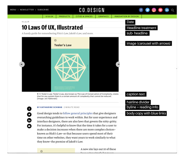
Think of an article page of a website. It involves a headline that is typically large and bold. Often there is a short description or tagline that is smaller and possibly in italics. There's a byline or article credit that gets another text treatment.
Then there's the body copy or paragraph text that should be in a regular weight font and sized comfortably to read. (An entire book in italics would be hard to read!). Line lengths should ideally be between 50-75 characters per line. When it's too long or short it can be hard to read. It's also important to consider the spacing between lines so that text flows well. If there is too much space between lines for a large amount of text it can be awkward to read.
Finally, there may be another typographic treatment assigned to caption text, which is different from the body copy in a way that does not distract from the main text. Everything is a variation on the same font family. For instance, you may use Arial bold, regular, and italic. Some typefaces will have a condensed, wide, or heavy version to provide additional variation yet still fit the overall feel of the typography.
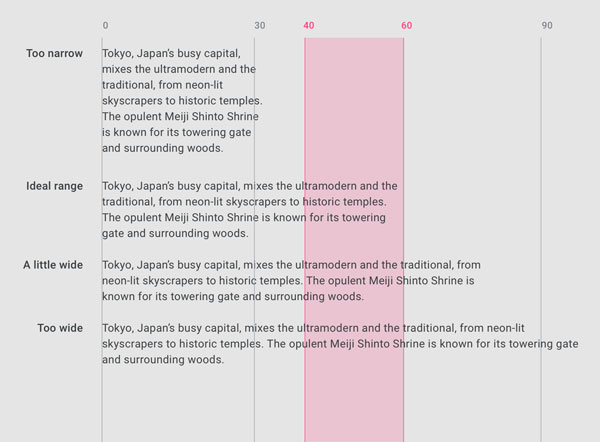
Material Design guidelines address ideal line length. I'm sure you've seen examples on the web with far longer lines of text which are nearly impossible to read while still keeping your place! Don't make the reader have to work too hard!
From a code perspective, developers use HTML tags to create the structure of the website and basic content. It all looks the same (and not very pretty) until they write CSS, a cascading style sheet, to change the appearance of that content. This is how different styles are applied to type on the web and why you need to define them in your style guide.
Selecting fonts
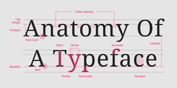
Anatomy of a typeface from Material Design. The above example is a serif font with feet called "serifs". You'll encounter sans-serif fonts (which have clean edges) more often in digital design. It all depends on the project!
It can be tempting to go crazy and have fun with typography when you're finally moving on to designing interfaces, but it's better to get the basic structure of your layouts together first and then go finesse your text. Of course, if you've already defined your typefaces in a style guide, you know to start with those.
There are several free web fonts available particularly through Google Fonts, and I recommend starting with:
As you can see from the type specimens in the links above, you can still adjust weight and size in order to add emphasis.
If you don't already have these fonts on your computer, you'll need to install them first. Depending on which operating system you're working on, you'll need to follow the specific instructions to install and activate fonts.
Typography checklist
Every project will be different, but use this checklist as a starting place when making sure your typography is effective and enhances (rather than distracts from) your design:
Fonts have enough weight (are not too thin) and are easy to read at small sizes.
Basic font is used for paragraph text for ease of reading.
Limit yourself to two fonts or use variations within the same font family.
If you're using two different fonts, make sure they don't look too similar (it can be good to mix a serif and sans serif font for contrast).
Use a font that stands out for headlines so it's the first thing your eye goes to on the page.
Make legibility a priority over creativity.
Make sure there are no issues with licensing agreements.
Mini exercise
Start a Pinterest board with your favorite examples of good typography on digital products. Save existing ones you find on the platform or upload your own screenshots. Check out Jason Santa Maria's type collection on Pinterest for inspiration.
Let's Recap!
Typography is an excellent way to establish hierarchy and rhythm in a design layout.
Stick to basic fonts that were designed for web when starting out.
Make sure that headlines stand out.
Use different treatments to add emphasis.
Consider the readability of your text and avoid long lines of text.
