Control an element's width and height
Every element has a width and a height that can greatly affect its appearance on your web page. Element widths and heights can be controlled in order to create large header images, stacked paragraphs, content columns, and more.
An element has a default width and height that are just enough to hold its contents. For example, a paragraph element that contains 5 words will be just wide enough to hold those five words and just tall enough for the font size of those words.
Setting a new width or height property can make an element be just as wide or tall as you want it to be. To make an element an even 200px wide and 200px tall, you could set:
element {
    width: 200px;
    height: 200px;
}
Padding and borders are added onto the width and height of the element, however. Adding 10 pixels of padding and a 3px border makes any element take up more space.
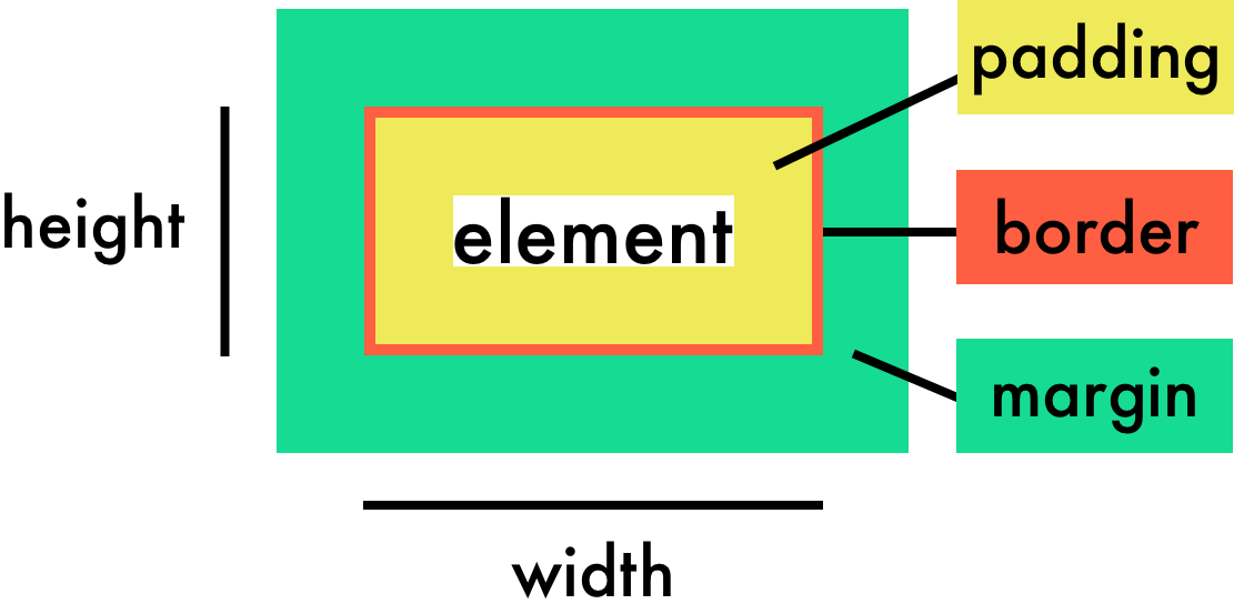
Even if you set a width of 200px on an element, the additional padding and border would make its width actually 226 pixels on the page (200px width + (210px for the padding) + (23px for the borders)).
This is probably the wonkiest behavior to consider when dealing with widths. With one line of code, you can override this behavior:
element {
    box-sizing: border-box;
}
By setting the box-sizing property to border-box on any element, you declare that its padding and borders should be included in the width of the element. In the above scenario, the element would only be 200px wide total — including padding and borders.
With that in mind, we'll shortly explore the various ways to set widths. We'll use a slightly more complicated example in order to show the various ways in which width can be set to achieve a desired effect.
In our example, we have a div that has a class of "main" that contains a heading, a paragraph, and several block quotes. The div has a dotted border, and the block quotes have a light green background.
Here's the starter example and its code:
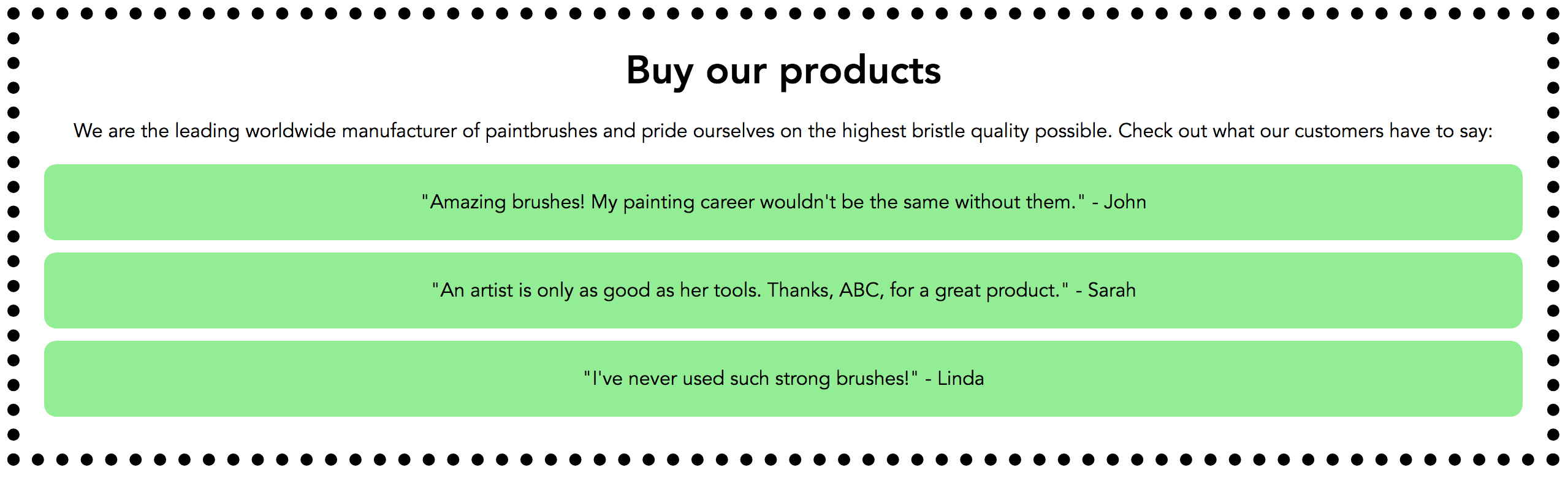
HTML
<div class="main">
    <h1>Buy our products</h1>
    <p>We are the leading worldwide manufacturer of paintbrushes and pride ourselves on the highest bristle quality possible. Check out what our customers have to say:</p>
    <blockquote>"Amazing brushes! My painting career wouldn't be the same without them." - John</blockquote>
    <blockquote>"An artist is only as good as her tools. Thanks, ABC, for a great product." - Sarah</blockquote>
    <blockquote>"I've never used such strong brushes!" - Linda</blockquote>
</div>
CSS
body {
    font-family: Avenir, Arial, sans-serif;
    text-align: center;
}

.main {
    border: 10px dotted black;
    padding: 20px;
    margin: 0px auto;
}

h1 {
    margin: 0px;
}

blockquote {
    padding: 20px;
    background-color: lightgreen;
    border-radius: 10px;
    margin: 10px auto;
    text-align: center;
}Setting width and height in pixels
As you saw in previous chapters about margins, borders, and padding, widths and heights can also be set in pixels. Setting a width or height in pixels means that the width or height will always be the same, regardless of the screen size from which the page is viewed. Be careful with this!
Setting a width of 600px on the main div will reduce its width and the width of its child elements automatically so that everything still fits inside:
.main {
    width: 600px;
}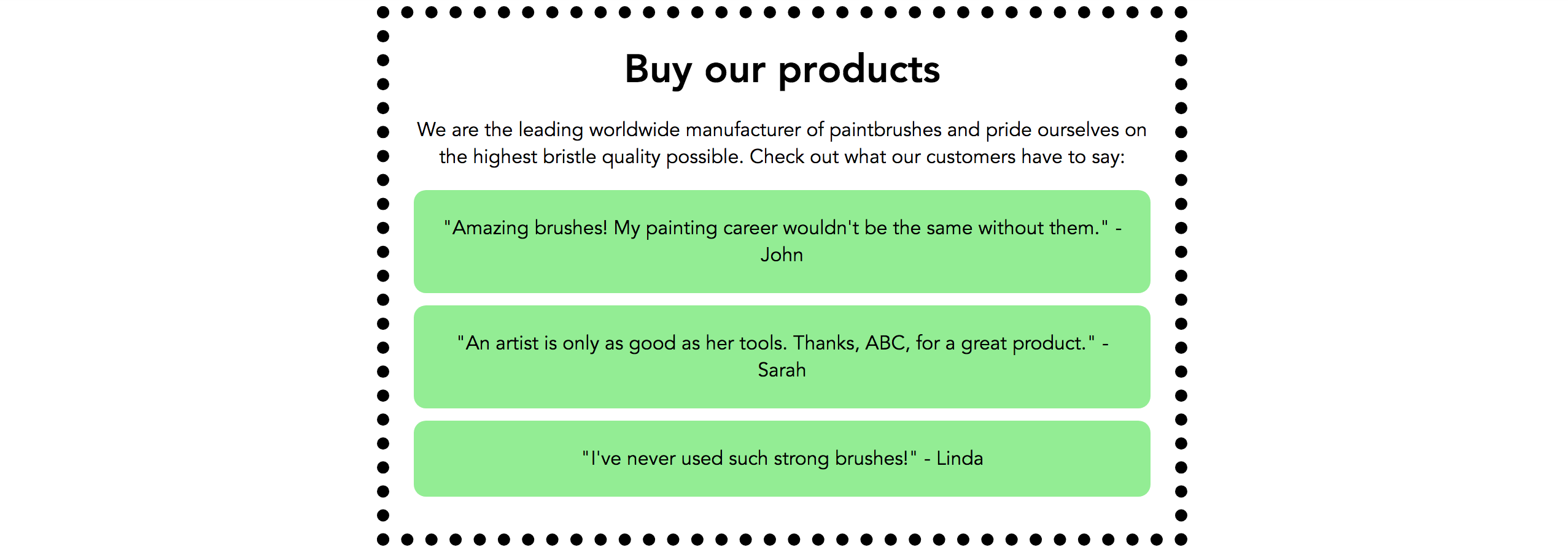
The div is centered on the page because it has a defined width and has its left/right margins set to auto. Remember that from last chapter?
Setting widths in em/rem
When an element's width or height is set in em or rem, the measurement will be equal to the element's font size. For example, if an element's font size is 16px, 1em of width would be equal to 16px.
Because main div's font size is the default 16px, we'd have to set its width to 37.5em in order to achieve a width of 600 pixels (because 600/16 = 37.5).
.main {
    width: 37.5em;
}
Setting heights and widths as percentages
When an element's width or height is set as a percentage, the value will be relative to the width or height of the containing block. Let's say a div is 700px wide. A paragraph inside the div with a width of 50% would ultimately be 350px wide.
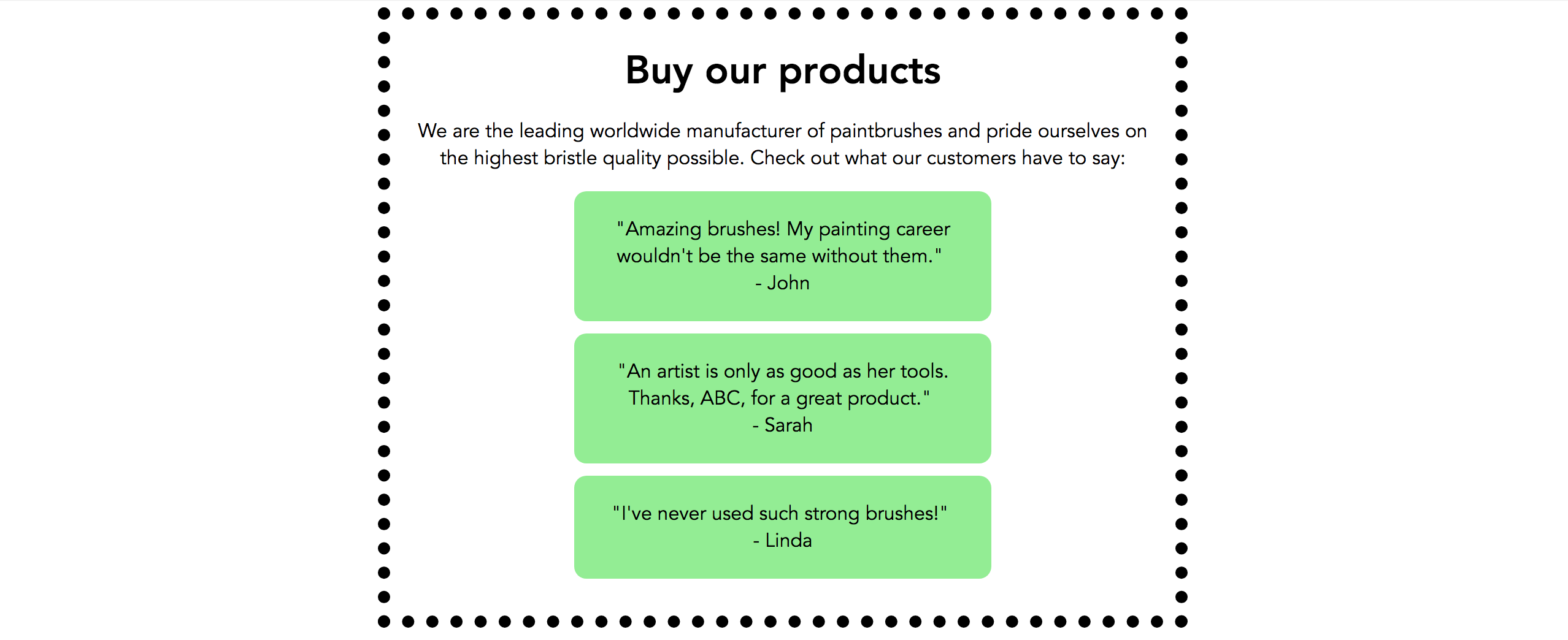
We most recently set the width of our div above to 37.5em. Let's keep that value and set the block quote widths to 50%. The block quotes will be reduced to half the width of the main div.
.main {
    width: 37.5em;
}

blockquote {
    width: 50%;
}
Minimum and maximum widths and heights
Many websites are responsive now, which means that they respond depending on a user's screen size. For example, if you're on your computer and gradually reduce the size of your browser window while on OpenClassrooms, you'll notice that most elements get smaller as well.
You may want to set values that never let an element's width or height go above or below a certain value. The min-width , max-width , min-height , and max-height properties are good for this.
The max-width and max-height properties will ensure that an element is never wider or taller than the value you set, even if there's enough room on the page for it to take up more space.
The min-width and min-height properties will ensure that an element is never narrower or shorter than the value you set, even if the browser window is too small to display the whole element.
Your Turn
These properties make much more sense when played with in the browser, so I encourage you to practice them in the interactive exercise for this chapter. Try adding a width of 50% to the paragraph elements.
Resize the your browser; see how the content gets really small if you make your browser window smaller and really wide if you make your browser window wider?
To fix this, add a min-width of 300px and a max-width of 800px to the body element.
Recap
Use the
heightandwidthproperties to size elements in pixels, em/rem, or percentages.Padding and borders are added to the height and width; to include them in the overall size of the element, use the
box-sizingproperty and set it toborder-box.Use
max-width,max-height,min-width, andmin-heightto ensure that elements never go above or below a certain size.
