Set media queries for different devices
When writing CSS, there's one thing to be particularly concerned about: visitors' screen resolutions. The space or number of pixels wide vary from one screen to another.
This information is important when you build a design: how should your website be displayed for different screen resolutions? If you have a widescreen, you may forget that some people browse with smaller screens. Not to mention the browsers of smartphones, which are even less wide.
This is where media queries come in. These are the rules to be applied to change the design of a website based on the screen's characteristics! Using this technique, we can create a design that automatically adjusts to each visitor's screen!
Implementation of media queries
Media are not new properties but rather rules that can be applied under certain conditions. Specifically, you'll be able to say, "If the visitor's screen's resolution is less than a certain value, then apply the following CSS properties." This allows you to change the website's appearance under certain conditions. You can increase the text size, change the background color, position your menu differently with certain resolutions, etc.
Contrary to what one might think, media queries are not just about screen resolutions. You can change your website's appearance based on other criteria, such as screen type (smartphone, TV, projector, etc.), number of colors, screen orientation (portrait or landscape), etc. There are a great number of possibilities!
Media queries work in all browsers, including Internet Explorer as of version 9 (IE9) onwards.
Applying a media query
Media queries are thus rules that specify when CSS properties have to be applied. There are two ways to use them:
by loading a different.css stylesheet based on the rule (e.g. "If the resolution is less than 1280px wide, load the small_resolution.css") file;
by writing the rule directly in the usual.css file (e.g. "If the resolution is less than 1280px wide, load the CSS properties below").
Loading a different stylesheet
You remember the <link /> tag which, in HTML code, loads a .css file?
<link rel="stylesheet" href="css/style.css" type="text/css">You can add a media attribute in which we're going to write the rule to be applied for the file to be loaded. This is known as making a media query. For example:
<link rel="stylesheet" media="screen and (max-width: 1280px)" href="css/small_resolution.css" type="text/css">In the end, your HTML code may provide several CSS files: one as default (which is loaded in all cases) and one or two others which are only charged in addition if the corresponding rule applies.
<!DOCTYPE html>
<html>
<head>
    <meta charset="utf-8" />
    <link rel="stylesheet" href="style.css" /> <!-- For everyone -->
    <link rel="stylesheet" media="screen and (max-width: 1280px)" href="small_resolution.css" /> <!-- For those who have a resolution lower than 1280px -->
    <title>Media queries</title>
</head>
Loading rules directly in the style sheet
Another technique, which I personally prefer for practical reasons, is to write these rules in the same CSS file as usual. In this case, we write the rule in the .css file like this:
@media screen and (max-width: 1280px) {
    /* Write your CSS properties here */
}
Possible rules
There are many rules for building media queries. I'll only mention the main ones here:
color: color management (in bits/pixel).height: display field height (window).width: display field width (window).device-height: device height.device-width: device width.orientation: device orientation (portrait or landscape).media: output screen type. A few of the possible values:screen: "conventional" screen;handheld: mobile device;print: printing;tv: television;projection: projector;all: all types of screens.
The prefix min- or max- can be added in front of most of these rules. So min-width means "Minimum width" and max-height means "Maximum height", etc. The difference between width and device-width can primarily be seen in mobile browsers for smartphones, as we'll see later.
The rules can be combined using the following words:
only: "only";and: "and";not: "not";
Here are a few examples of media queries to help you understand the principle.
/* On screens with a maximum window width of 1280px */
@media screen and (max-width: 1280px)
/* On all screen types with a window width of between 1024px and 1280px */
@media all and (min-width: 1024px) and (max-width: 1280px)
/* On TVs */
@media tv
/* On all vertically oriented types of screens */
@media all and (orientation: portrait)
Older browsers, including IE6, IE7, and IE8, don't know media queries but are able to interpret the start of the rule (they can read @media screen , for example). They will thus read the following CSS properties even if they are not affected by the rule! To avoid this, one trick is to use the only keyword that these old versions don't know: " @media only screen " does not cause a bug on older browsers.
Testing media queries
Media queries are mostly used to adapt the website design to different screen widths.
Let's do a very simple test: we're going to change the text size and color if the window is more or less than 1024 pixels wide. For this test, I'm going to use the second method is to write the rule directly in the same .css file as usual:
* {
    font-family: Helvetica;
}

p {
    background-color: blue;
    color: white;
    width: 300px;
    padding: 50px;
    text-align: center;
    margin: 0px auto;
}

/* New rules if the window width is smaller than 1024px */
@media screen and (max-width: 1024px) {
    p {
        background-color: black;
        color: red;
        text-transform: uppercase;
    }
}

We have added a media query that applies to all screens not wider than 1024px and applies some color and text changes depending on the screen size.
Practical use of media queries in the design
Changing the text color is nice, but it doesn't really add much. However, using media queries to change your website's appearance depending on screen resolution is immediately much more useful. You'll see that you can do whatever you want!
On mobile sites, you'll often see navigation bars stacked vertically instead of horizontally. Since the smaller screens are narrower, the full horizontal bar can't be shown.
Let's take a basic navigation bar and make its menu items stack upon one another when the screen size is less than 320px wide (a standard measurement for smartphone screen width).
On screens greater than 320px wide, the nav bar should look like this:

On screens less than 320px wide, the nav bar should look like this:

Here's the starter code for the horizontal nav bar (no media queries yet):
HTML
<nav>
    <ul>
        <li><a href="#">Home</a></li>
        <li><a href="#">About</a></li>
        <li><a href="https://twitter.com">Contact</a></li>
    </ul>
    </nav>
CSS
nav {
    background-color: #E8D7FF;
    padding: 10px;
    margin: -8px;
}

a {
    font-weight: 200;
    text-decoration: none;
    text-transform: lowercase;
    font-family: Helvetica;
    color: #151814;
}

ul {
    text-align: center;
    padding: 0px;
}

li {
    list-style: none;
    display: inline-block;
    margin: 0px 20px;
}
We only need to change the CSS rules for the list item (li) elements in order to make them stack upon one other. We'll change:
their display property to block instead of inline-block
their top and bottom margins to 5px so there's some vertical space between each item (this was not necessary when the items were in one row)
Here's the resultant media query that can simply be placed under all the other CSS code above:
@media all and (max-width: 320px) {
    li {
        display: block;
        margin: 5px 0px;
    }
}
Media queries and mobile browsers
As you probably know, the screens of smartphones are much narrower than our usual computer screens (they're only a few hundred pixels wide). To adapt to this, mobile browsers display the website by "zooming out" to allow the whole page to be seen. The simulated display area is called the viewport: it's the width of the mobile phone's browser window.
With media queries, if, in CSS, you target the screen with max-width on a mobile phone, it will compare the width you specify against the width of its viewport. The problem is that the viewport changes according to the mobile browser used!
Browser | Default viewport width |
Opera Mobile | 850 pixels |
iPhone Safari | 980 pixels |
Android | 800 pixels |
Windows Phone 7 | 1024 pixels |
An iPhone behaves as if the window were 980 px wide, while an Android behaves as if the window were 800 px wide!
To target smartphones, it may be better, rather than using max-width, to use max-device-width: this is the device's width. Mobile devices are not more than 480 px wide, so we can target mobile browsers only, using this media query:
@media all and (max-device-width: 480px) {
    /* Your CSS rules for your mobile phones here */
}
Why not target mobile phones using the handheld media rule?
I can see that you're following: very good! Indeed, we could theoretically target mobile screens using the handheld media rule... Unfortunately, no mobile browser except Opera mobile recognizes handheld. They all behave as if they were normal screens (screen). So you can't really use handheld for mobile phones.
You can change the mobile browser's viewport width with a meta tag to be inserted in the document header: <head>.
<meta name="viewport" content="width=320" />You can use this tag to change the way your page content is organized on mobile phones. To obtain readable render without zooming, you can set the viewport to the same width as the screen:
<meta name="viewport" content="width=device-width" />Your Turn
Take media queries for a spin with this interactive exercise! First off, make the browser window narrower to see how the content gets crushed as screen sizes get smaller. A media query will fix this!
Add a media query that applies to all media types below 768px (think in terms of devices that have a "maximum width of 768px").
In that media query, set the body element to have a max-width of 300px so the content doesn't get too crushed as screen sizes become narrower.
In that same media query, make all link elements:
have a width of 50%,
have top/bottom margins of 30px and right/left margins of auto,
display as block elements.
All done? Now, adjust your window to check if your media query works!
Recap
This was a tough chapter, so let's sum up what we covered:
Media queries allow the loading of various CSS styles based on certain settings.
There are a large number of settings allowed by media queries: number of colors, screen resolution, orientation, etc. In practice, they are mostly used to change the website's appearance for different screen resolutions.
You create a media query with the
@mediadirective followed by the screen type and one or more conditions (such as the maximum screen width). The following CSS style will be enabled only if the conditions are met.Mobile browsers simulate a screen width: this is called the viewport.
Smartphones can be targeted by a rule based on the actual number of pixels displayed on the screen:
max-device-width.
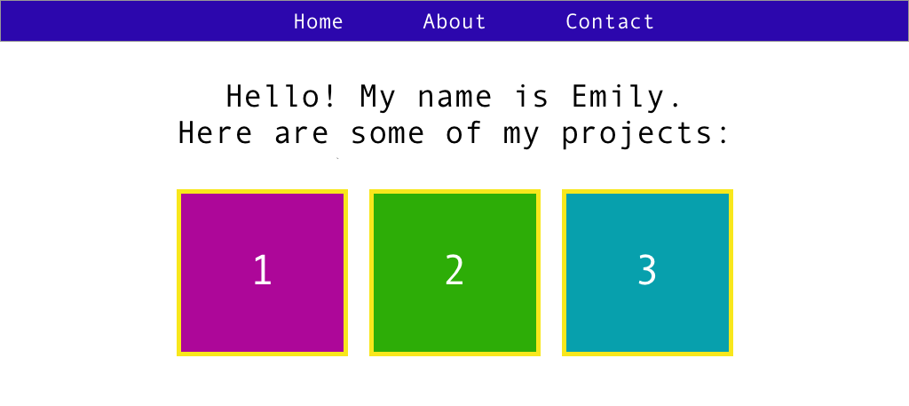
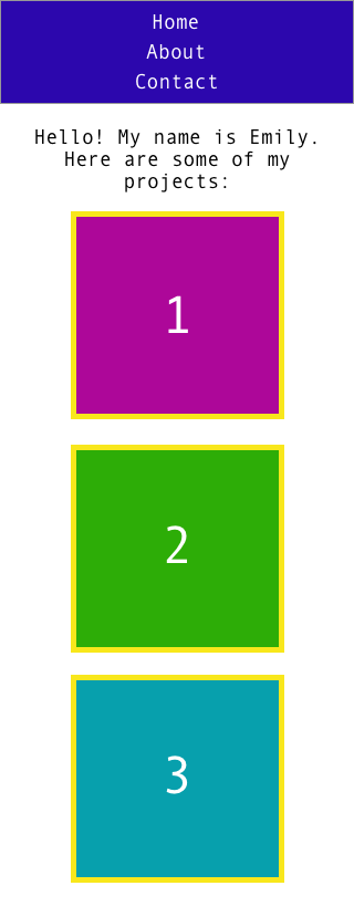
Exercise Challenge: Create a page about your projects
Test out what you've learned in this part by creating a simple page that includes padding, widths, margins, and more.
Here's the general idea of what the page should look like:
There should be a
navbar with links to Home, About, and Contact (you can set the linkhrefvalues to#).There should be an
h1introducing yourself and your work.There should be 3 placeholder squares, each with a number inside and a different
background-color.There should be at least:
one use of
borderone use of
paddingone use of
marginone use of
widthone
@mediaquery that makes the placeholder squares stack vertically on screen sizes with a maximum width of 320px.
The exact design decisions are up to you. You can customize the element padding, borders, margins, and colors as you see fit.
We suggest that you do this exercise in a set of files on your computer: a project folder that contains 1) an index.html file, and 2) a folder called css that contains a file called style.css .
Here are two mockups (one for desktop and one for mobile) to inspire you!