What is Flexbox?
In the previous part of this course, you learned about CSS Grid. CSS Grid is a way to create two-dimensional layouts using a system of columns and rows.
There are other ways to set layouts using CSS, though. Another popular way is to use a tool called Flexbox!
Like CSS Grid, Flexbox is pure CSS. You don't have to install any fancy external tools. Sweet. However, you don't set columns and rows; with Flexbox, you'll only set rows or columns. Flexbox is therefore considered a way to set one-dimensional layouts.
However, this doesn't mean you can't have any vertical content if you set rows, or any horizontal content if you set columns! It just means you can't control the measurements of the other direction.
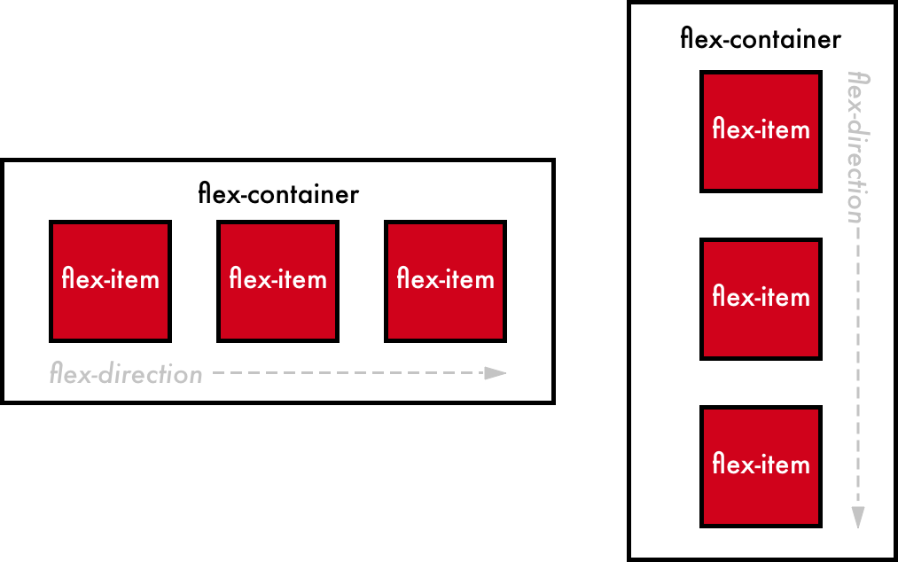
In the image on the left, you can see elements arranged using Flexbox rows. In the image on the right, you see elements arranged using Flexbox columns.
In both cases, the following code vocabulary is used:
flex-container: the container with the items inside that will be arranged in either rows or columnsflex-direction: the direction in which the elements are arranged, which can be eitherrow,column,row-reverse(a row from right to left), orcolumn-reverse(a column from bottom to top)flex-item: an item arranged via Flexbox
Now let's do a quick comparison with CSS Grid. Open this CodePen to follow along interactively.
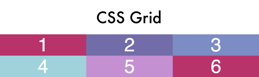
With Grid, you can set columns and rows. In the following image, 3 columns of equal width have been set, and 2 rows of equal height have been set:
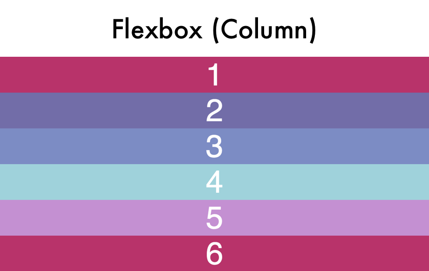
With Flexbox, you can set only columns or only rows. In the following image, I've defined that I'll be working with columns. Therefore, my elements are automatically stacked as a column:
In the following image, I've defined that I'll be working with rows. Therefore, my elements are automatically stacked next to each other in a row. Admittedly, this looks weird for now:
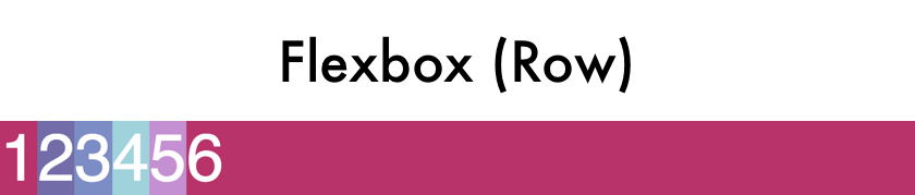
In Flexbox, you can also control the sizing of the elements inside. That would be useful in the row example above. We'll see that later in this course.
In the next chapter, let's see how to set up Flexbox on your elements!
Recap
Here is the key vocabulary you will need in the following chapters:
flex-container: the container with the items inside that will be arranged in either rows or columnsflex-direction: the direction in which the elements are arrangedrow-reverse: a row from right to leftcolumn-reverse: a column from bottom to topflex-item: an item arranged via Flexbox
