Table des matières
- Partie 1
Apply basic CSS positioning techniques
- Partie 2
Create two-dimensional layouts with CSS Grid
- Partie 3
Implement one-dimensional layouts with Flexbox
- Partie 4
Explore legacy layouts
Table des matières
- Partie 1
Apply basic CSS positioning techniques
- Partie 2
Create two-dimensional layouts with CSS Grid
- Partie 3
Implement one-dimensional layouts with Flexbox
- Partie 4
Explore legacy layouts
Float elements
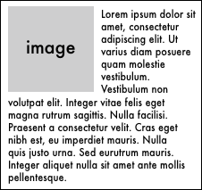
Another very common legacy way of creating layouts that you might see in older codebases involves floats. The float property in CSS was originally created so that developers could float text around images, like in the following example where an image is floated to the left of text:

Floats quickly took on lives of their own, though. Developers started using them to float anything left or right; not just images in text, as originally expected.
Before the advent of Flexbox and CSS Grid, though, you would've likely created your elements and then floated them around each other to achieve your desired effect, like a three-column layout or a sidebar on the right side of the page.
Take three simple divs, each of which has some basic styling just for aesthetic purposes:
HTML
<div>1</div>
<div>2</div>
<div>3</div>
CSS
div {
    font-family: Futura;
    font-size: 2em;
    background-color: #ff4c65;
    color: white;
    width: 200px;
    height: 200px;
    border-radius: 3px;
    margin: 10px;
    text-align: center;
}
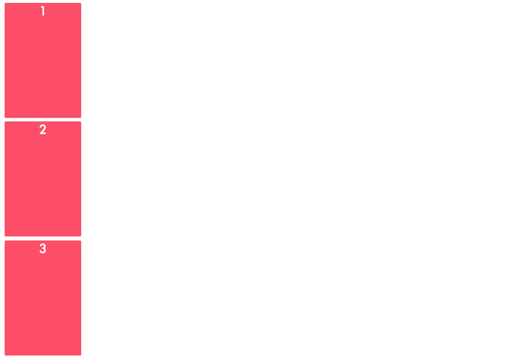
Ordinarily, they divs will stack on top of one another because they're block-level elements:

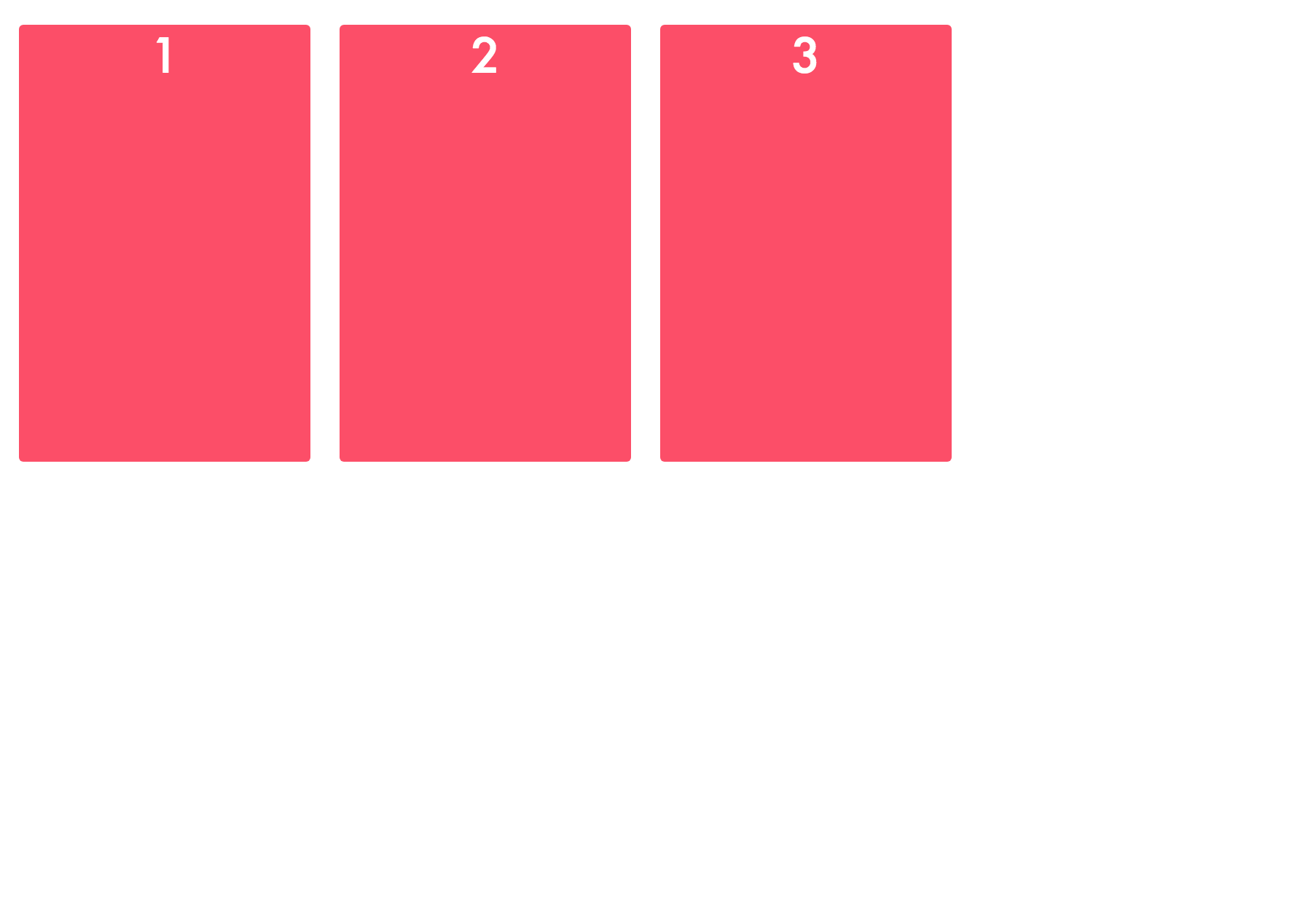
You can float them up next to each other, though, using the float property. Its value can be either right or left . Let's float them to the left first:
div {
    float: left;
}
This means that each element will be floated to the left, either to the left edge of its containing element or next to its neighboring element.
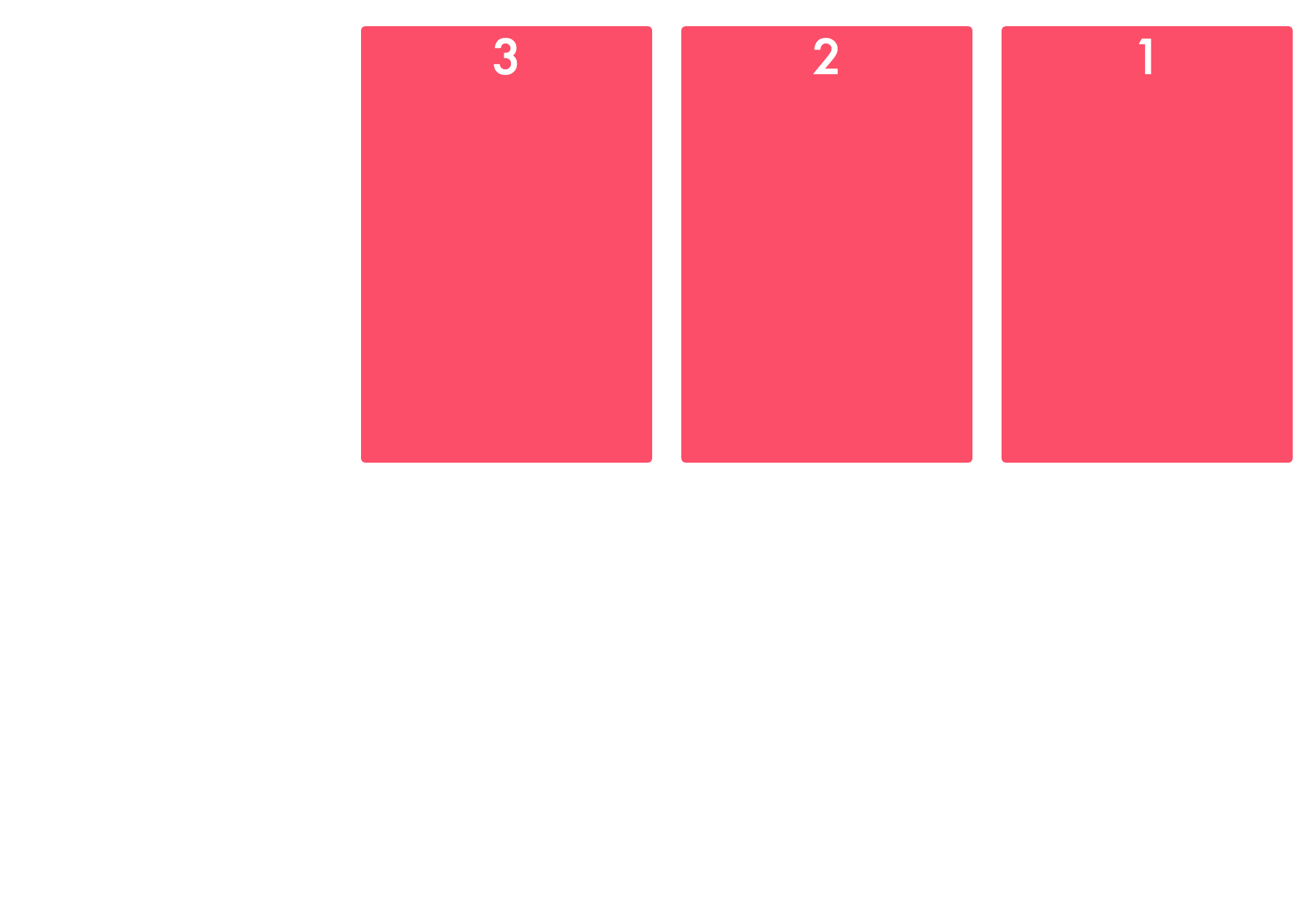
You can also float elements to the right:
div {
    float: right;
}
You can get very nuanced with your floats, especially if you're floating every single element on your page in order to create a precise layout. Since creating layouts this way is seen as outdated, we won't explore the use of floats to create layouts in more detail.
Recap
Floats used to be applied to construct layouts.
Only use floats to wrap text around images , as they were first intended to do!
Et si vous obteniez un diplôme OpenClassrooms ?
- Formations jusqu’à 100 % financées
- Date de début flexible
- Projets professionnalisants
- Mentorat individuel
Trouvez la formation et le financement faits pour vous
