Discover third-party solutions
CSS offers an incredible range of ways to set elements' locations and appearances. However, there are also third-party solutions that you can integrate into your code in order to add styling that you don't have to code yourself.
One such third-party solution is Bootstrap, but there are others. We'll explore a few in this chapter, and it'll be up to you to go further with them if you so desire!
Bootstrap
Bootstrap is a library that has an incredible wealth of components including navigation bars, buttons, and fonts. Once you integrate Bootstrap into your code, your pages will look instantly cleaned up to match the default Bootstrap style. It's not too bad!
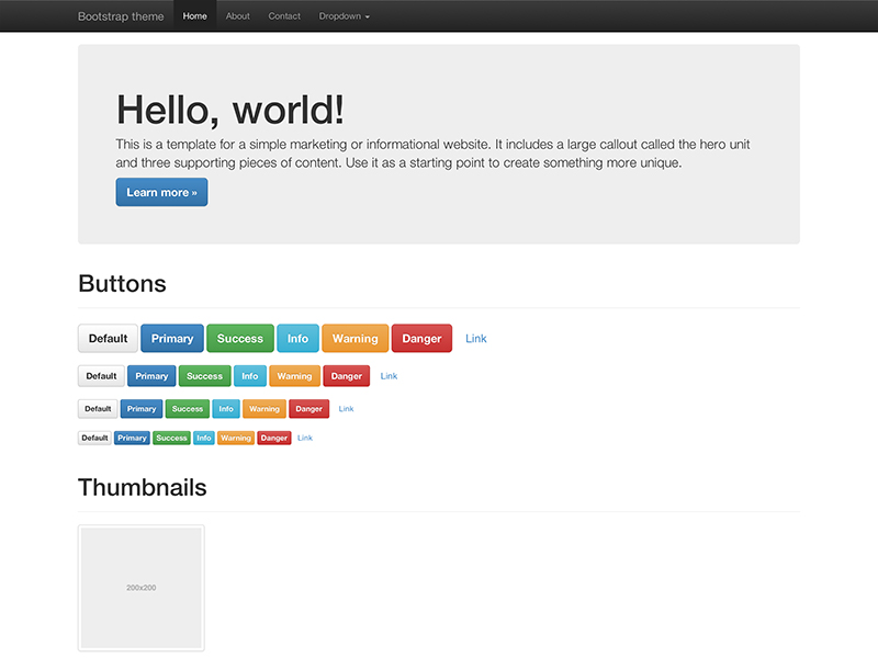
Check out this image that shows off some of Bootstrap's components (I guarantee you'll recognize the nav bars or buttons from sites you've visited before. Chances are they were using Bootstrap!):
Including Bootstrap in your projects is as easy as either:
downloading the Bootstrap code and including it in your project files, or
adding the following link to your HTML:
<link rel="stylesheet" href="https://maxcdn.bootstrapcdn.com/bootstrap/3.3.7/css/bootstrap.min.css" integrity="sha384-BVYiiSIFeK1dGmJRAkycuHAHRg32OmUcww7on3RYdg4Va+PmSTsz/K68vbdEjh4u" crossorigin="anonymous">
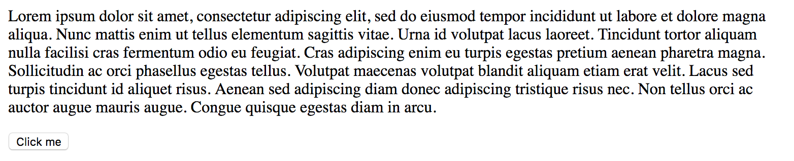
To see what I mean by "integrate Bootstrap into your code", take the following very simple page with no styling and no Bootstrap added yet:
HTML
<html>
    <head>
    </head>
    <body>
        <p>Lorem ipsum dolor sit amet, consectetur adipiscing elit, sed do eiusmod tempor incididunt ut labore et dolore magna aliqua. Nunc mattis enim ut tellus elementum sagittis vitae. Urna id volutpat lacus laoreet. Tincidunt tortor aliquam nulla facilisi cras fermentum odio eu feugiat. Cras adipiscing enim eu turpis egestas pretium aenean pharetra magna. Sollicitudin ac orci phasellus egestas tellus. Volutpat maecenas volutpat blandit aliquam etiam erat velit. Lacus sed turpis tincidunt id aliquet risus. Aenean sed adipiscing diam donec adipiscing tristique risus nec. Non tellus orci ac auctor augue mauris augue. Congue quisque egestas diam in arcu.</p>
        <button>Click me</button>
    </body>
</html>
The second I add this link into the <head> of the HTML, you'll see a huge difference!
<head>
    <link rel="stylesheet" href="https://maxcdn.bootstrapcdn.com/bootstrap/3.3.7/css/bootstrap.min.css" integrity="sha384-BVYiiSIFeK1dGmJRAkycuHAHRg32OmUcww7on3RYdg4Va+PmSTsz/K68vbdEjh4u" crossorigin="anonymous">
</head>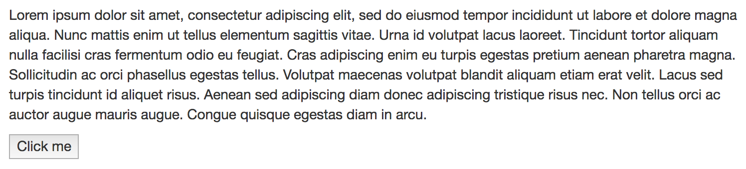
Bootstrap has loaded its default styling for fonts and buttons, and there's much more where that comes from. Check out the Bootstrap website for more information, and try adding it to your own basic projects!
Bulma
Bulma is another CSS framework that gives you easy column systems, fonts, icons, buttons, and more. Like Bootstrap, it also has layout options that allow you to create navigation bars, huge header images, carousels, etc. The biggest difference between Bootstrap and Bulma is that Bootstrap has JavaScript included, and Bulma does not.
JavaScript may not be part of your web development toolkit for the moment; however, it is a powerful front-end language that will probably become necessary in your coding journey if you want to be a front-end developer. If you want to focus just on CSS for now (it's not a bad idea!), Bulma could be useful for you to explore.
Check out some of these projects created with Bulma if you want inspiration: https://bulma.io/expo
Foundation
The final third-party solution we'll briefly discuss in this chapter is Foundation. This front-end framework is used by a ton of well-known companies like Pixar, North Face, National Geographic, and more.
The most defining element of Foundation is perhaps its integration of a mobile-first mentality. Mobile-first is an increasingly common design practice that involves designing layouts for smartphones first and then moving onto desktop layouts. This encourages minimalism and cleanliness in design, since there's much less screen size to work with during the initial design phase!
Foundation is also extremely customizable, meaning that you can take its defaults and adjust them to your own needs. If you want to go to the next level, you can also take the Intro to Foundation class or become certified!
Recap
There are many front-end frameworks to choose from, including plenty that don't appear in this chapter! However, they often offer similar features: easy grid systems, responsiveness, etc. Using them is a great way to ensure consistency among your pages and default styles that don't require much work.
Nonetheless, nothing beats knowing pure CSS tools that don't require frameworks, like basic layout properties, Flexbox, and CSS Grid. The more you master pure CSS, the more you'll be able to harness the power of external tools like Bootstrap, Bulma, and Foundation in order to adapt them to your particular needs.
