Table des matières
- Partie 1
Edit a spreadsheet
- Partie 2
Format data in a spreadsheet
- Partie 3
Analyze data in a spreadsheet
- 1
Filter and sort data to find information quickly
- 2
Make calculations in your spreadsheet with functions and formulas
- 3
Check if your data matches certain conditions with the IF function
- 4
Match up data from separate datasets with the VLOOKUP function
- 5
Set up data validation to avoid errors in data entry
Quiz : Analyzing data
- Partie 4
Visualize data in a spreadsheet
Display information visually with charts
Charts make it easier to see and understand the messages data is sending; even more so than a table.
Discover the main types of charts
Here’s a recap of the most common charts and what they work best for:
Type | Visual | Best For |
Bar / Column charts |
| Comparing categories of data to each other. |
Line |
| Demonstrating an evolution in data over time. |
Pie |
| Comparing one or several parts of a data set to the whole. |
Scatterplot |
| Demonstrating how much one variable is affected by another. |
Prepare your data for a chart
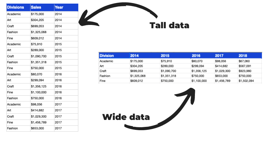
Google Sheets and other spreadsheet programs are easier to create if the data is wide as opposed to tall.

To save time when editing your chart, make sure your data is wide beforehand. Doing this may require creating a pivot table, which you now know how to do thanks to the previous chapter. 💪
Create a chart
To insert a chart into a spreadsheet, click either the quick action button for charts or navigate to Insert > Chart.

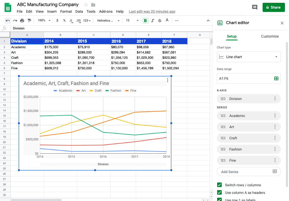
In Google Sheets, a recommended chart will appear based on the range of data selected. The chart editor will also appear where you will be able to pick the best one for your data and customize it as needed. It appears in the same place the pivot table editor came up - on the right-hand side of the screen.
In this example, we have charted the sales data for the ABC Manufacturing Company by division:

Because the data included time, I chose a line chart, which is the most appropriate for visualizing data over time. Each division appears as a line on the graph, with a color of each division in a color legend.
Here is a recap of how to transform data into a chart in the following below:
Edit a chart
The chart editor which came up on the right, allows changes to nearly everything: chart style, chart and axis titles, series of data, legends....
Select the data range
The data range allows you to specify the data you want included in your chart in the event it wasn’t captured correctly when you inserted it.
Label your data
Default titles for the chart and the x-axis (the horizontal axis) came up automatically. Pretty neat, right? You can identify rows and columns for labeling or headers.
Customize the appearance
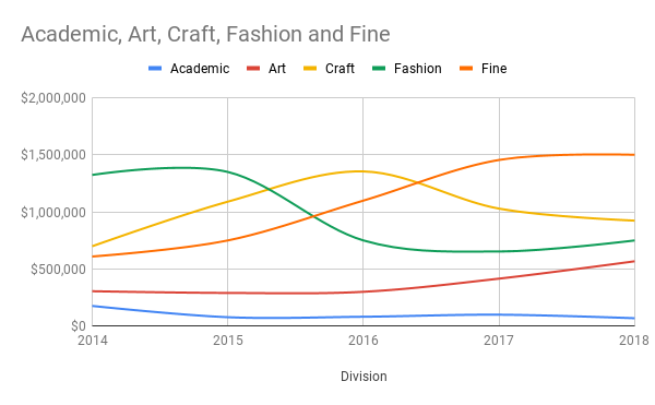
Customization options change depending on the chart type. For example, line charts have the option to smooth the line, whereas a bar chart does not. Look at the angular lines above and the smooth lines below.

Remove gridlines
Finally, there’s the option to change gridlines. One of the better practices when it comes to charts is to make the data stand out. Sometimes gridlines can add noise to the message your chart is trying to convey. With this feature, you can turn off or change the color of gridlines to make the data sing.
Here is recap of the main editing options:
Watch out for readability issues with pie charts
To build a pie or a donut chart, you’ll follow a similar process to the line chart. You’ll want to select your range of data and navigate the menu or the quick action button to insert a chart.
Pie charts should be used when there are just a few slices of data so the reader can tell which piece is bigger or smaller in relation to the others.
Share or print a chart
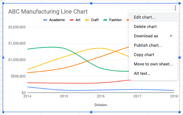
When you create a chart, three vertical dots appear in the top-right hand corner which open up an extra menu:

Here, you can share your charts by publishing to the web, or saving them as a PNG, PDF, or SVG. You can even move the chart to another sheet, which is helpful when collaborating with others.
To save as a PNG, PDF, or SVG, click on the three dots and then select the Download As button then select the best choice. A PNG is great to include in presentations!
When you publish to the web, you can select the chart, spreadsheet, or entire document be published.
When you publish to the web, you can also embed the visualization. This can be helpful if you want to insert the chart as part of another web page.
The process is similar for sharing pivot tables. However, there is no export image functionality in Google Sheets. Others programs have the ability to copy the table as a picture.
Let’s recap!
Create a chart which makes sense based on your data.
Bar / Column charts when comparing categories of data to each other.
Line charts when demonstrating an evolution in data over time.
Pie charts when comparing one or several parts of a data set to the whole.
Scatterplots when demonstrating how much one variable is affected by another.
You can edit items in the chart area or the chart itself through the chart editor.
As a rule of thumb, don't use a pie chart if you have more than five segments of data.
You can save charts as images to include in other documents while pivot tables do not have a save as image feature.
Google Sheets allows you to publish a spreadsheet or chart to the web and allows for embedding into websites. Use caution in publishing sensitive data or information.
Congratulations! You've gone from learning how to enter data to sharing your charts or tables! Now it's time to test your knowledge with a quiz! :honte:
Good luck with this final assessment in the course and with all your data entry, formatting, analysis and visualization in the future!
I hope you have as much fun editing spreadsheets as I did creating this content for you!
Et si vous obteniez un diplôme OpenClassrooms ?
- Formations jusqu’à 100 % financées
- Date de début flexible
- Projets professionnalisants
- Mentorat individuel
Trouvez la formation et le financement faits pour vous


