Represent the Empirical Distribution of a Variable
First thing's first: download a file called operations.csv. This is a fictitious statement in which parts of the transaction labels have been redacted.
Second, load the dataset:
data = pd.read_csv("operations.csv",parse_dates=[0])Understand the Data and the Code
Every bank statement contains at least these three pieces of information (for each transaction):
date of transaction
description of transaction
amount of transaction
We are going to use these three pieces of information to create some variables:
transaction_date
label
amount
debcr: indicates whether the transaction is a debit or credit
balance_bef_transaction: account balance before the transaction was made
categ: transaction category, for example: “groceries,” “rent,” “bill,” etc.
type: transaction type, for example: “deposit,” “charge,” “withdrawal," etc.
expense_slice: indicates whether an expenditure is small, medium, etc.
year: year as determined by the transaction_date
month: month as determined by the transaction_date
day: date of the month (between 1 and 31)
day_week: day of the week (Monday, Tuesday, etc.)
day_week_num: number of the day of the week (between 1 and 7)
weekend: indicates that the transaction occurred on a weekend
quart_month: value 1, 2, 3 or 4, indicating how far into the month the transaction occurred (1: beginning ... 4: end)
wait: for each transaction in the “groceries” category, indicates how much time has elapsed (in number of days) since the previous “groceries” transaction. This will be calculated later, in the chapter on linear regression.
How can a variable be represented?
So far, we have seen how to display a sample (in the form of a table in which each row represents an individual, and each column represents a variable). To represent the categ variable, for example, we could select the table’s categ column, and display it as follows:
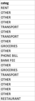
But, you have to admit, it’s not very readable! Moreover, a sample can contain 1,000 individuals or more. A column with 1,000 values is not pretty, and it’s really hard to interpret. There’s a much better way, which consists of saying:
A value for GROCERIES occurs 39 times, a value for OTHER occurs 212 times, a value for TRANSPORT occurs 21 times, etc.
This formulation is called an empirical distribution, which we represent graphically.
Represent an Empirical Distribution
The various “possibilities” that can be observed for the categ variable are its categories. Here, the categories of the categ variable are: groceries, transportation, other, rent, etc. For quantitative variables, however, these are referred to as possible values. Each category (or value) is associated with a number of occurrences. The number of occurrences for the groceries category is n groceries = 39.
If we divide an occurrence by the number of individuals in the sample (represented by n ), we obtain a frequency.
An alternative version of this would be: the empirical distribution of a variable is all of the values (or categories) taken by this variable and their associated frequencies. This can be presented in the form of a table. We will go into this in further detail in the next chapter.
category | occurence | frequency |
GROCERIES | 39 | 0.126623 |
OTHER | 212 | 0.688312 |
TRANSPORT | 21 | 0.068182 |
... | ... | ... |
Let’s turn now to graphic representations.
Represent Qualitative Variables
Here are two possible ways of representing the distribution of the categ variable:
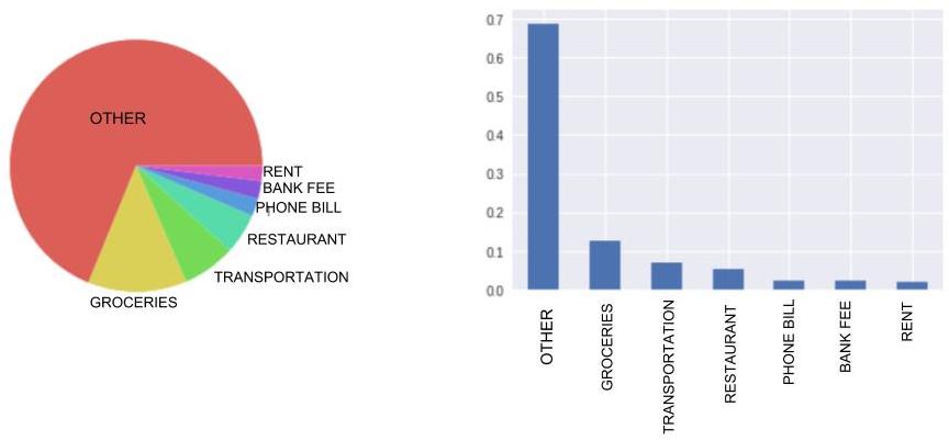
On the left, we have a circular diagram, better known as a pie chart. Here, each section is proportional to the occurrence of the category it represents.
On the right, we have a bar graph. The height of the bars is proportional to the number of occurrences of each category, or (if you prefer) proportional to the frequency of each category, as is the case here.
For ordinal qualitative variables, simply arrange the categories on the graph in increasing order.
Representing Quantitative Variables
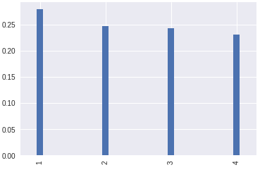
Discrete Variables
Discrete variables are represented by the equivalent of a bar chart: a vertical line graph. Although with qualitative variables, you can place the bars pretty much anywhere along the horizontal axis, with quantitative variables, the lines must be located at precise points. For this reason, it’s best to make your lines very thin.
Continuous Variables
Let’s take the example of a person’s height: this is a continuous variable. It’s quite possible for one person to be 1.47801 meters tall, and another person to be 1.47802 meters tall.
These two heights are different: should we add two lines to our graph to represent them, one for each height?
You’re splitting hairs! 1.47801 meters and 1.47802 meters are practically the same! You should consider these values to be equivalent.
Considering 1.47801 meters and 1.47802 meters to be equivalent is called grouping. We then say that we are aggregating these values into classes or bins. If we decide to group according to height intervals of 0.2 meters, then these two values would both be assigned to the same bin: [1.4m;1.6m[.
Aggregating or grouping variables is called data binning (also discrete binning, bucketing, and discretization).
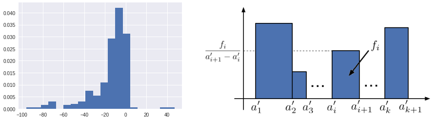
So for continuous variables, we use histograms in which the values have been aggregated. Here, because we are representing classes (or bins, if you prefer), we aren’t using thin lines, but instead rectangles whose widths correspond to the size of the bin.
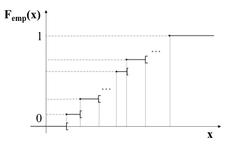
However, if you don’t want to aggregate values, there is another solution: representing the empirical distribution function. Think of it as a staircase. To represent it, we place our values along the horizontal axis in increasing order, from small to large. Each time we encounter a value that appears in our sample, we go up a step. So there will be as many steps as there are values—and, moreover, as many individuals. All of the steps are of the same height.
When we’ve gone through all of the values of the sample, we will be at the top of the staircase. The staircase is (arbitrarily) assigned a height of 1.
To find out more about distribution functions, go to the end of the chapter (Take It Further).
Now For the Code...
Here is the code that loads the data from the CSV file :
import pandas as pd
import matplotlib.pyplot as plt
import seaborn as sns

data = pd.read_csv("operations.csv",parse_dates=[0])
Here is the code that generated the above graphs. Each graph required only two lines of code:
import matplotlib.pyplot as plt

# QUALITATIVE VARIABLE
# Pie chart
data["categ"].value_counts(normalize=True).plot(kind='pie')
# This line ensures that the pie chart is circular, not elliptical
plt.axis('equal')
plt.show() # Displays the graph

# Bar graph
data["categ"].value_counts(normalize=True).plot(kind='bar')
plt.show()

# QUANTITATIVE VARIABLE
# Vertical line graph
data["quart_month"].value_counts(normalize=True).plot(kind='bar',width=0.1)
plt.show()

# Histogram
data["amount"].hist(normed=True)
plt.show()
# Prettier Histogram
data[data.amount.abs() < 100]["amount"].hist(density=True,bins=20)
plt.show()Here, we use the same reasoning we used at the beginning of the chapter. We begin by selecting the desired data['categ'] column, then count the number of times each category appears: data['categ'].value_counts() . To obtain the frequencies, we might want to add normalize=True. This gives us the empirical distribution. To display it, we use the plot method, in which we specify the desired chart type ( pie or bar).
As we said earlier, for a quantitative variable, we group the values into classes (bins), so using value_counts()doesn’t really make sense. Therefore, we use the hist() method, which groups the values into bins for us. Line 20 creates a histogram that’s a little too spread out, because some amounts are very large and some are very small. For this reason, here we fllter for amounts of between -$100 and $100 using data[data.amount.abs() < 100] (for this we use the absolute value). Finally, we can also specify the number of desired bins using the bins keyword: here, 20.
Take It Further: The Empirical Distribution Function
The Empirical Distribution Function is expressed as follows:
where I is the indicator function.
Take It Further: Optimum Number of Data Bins
With histograms, there are rules for determining the optimum number of bins (classes or intervals) into which a distribution of observations should be grouped. For example, the Sturges rule (1926) considers the optimum number of bins to be:
where is the sample size.
