Get to Know the Web Content Accessibility Guidelines (WCAG)

Meet WCAG
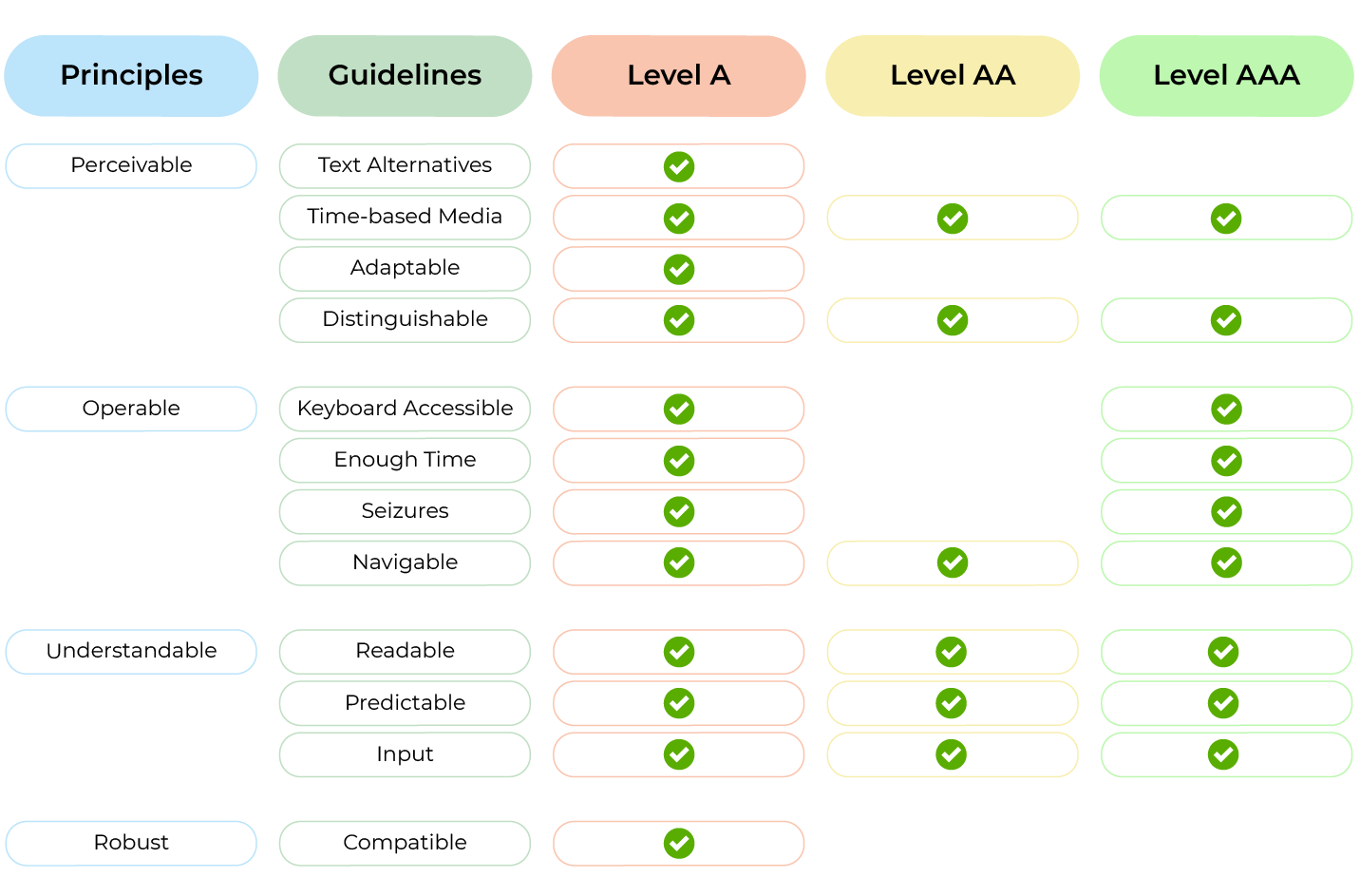
One of the biggest challenges for creating accessible content is to think of all of the different ways people may need to interact with websites. To help people consider what is needed to make sites more accessible, the World Wide Web Consortium (W3C) created the Web Content Accessibility Guidelines (WCAG). The first version, based on specific criteria and technologies, became quickly irrelevant since the web changes so fast. So when they rewrote the document, they restructured it cleverly. Instead of focusing on highly specific requirements, it was organized in an incremental hierarchical structure, moving from more high-level considerations to more specific ones.
The top four accessibility principles are:
Perceivable
Operable
Understandable
Robust
No matter how much technology changes, these core principles will always hold. Within each principle, there are several guidelines. These guidelines are more specific and often relevant to certain kinds of content, like images or forms. They help categorize the requirements but are still broad categories.
Within each guideline are success criteria that are specific enough to be testable. These criteria fall into one of three levels: A, AA, and AAA, which build on one another. Level A covers basic accessibility requirements. AA is the international best practice and is usually the level required in legislation. AAA is considered advanced conformance and sometimes includes elements that are more difficult to implement. To meet a particular level, you first have to meet the one that precedes it. To reach level AA, you also have to meet all of the A criteria.
The document has a list of very specific techniques that people can use to meet the criteria. It also includes common failures. As technologies change, W3C can update the document without disrupting the overall structure.
The most common misconception about WCAG is that it is a checklist. The document was not intended as one, but because a list tends to be the simplest and quickest approach, people use it that way.
The problem with this approach is that it promotes the misconception that a site can be 100% accessible, or that it’s either accessible or not accessible. The reality is that accessibility is a continuum. If a site fails all WCAG criteria, it will still be accessible to some people, and even if it passes all of them, some people may not be able to use it because their needs fall outside of the narrow scope of the document.
If not a checklist, what’s the alternative?
The best results come from getting out of the weeds and thinking of the bigger picture. Focus less on the specific techniques and success criteria and think back to the high-level principles. Is it perceivable? Operable? Understandable? Don’t get me wrong; you should familiarize yourself with the success criteria and common techniques for meeting them. That’s how you’ll be able to quickly identify when your web content is falling short. But just like following laws doesn’t guarantee ethical behavior, following web accessibility guidelines doesn’t guarantee inclusive design. It just satisfies minimum requirements. The benefit of the Web Content Accessibility Guidelines is that they open your eyes to different types of considerations. From there, you can make better-informed decisions and move in the direction of including more users.
WCAG 2.0 vs. 2.1
WCAG 2.0 did quite well compared to WCAG 1.0 in terms of withstanding the test of time. The first refresh to the guidelines came out ten years later, in 2018. The 2.1 update is entirely backward compatible, so every requirement from in the previous version also applies to the new one. Quite the accomplishment considering how much the web has changed!
WCAG 2.1 contains all of the same principles and guidelines as WCAG 2.0. The main change is that new success criteria have been added to these categories to expand the scope of the requirements. For example, under the distinguishable guideline, WCAG 2.0 only had contrast requirements for text content. In version 2.1, a new success criterion for the contrast of non-text content, such as icons and UI controls, was added under this guideline. In a couple of instances, the existing guidelines were extended, and new ones added. For example, the seizure guideline in WCAG 2.0 was expanded in 2.1 to seizures and physical reactions, to cover animations.
Users utilize the web on mobile devices much more than they did ten years ago, which is why addressing mobile accessibility was one of the main goals of the refresh. Other goals included expanding requirements for users who are blind or with low vision and adding more for those with cognitive disabilities.
You may have to comply with different versions and levels of the standard, depending on your location and that of your users. In Europe, the current version of the Accessibility Requirements for ICT Products and Services (EN 301 549) references WCAG 2.1 Level AA. Most other legislation, including section 508 in the U.S., the Disability Discrimination Act in Australia, and legislation in some Canadian provinces, require conformance with WCAG 2.0 AA.
Create Perceivable Content
Remember the two types of assistive technologies? The first category was an alternative output or alternative display. The perceivable principle covers considerations that are important for users who may perceive your content differently. The key is transformability! Text often tends to be the easiest medium to translate from one modality into another. Users can perceive text and descriptions of visuals through sound (a screen reader) or touch (braille); they can perceive sound through sight (captions and transcripts). But there are a few additional considerations, so let’s look at the guidelines more closely.
Non-Text Content
Non-text content refers to visuals on your page, like illustrations, image links, icons, and charts. People who can’t see to perceive the information in these visuals require alternative text descriptions. These descriptions are added to the HTML code and can be read by assistive technologies.
Alternatives to Time-Based Media
Time-based media is a fancy way of saying audio, visual, or audiovisual content. All videos should be captioned for users who can’t hear, and all audio content, like podcast episodes or meeting recordings, should have transcripts.
To make visual and audiovisual content accessible for users who can’t see, provide descriptions of all relevant information shown on screen, including informative visuals, such as the steps in a recipe and any text on the screen. The descriptions can be either in text or described video, which integrates explanations of the visuals into the narration track.
Adaptable Content
Have you ever made a piece of text a bit bigger and bolder than your paragraph text and then sat there admiring the beautiful heading you’ve created? I have news for you - that heading was an imposter. It may have looked like a heading, but there was no semantic markup to back it up.
If someone can’t see the visual difference between the heading and other text, they will think it’s just regular text. It makes it more challenging to understand the structure of the page and how content is organized.
When you land on a new web page, do you go through all of the content, read every word from top to bottom, or scan the page for information that is relevant or interesting to you?
When headings are identified in the markup, assistive technology users can scan the structure of the page and jump from heading to heading. It’s a much more efficient way to navigate, especially when you can’t scan it at a glance.
Assigning semantic or programmatic meaning to your content indicates it can be adapted from visual to non-visual representation without losing meaning. It doesn’t just apply to headings; you should do the same for all content so that the role of that content is clear to non-visual users.
Another important thing to keep in mind is that unlike visual presentation, assistive technologies need to linearize content because, with sound and braille, only one thing can be communicated at a time. When the content is linearized, it should still appear in a logical order, so the code order should match the visual order.
Lastly, you should never rely on one specific type of sensory cue. Avoid instructions like “press the big blue button’” or “you will hear a beep once the test is finished,” since these instructions would be useless to people who need to adapt them to another modality.
Distinguishable
Users need to be able to distinguish content from everything else that surrounds it. Make sure that contrast is high enough between the background and then information that appears on it, such as text and important visual elements—also, separate text from the background instead of embedding it in images. You may have seen this in advertisement banners where text and visuals are one single image. It prevents people from modifying fonts and doesn’t respond to changes in color, size, and regular text. It also means readers can’t select the text if they need to copy or annotate it. Finally, while it is possible to communicate all of the text in the image as alternative text, this often isn’t done in practice, so assistive technology users can’t perceive the content. In contrast, you can create the advertisement banner by separating the text and placing it as HTML content on top of the background. This way, it is easier to read the text with assistive technologies, and the content is much more flexible, making it easy to adjust the font, size, and color.
There is also a requirement around automatically playing audio. If you have audio that starts playing when the page loads, such as a video or advertisement, users should be able to stop it or adjust the volume separately from the system volume.
Can you guess what this has to do with separating the foreground from the background?
If you are a screen reader user, the information readout is your foreground. Any other sound on the page is the background and can interfere with your ability to perceive the page content.
Ensure Your Interface Is Operable
Remember the second category of assistive devices? Just like perceivability is important for people who need alternative output, operability is about supporting users that need alternative input.
Keyboard Accessible
Every interactive element on the site should be operable with a keyboard, not because everyone who can’t use mouse or touch interactions will be a keyboard user. Keyboard operability translates well into other alternative modes of interaction, and screen reader interactions are often keyboard based. If an element is not keyboard accessible, it also won’t be accessible to users of screen readers and other assistive technologies.
Give Users Enough Time
The amount of time people need to accomplish a task is very different from person to person! If you have any moving or auto-updating content, give people the option to stop it or get it out of the way entirely. It’s helpful to users who need extra time and those who can get distracted by movement on the page.
If the page can time out, whether it’s an interactive form or a login, warn them before the page expires and give them a chance to extend the session. It is especially crucial if they might lose their work because of the timeout.
Don’t Trigger Seizures
This one is simple: don’t have anything that flashes at more than three flashes per second as it can trigger seizures in some people.
Support Navigability
One of the challenges with keyboard navigation is that you often need to tab through many focusable elements before you reach the one you’re interested in. If you have repeating blocks of links on every page, help users avoid having to tab through all of them every time they reach a new page by having a “skip to content link.” These links are often hidden until someone tabs to them, so unless you need them, you won’t even know they’re there.
Even if all interactive controls are accessible with a keyboard, people won’t be able to navigate around if they can’t tell where they are. When keyboard users interact with the site, there is no cursor to point to their spot on the page, so you should have a clear focus indicator for interactive elements like buttons and links.
Make it easy to find content and help users figure out where they are. Give your pages unique programmatic titles and provide a few ways of finding information by adding a search function, for example, or providing a site map. Clear headings and labels are another way to help users orient themselves on the page.
Visitors should know where they are and where they’re going. Avoid having ambiguous link text like “read more” or “click here” and associate the link with a description of the link destination.
Make Your Site Understandable
Understandability is a matter of usability. This principle helps users understand the content and how the site and its elements behave.
Readability
Screen readers need to know what language they’re reading in order to pronounce it correctly. Imagine pronouncing a paragraph written in English as if it were French. It also helps browsers display the right alphabetical characters. Define the language of your content programmatically, both for the whole HTML page and paragraphs of text that appear in a different language (for those pieces of text separately).
Predictability
Predictability is all about consistency! Keep repeating elements consistently (like navigation) from page to page. If there are elements that serve a similar function, they should be labeled, look, and behave the same way.
What do you think could be problematic about having several different search inputs on a site that look and behave inconsistently like in the example below?

If you have elements that do similar things but behave slightly differently from one page to the next, you’re essentially asking the user to re-learn how to use it every time. It can be frustrating to all users, but it’s especially tricky for non-visual users and users with cognitive disabilities who rely on consistency.
Help With Forms
Have you ever filled out a form that was returned with a bunch of fields highlighted in red, but no explanations why? It can be frustrating if the instructions or errors aren’t clear. Try to be as specific as possible about the information you need users to enter. If there is a particular format, providing examples can be helpful. If the form comes back with an error, be very clear about where the error happened and how the person can fix it.
One of my favorite examples is this credit card form. Can you identify what makes it a good example?

There really isn’t anything that special about this form. But the instructions are so clear that even if someone woke up from a long coma and had never seen a credit card in their life, they would probably still be able to fill it out correctly.
Build Robust Web Content
Ironically, following the understandable principle, robust is the least logical concept in WCAG. It's intended to help with interoperability so that users can access the site content no matter what technology and browser they are using.
Compatibility With Different Technologies
Firstly, you should make sure that there are no validation errors in your markup. Markup errors like duplicate IDs or stray start and end tags can prevent assistive technologies from properly communicating information. For example, if an input element has a duplicate ID, assistive technologies may not associate it with the label that describes it.
Secondly, make sure that all elements on the site, especially any custom components, have assigned roles, states, and properties. Like the headings I mentioned in the section on adaptability, the function of all elements should be identified programmatically.
Let’s Recap!
The Web Content Accessibility Guidelines (WCAG) were created to help people think about how to make the web accessible to a broader range of people.
WCAG is organized around four main principles:
Perceivable content can be presented through different modalities: sight, sound, and touch.
Operable content can be interacted with in different ways, not just by using a mouse or specific gestures.
Understandable content is predictable, clear, and helps users with interactions.
Robust content supports a wide presentation across a variety of user agents and different types of assistive technologies.
Within each principle are a number of guidelines, and within each guideline are specific, testable success criteria.
In the next part, we’ll dive deeper into the guidelines and evaluate each of the success criteria using automated, manual, and assistive technology testing.
