Customize Your Charts Using Matplotlib

So far, we’ve created a number of functional charts. However, they don’t all conform to the best practices we mentioned previously.
In almost all cases, there are elements missing that would make them easier to read, such as the title, axis titles, or the legend. Now we’re going to see how we can add these elements using Matplotlib.
Update External Elements
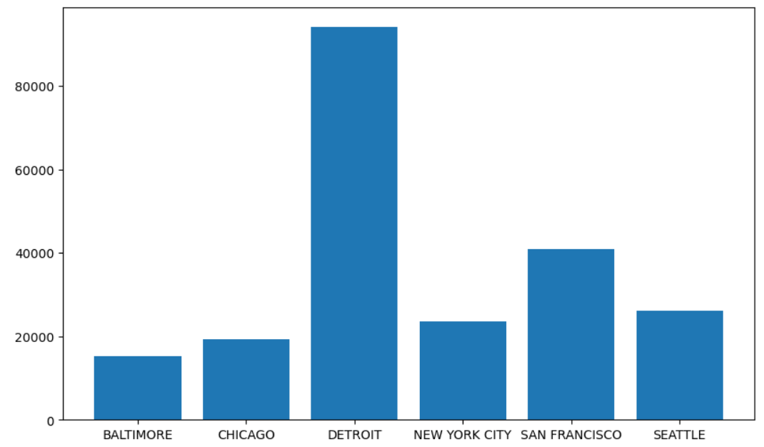
Firstly, let’s focus on the “external” elements of a chart. If we go back to the chart showing revenue by branch:
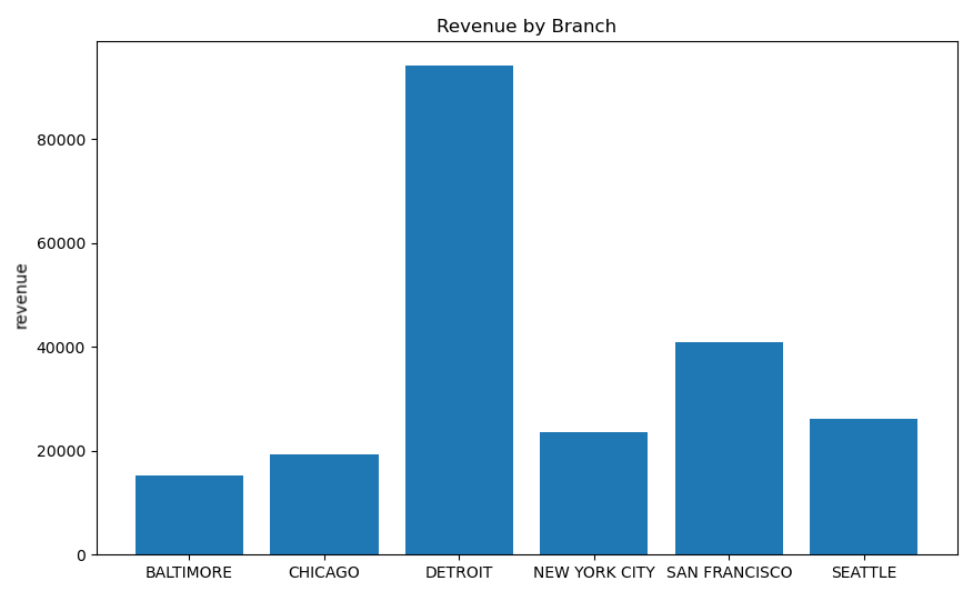
So, we need to add a main title and at least an axis title for one of the axes. To do this, we’re going to do the same as we did before: apply additional functions to our chart window.
I suggest you watch this video, which brings it all together:
Update Internal Elements
So, now we have a complete chart with clear explanatory notes. There are other options we can use to clarify our visuals or make them more appealing to the eye.
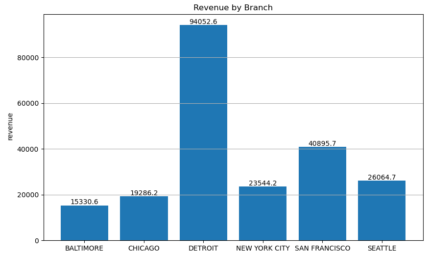
There are a number of ways of playing around with various internal chart components. You’ve already encountered one of them, when we displayed values as text on pie plots and bar plots. You can also play around with ticks, grid style and background colors.
Let’s take the following chart:
Let’s make some changes so it looks like this:
Ready? Let’s take a look at it together:
Over to You!

Background
Monthly profits by loan type for the year 2021 have just been released at the branch where you work. As part of the monthly reporting cycle, you’ve been asked to create a specific chart to show profits changing over time by loan type.
Guidelines
Here’s the chart that was produced last year:
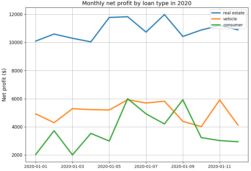
We’d like to reproduce this visual using data for the year 2021.
You’ll find the exercise via this link.
Check Your Work
Now you can compare your result with the solution.
Let’s Recap
Add external elements to a chart using the various functions provided in Matplotlib:
A chart title, using the
titlefunctionA legend, using the
legendfunctionAxis labels, using
xlabelandylabel
Update various internal elements on your visual:
Ticks, using the
xticksoryticksfunctionAdd text to a specific location using the text function
Update the grid style using
gridUpdate specific chart elements using the
rcfunction
Now let’s take a look at the second key library used for dataviz in Python: Seaborn.
