Integrate a Bootstrap grid
Let's start to take a look at the layout of elements according to the principles of a grid, as discussed in the first part of this course. You learned that using a grid, whether in print or on the web, makes content look more organized, more professional, and more consistent across different viewing mediums. Don't worry, you're not going to have to create your own perfect mathematical grid by yourself! Instead, we will use an excellent option already created by the developers over at Twitter called Bootstrap.
What is Bootstrap?
Bootstrap is an incredibly popular HTML, CSS, and JavaScript framework. It's used often on the web, probably on websites you regularly visit. Bootstrap can help you at any level of development, whether you're working with basic layouts or you want to do very custom design work.
In this course, we are particularly interested in Bootstrap for two reasons: its responsiveness and its grid. Using the Bootstrap grid will allow you to build a site that looks great on any device and adapts to different screen sizes without too much heavy development work. You can visit http://getbootstrap.com for more information on the tool itself.
The Bootstrap grid is a fluid grid system of 12 columns that rearrange themselves according to a user screen size based on the criteria that you set. Each row (meaning a group of content) in your code will be divided up into horizontal groups of columns, and Bootstrap provides you with predefined classes to set each column width. You may be used to measuring things with pixels, feet, centimeters, inches, etc., but if you're using a Bootstrap grid, you should get used to measuring in columns.
Hop back to your Photoshop document. You will notice that the mockup also includes a grid with 12 columns! This means that you can measure the width of elements in the mockup using columns as a unit, and then translate those column widths to their exact classes with Bootstrap.
Start with the first two elements that are side-by-side on the mockup: the "picture perfect" paragraph and the photo of the smartphone. If you just measure with your eyes on the mockup, you'll notice that the paragraph takes up 6 columns of width before it hits the photo of the smartphone. We would then set the width of the paragraph to 6 columns on large screen sizes so the phone photo appears next to it and takes up the rest of the space.
The way you translate column widths into Bootstrap is by writing a class in this format:
class="col-XX-##"The XX will either be xs, sm, md, or lg. "xs" will apply for devices like phones (<768px), "sm" will be for small devices like tablets (≥768px), "md" will apply for desktop viewing on medium devices (≥992px), and "lg" will apply for desktop viewing on large devices (≥1200px).
The ## will be the number of columns the element should take up. You can combine multiple screen size rules into one statement, such as:
<div class="col-md-8 col-sm-12 col-lg-6">Learning about the bootstrap grid could be an entire course in and of itself, so if you feel like you need more information in order to understand this way of measuring columns, check out this chapter from our Bootstrap course.
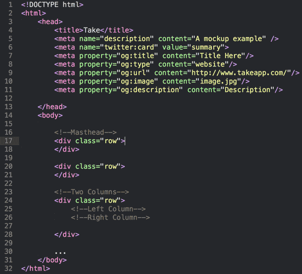
As you start to add column widths for your different elements, your code will look like this:
<!DOCTYPE html>
<html>
    <head>
    </head>
    <body>

        <!--Masthead-->
        <div class="row">
            <div class="col-md-2"></div> <!-- logo -->
        </div>

        <div class="row">
            <div class="col-md-8"></div> <!-- paragraph -->
            <div class="col-md-4"> <!-- phone image -->
        </div>

        <!--Two Columns-->
        <div class="row">
            <!--Left Column-->
            <div class="col-md-6"></div>
            <!--Right Column-->
            <div class="col-md-6"></div>
        </div>

        ...
    </body>
</html>
Take some time now to measure the width of each major element in columns, and incorporate a divtag in your HTML with the appropriate column size class. Basically, just keep building on the example above! Once you have the column widths set up, you can place elements inside them, and Bootstrap will arrange the rest for you (and handle the weirdness of users on multiple screen sizes).