Discover the Measure step of the Lean Cycle
The Measure Step
The second step of the Lean Cycle is the measure step.
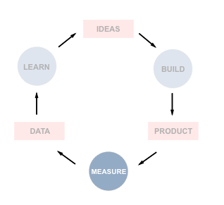
Our goal in the measure step of the Lean Cycle is to gather information or data that allows us in the next step (learn) to draw conclusions about our experiment's success.
The term "metrics" is one that you will see often as a product manager. A metric is just a standardized way of representing the measurement of something. You could measure a politician's success by how many people voted for her or you could measure a basketball player by how many points she scored or if her team won the game.
When building products or running experiments, we will decide which metrics are the most important to measure to determine our success. Doing so is not trivial. Let's consider what 'good metrics' look like.
Principles of Good Metrics
Alistair Kroll & Ben Yoskowitz, authors of Lean Analytics, share some rules of thumb for what makes a good metric.
A good metric is comparative. Try to compare your metric to other time periods, groups of users or competitors to help you to understand the trend and direction in which things are moving.
A good metric is understandable. If people can't easily have a discussion about this metric or get confused or have a hazy understanding of it, then it will prove difficult for this metric to be actionable.
A good metric is a ratio or rate. Since ratios are inherently comparative, looking at a daily metric over 30 days, you'll see if there is a sudden spike, a general trend or just noise. This is far more useful than a metric such as 'total number of users'.
A good metric changes the way you behave. When our actions raise the metrics that we care about, then we are likely to do more of those actions as we can see their virtue. For example, knowing that more than 2% of users cancelling per month is a 'line in the sand' for the business can mean that any rate higher than 2% is going to trigger action within the company and the roadmap.
Vanity Metrics
Eric Ries, author of Lean Startup, uses the term 'vanity metrics' to describe metrics that make us feel good about ourselves but do not serve us well in terms of an honest reflection of business health or as a guideline for the next actions we should take.

Classic examples are number of users, number of visitors to a website, or total number of downloads. If you have had a large number of users since the beginning of time, it doesn't tell you which of your actions or product benefits caused those users to join. It is also possible that a specific event, like a big PR launch when you launched the product or getting your product featured in TechCrunch, brought in a large number of users who visited once and never did anything. These numbers are not 'good metrics' like we have seen above.
We will aim to use ratios and comparative metrics. In this course, we will also examine split testing (running two versions of your product in an A/B test to see which performs better) and cohort analysis (where we measure performance based on a relationship between the version of the product released and how the users of that version behaved).
Cohorts
A definition of a cohort on Dictionary.com is "a group of people with a shared characteristic". We can think of this as a group of people who experienced a common event e.g. 'born in the same year' or 'graduated from Harvard Law in 2005'.

The most common type of cohort that we care about as product managers is based on the dates when people first sign up for our service.
Let's say that we do a release of our product on May 1st, do another big upgrade on June 1st and do a final upgrade on July 1st. Then all of the users who sign up in May are 'experiencing' the May product and its set of features and all the users who sign up in June are 'experiencing' the June product and its set of features. If the latter set of users (the June cohort) display better metrics (e.g. spend more money per user), then we can attribute that to the product (and its set of features) being better in June than in May.
So if we release one feature in June and revenue increased by 5%, then this suggests that this feature "explains" that increase in the revenue metric. For this reason, cohort analysis is useful because when we see changes in metrics, we can actually deduce what caused it, and adjust our product in response.
For Lean Startup, if we are doing one experiment per week, looking at weekly cohorts can help us to understand the true impact of that experiment.
Cohort Analysis
Cohort Analysis is a way of visualizing data in a chart each day. To the right of each day there are columns showing the percentage of users still active 1 day later, 2 days later, etc.
Below is an example where we examine the daily cohorts of people signing up for a product. The first row shows us the behavior of the cohort of people that signed up on February 6th. The second row shows us the behavior of the cohort of people that signed up on February 7th and so on
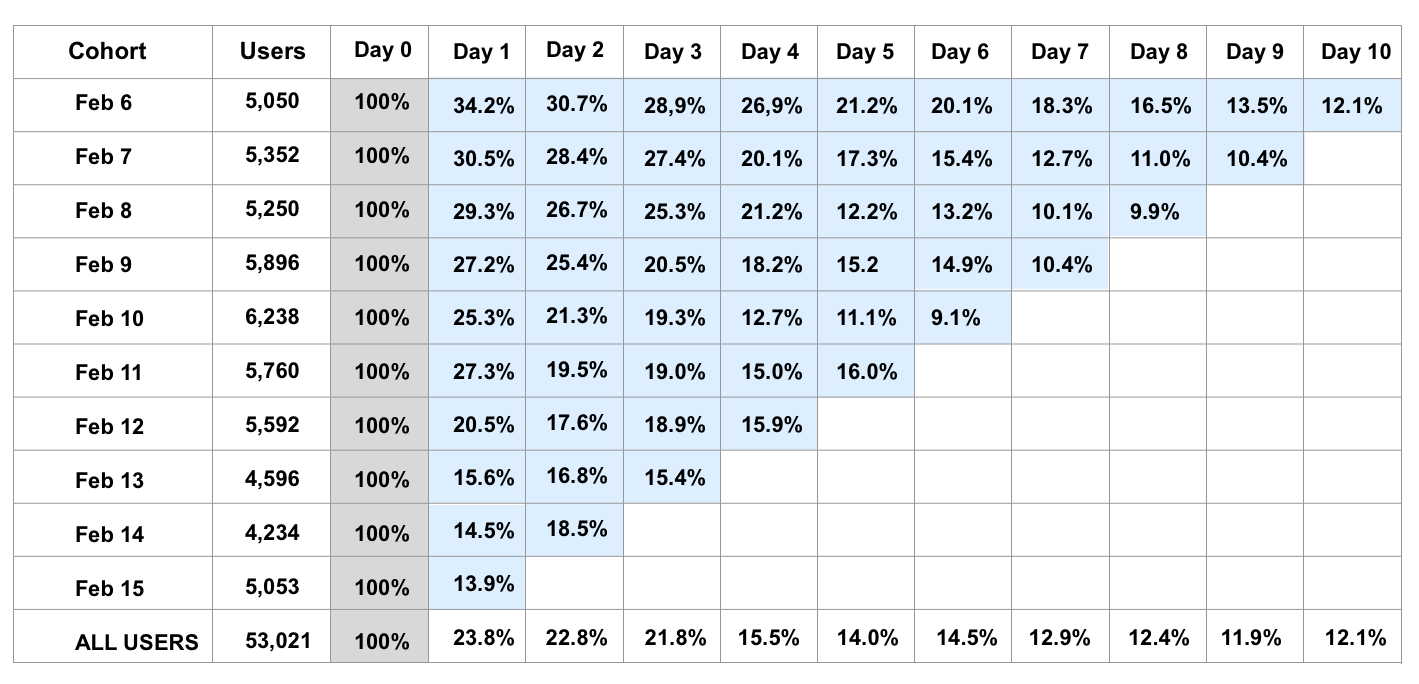
By examining the columns of chart for May 1st, each column (looking right) tells us how many users are retained each day (and this in turn tells you how many users are 'lost').
We will always have 100% on day 0 (All of the users who sign up on day 0 are also logged-in on day 0)
Then Day 1 (one column to the right) shows us what percentage of those users are still active one day later (of the users who signed up on Feb 6th, how many are active on Feb 7th)
Then Day 2 (two columns to the right) show us what percentage of the Feb 6th users are still active on Feb 8th
And so on....
In the chart above, if we look at our Feb 6th cohort, then:
We have 5050 users creating accounts on this day 0
Of this 5050 users, 34.2% or 1721 users (of these 5050 users) are active on day 1 (one day after creating an account)
Of this 5050, 30.7% or 1541 users (of these 5050 users) are active on day 2 (two days after creating an account)
And so on...
By examining the rows of our chart underneath May 1st, we can see over time, we can see which of our product experiences had the highest retention after 1 day, after 2 days etc. If the May 5th performance was the best, we can ask what product and features did we have live in production on that date? What did we do, what was the product like and what caused that excellent performance.
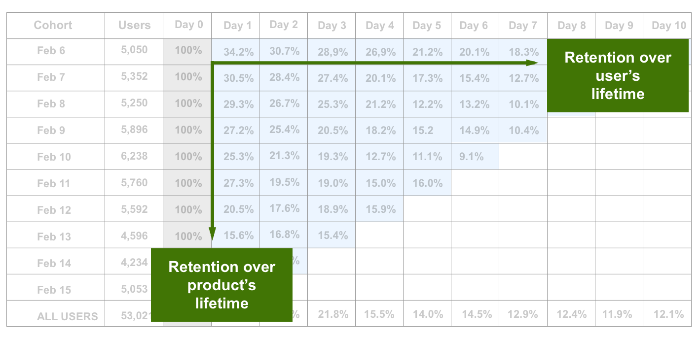
Thus, the cohort analysis allows us to see the impact of the changes we make (through the product versions we release) and how those impact the metrics that we care about.
Additional Resources
Eric Ries describes Vanity Metrics
Monica Rogati shares 10 common pitfalls entrepreneurs should avoid making with their data
Seth Godin on avoiding false metrics
