Table of contents
- Part 1
Prototyping Basics
- Part 2
Learn Sketch
- Part 3
Creating High-Fidelity Prototypes with Sketch and InVision
Table of contents
- Part 1
Prototyping Basics
- Part 2
Learn Sketch
- Part 3
Creating High-Fidelity Prototypes with Sketch and InVision
Discover the different types of prototypes
There are many different types of prototype you can make. If you are clear on your prototyping goal, then the next question is which variety of prototype you should build to help you achieve that goal. We will discuss the various options in this chapter. In order to discuss types of prototyping further, let's introduce the concept of fidelity.
The concept of fidelity
The word fidelity as defined in Dictionary.com is:
the degree of exactness with which something is copied or reproduced.
We can think of fidelity as it applies to:
Design
Interaction
When we apply the concept of fidelity to prototypes, we find that:
Low-fidelity prototypes are not that realistic looking (design fidelity) and/or not that realistic to use (interaction fidelity)
High-fidelity prototypes are very realistic looking (design fidelity) and/or very realistic to use and interact with (interaction fidelity)

Consider the following levels of fidelity in an app design:
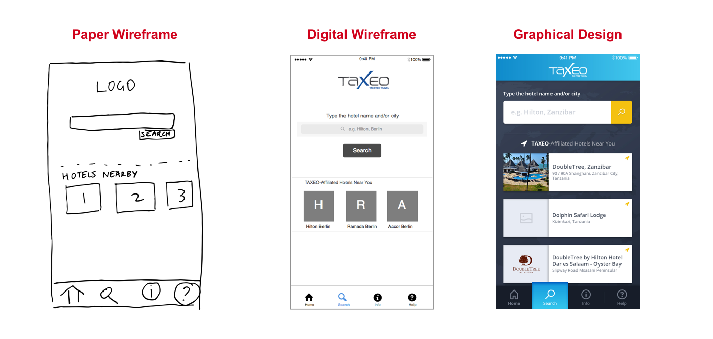
The lowest fidelity (least exact version of final product) is when we sketch by hand on a piece of paper.
The next highest level of fidelity is a black and white digital version that deliberately doesn't include colors or design elements such as images. We can refer to this as a "digital wireframe," almost a digitization of our hand drawn sketch.
The next highest level of fidelity is a full graphic design which is an exact version of a screen in our app.

Typically it is a good idea to progress from left to right as seen in the screenshots above.
Start with a prototype on paper. This is the quickest and best way to make early revisions and figure out the main elements.
Then do a digital wireframe version. Now you want to discuss with your team and perhaps some clients whether the flow is appropriate and the major features help the customer to do a "job" or fix a problem that they care about. You do not want to be in an argument over whether the button is the right color or whether the image is too big! Therefore, you use only black and white and very few graphical elements (if any!). This keeps the focus on the main functionality and flow!
When the digital wireframe is generally accepted, now move on to creating a full graphic design. This version will be the version of the screen that appears in the app (once finalized).

Although a clickable prototype is often an excellent prototyping option to generate real-life feedback from real customers, there are also other approaches worth mentioning:
1. A Single Screenshot
It is perfectly valid to show a potential customer a single page screenshot to get feedback. The customer will know that the feature is probably not built yet (otherwise you would show the website, app, or system to them).
If you have printed a few screenshots on paper and show those to a customer, then there is no interaction between these printed pieces of paper! You would typically explain instead that if you click here, you will then see this other screen. This approach has effectively no "interaction" between screens, although hopefully you have a good interaction with the customer when you get their feedback.
This is the lowest possible interaction fidelity: you don't really have a prototype (or you can say you have a few screens that do not interact with each other), which is why you explain any relationship between screens.
2. Clickable Prototypes
Let's imagine that you have 6 screenshots of individual product screens. There exists many prototyping software solutions which allow you to import those images and will allow you to specify how they link together. By letting you create a link area (typically referred to as a 'hotspot') over say the button area in screen 1, the users who click on that area of screen 1 is then shown screen 2 (and so on).
The idea here is that we are not creating a website, nor a mobile app, nor software. Instead, we are creating an experience delivered within a browser (that we use our prototype software to create). And this in-browser experience will mimic what a final product will look like (design) and feel like to a user (interaction).
Clickable prototypes can be thought of as having a medium level of interactive fidelity.
3. Fully-Interactive Prototypes
In a clickable prototype, you can link between screens. But if you see a screen that has a dropdown area you cannot select from the dropdown. You cannot select the month of November from the month dropdown for example.
However, if you want to actually write some code or built some real web site for a user to interact with, then this would be possible. The user is actually interacting and feels even more like the product is real. The data may not necessarily be saved to the database, but it is remembered during the session for this user.
How to choose the right fidelity prototype
Here are some general rules for choosing the right fidelity of prototype:
Look at your prototyping goal. Ask yourself: what is the quickest and smallest thing I can build that will give me the feedback that I need?
If starting off on a new product/feature, always begin on paper. Even if you don't share with anyone else, a paper prototype will help you to understand the possible flows of the screens involved.
If working with your internal team, always get agreement on the black-and-white version with no graphical elements (digital wireframe) before doing full graphic designs.
Use high-fidelity prototypes when:
You have a good idea of what the solution looks like
Experts are using the system (doctors, accountants) who might see through a clickable prototype, and it might not be enough to get their attention.
Additional Resources
Take a deeper look at the anatomy of a prototyping project.
Ever considered an OpenClassrooms diploma?
- Up to 100% of your training program funded
- Flexible start date
- Career-focused projects
- Individual mentoring
Find the training program and funding option that suits you best
