Design With Accessibility in Mind
In the final part of this course we're going to look at accessibility, ethics, and inclusion as concepts to consider through your journey as a designer. Too often these topics are overlooked or brushed aside, but it's important to be aware of them on your road to becoming a UX designer. In fact, as these topics increasingly come into conversations around design, you'll be ahead of the curve. Design is not exclusionary, but something that should be accessible to everyone. Additionally, you'll want to discuss issues of accessibility with the tech team and UI designer to make sure they're aware as well.
Designing for disability
Elise Roy is a deaf disability rights lawyer turned human-centered designer. In her TED talk, she addresses the idea that when we design for disability, we all benefit. [13:18 min]
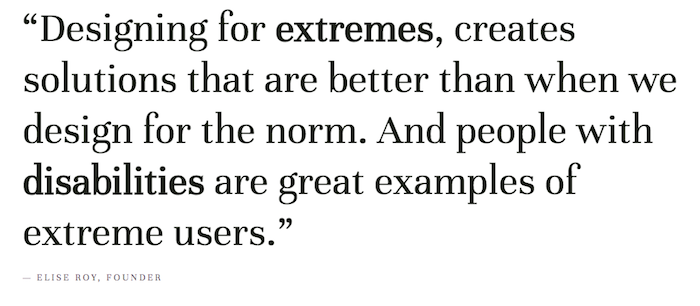
In addressing extreme users, designers are often forced to look at issues with completely new eyes (and a deeper sense of empathy). The result can lead to more creative solutions. And while the solution was made for a particular audience, it doesn't mean that other people can't benefit from it as well.
A disability can take on many forms such as limited motion or mobility, loss of hearing, loss of vision, or various levels of color-blindness. It may not be something we are aware of unless we are directly affected by it ourselves, or know someone who is. While every design solution cannot respond to every problem out there, there are issues we can consider to make strides, and even create more innovative solutions.
Color as an accessibility issue
Let's consider color-blindness.
As a general rule of thumb, graphic designers avoid putting large amounts of small white text on a dark background because, for the average reader, it's hard on the eyes. Can you imagine reading an entire book like that?
When someone is color-blind, they do not see the complete spectrum of color. In fact, since they can't recognize certain colors at all, using white text on certain colored backgrounds can be even harder to read(for instance, white text on a yellow background).
In selecting colors, OpenClassrooms has updated their color scheme over the years to make sure they are accessible – visible – to everyone. As a designer, it's not only about finding colors and text that looks good together, but it's also imperative to be aware of accessibility issues.
One of the best places to learn about web standards for accessibility is the W3C Web Accessibility Initiative website. The WCAG (Web Content Accessibility Guidelines) are published and updated (currently in version 2.0) regularly. Websites are given ratings from A (low level of accessibility) to AAA (high level of accessibility). Government websites tend to be some of the most accessibility-friendly sites because they need to ensure that they are reaching all of their constituents, regardless of disability.
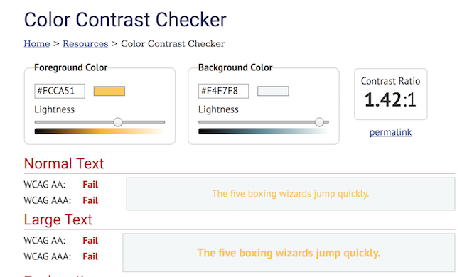
Below is code created by one of the project managers in the education department at OpenClassrooms. He wanted to know if the colors were acccessible.

It was run through an online color test where it failed in terms of color accessibility because the yellow was too hard to read.
Choosing appropriate colors isn't the only way to ensure accessibility. As a workaround to selecting WCAG approved colors, the organizational tool Trello added a feature called "color-blind mode" which adds patterns to labels, making them distinguishable without relying on color.
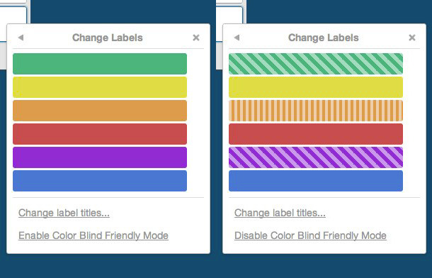
Trello's color-blind mode, via Little Big Details
Accessibility in video
One of the most common accessibility features is closed-captioning on videos. This may be something you'd expect your grandparents to use, but it helps the hearing impaired and deaf communities as well. There's another benefit that many people may have never considered: closed- captioning and subtitles are a great way to help learn a new language. Even though I speak French, I like to put French subtitles on Netflix because I learn new words! This is not what that feature was initially created for; however, opportunities emerge when you design for what Elise Roy calls "extreme audiences."

Click the CC button to view videos with closed-captioning.
Build empathy
We've already talked about empathy for users, but how can you start putting yourself in the shoes of people with disabilities? How can you learn more about the adaptations and adjustments they make every day?
Have you ever watched the Paralympic Games? Even though it doesn't get a lot of mainstream press, paralympic athletes compete right after the Olympics and are incredibly inspiring. Did you know there is wheelchair fencing, sitting volleyball, and blind handball? Watching these athletes compete is a great way to build empathy and realize there are many approaches to what some may see as challenges. Imagine how the rules may change, and the way light and sound is used in different ways for these athletes living with a range of different disabilities.
Accessibility for everyone
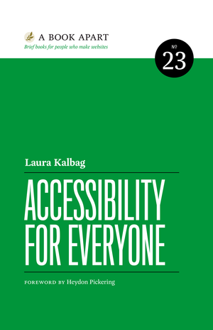
There is so much more to accessibility than what we've covered here. If you're serious about UX design, I recommend reading A Book Apart's Accessibility for Everyone, by Laura Kalbag as it brings accessibility issues to the forefront. There are additional articles on "accessibility" on A List Apart.
