Investigate Layouts and Grids
Design can be like a puzzle and the designer’s role is to consider how the pieces fit together. There are endless solutions, but the goal is to create a layout that lets the content shine.
We see design around us all the time, but tend to take it for granted as part of the environment around us. Start by thinking of your favorite magazine. If you have tracing paper, trace over the images and text boxes. What do you notice?
Layouts and grids
Take a copy of your favorite print magazine and start to look at the anatomy of a page layout. Start to trace existing layouts to better understand how the elements – words, images, illustrations – fit together.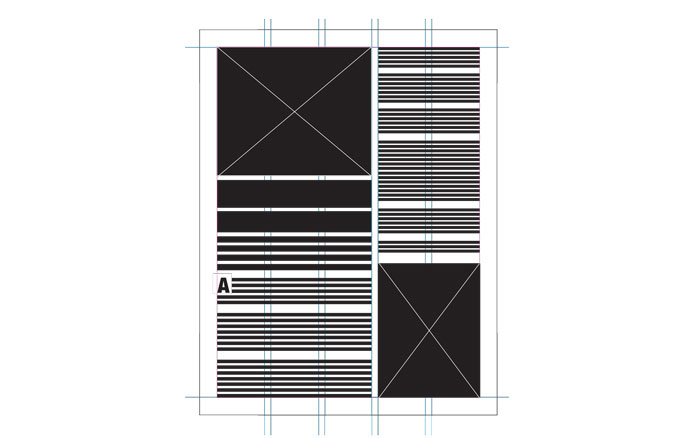
The text and images are divided into columns. The column width may vary depending on the publication. The thing to realize is that there is an underlying grid system. The number of columns in the underlying grid is up to the designer. Just because the grid column is narrow doesn’t mean that the text column needs to be narrow. A text block, or image, may extend over multiple columns. Using columns for text is a good way to avoid long lines of text, which can be hard for the reader to digest the content efficiently.
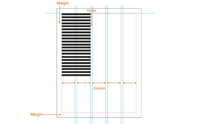
The margins are the space between the side of the page and where the content lies. Gutter is the term that is used to describe the space between columns, or in the case of a magazine, the space between two pages.
Alignment
Typography is often arranged on a page to make it easy to read. Alignment refers to how elements “line up” on a page, both vertically and horizontally, but also the way in which text flows within a text block.
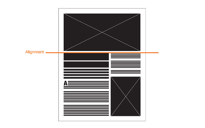
Imaginary grid lines are used in design to make sure elements line up or "align" properly.
Look for the alignment of elements. If you were to draw an imaginary line down your page, does your image frame line up with the text frame? You want elements to fit together naturally. When something is not aligned, you need to make sure the design decision was intentional – significant enough to not look like a mistake. Also, you’ll want to be sure to be consistent with these spaces throughout your “document”.
Typography also impacts how elements are aligned on the page. The goal is to have a nice flow of text, not something that is distracting to the viewer. Similarly, you don’t want too many gaps or awkward spacing in a block of text.
To get an idea of how text will look on the page, some designers use a latin text called Lorem Ipsum, which is also known as “placeholder text”. The spacing is intended to mimic actual word length and sentence structure.
Justified type extends across the entire column.
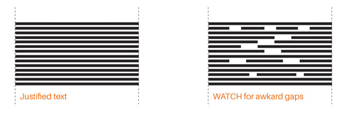
The black rectangles in these illustrations represent text. Sometimes hyphenation is used to make sure the lines of text flow evenly so you can avoid
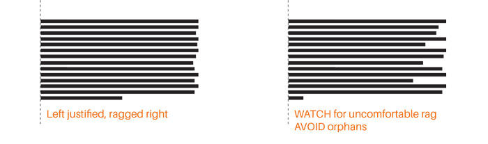
It's also common to have left aligned type, with a ragged right edge. [above]
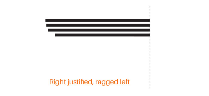
Right aligned, ragged left is less common in typography, but sometimes it's helpful to use for report covers or for things like contact information on a résumé.
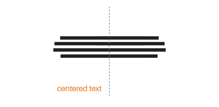
Centered text is often used for titles, invitations, or poems. Most of the time you don't see centered text used with paragraphs.
Readability and legibility are key concepts in strong visual design. Legibility refers to being able to make out the letter form. (For instance, the smaller the letter gets a D may start to look like an O). Readability meanwhile refers to the ease of the reader as they scan the text. Ideally, the text should be inviting and entice the reader!
Let the layout breathe
One of the most unlikely design tools is that of no design at all: white space (ok, well, it can be a color too!), which can also be referred to as negative space. For instance, when you're starting to read a chapter in a book, sometimes the content starts midway down the page, giving more room to the title. This would be considered white space. It helps break up and give a rhythm to the layout. White space helps break up the monotony of a layout with a lot of information. Another time you may see white space is around an infographic – you need to have enough space for the viewer to be able to see the key information without getting distracted by what is around it.
It is also important to remember that audiences typically aren't interested in reading large blocks of text. In the world we live in, people want information fast. Consider how you can say a lot in a little space. Don't clutter the page, and let the content shine.
Images – photographs, icons and illustrations – are another element that can be used to better tell the story, and add visual interest to a page layout. The feature known as text wrap makes sure the text flows around the image. It’s important that there is enough space between the image and the text so that it is not distracting for the viewer. In your "document" it is also important to use consistant spacing for all your image/text pairings. Not only will it be less distracting for the reader, but it reflects a level of polish and professionalism by the designer. The devil is in the details.
When it comes to design often less is more.
