Table of contents
- Part 1
Communicate Your Ideas Visually
- Part 2
Explore Graphic Design Basics
- Part 3
Engage your audience
Table of contents
- Part 1
Communicate Your Ideas Visually
- Part 2
Explore Graphic Design Basics
- Part 3
Engage your audience
Get in the Presentation Mindset
Regardless of your profession, chances are you're going to have to give a presentation from time to time whether it be internally, or for a big audience. Integrating some basic design skills and thinking creatively about your presentation can make your subject matter more memorable. Whenever you're giving a presentation you want to make sure you're effectively communicating your ideas to your audience.
Types of presentations
As a professional you may find yourself giving presentations in any number of contexts and situations depending on what kind work environment you’re in. The purposes for presentations and slide decks (the visuals that go along with what you're saying) may include:
Portfolio presentation (to get a job, or to get hired for a project)
Presentation of project information or findings to your boss, team members, stakeholders (internal or external)
Communication of key ideas to designers or developers who will realize the project (aka bring it to life)
Creation of a pitch deck to receive funding from investors (see more here and here)
A talk at a conference or industry event (check out TED and CreativeMornings to get inspired!)
Whenever preparing a presentation it’s important to keep the audience in mind. An audience of industry leaders is going to come into a talk or presentation with a different mentality than an event open to the general public. If your audience is not familiar with the subject matter, make sure you are establishing some context.
It’s much easier to prepare a presentation if you have a goal in mind. One tip is to reverse engineer your presentation. This means you’ll start with the end goal and work backwards. Remember, presenting information in a chronological form is not necessarily the most effective mode of communication. You may want to consider themes or “chapters” where the background color of the slide is a different color in order to break up the information into digestible blocks. Doing this will also help you think more critically about your content.
When building a presentation deck consider if you’ll be there to present and explain, or if it’s something the recipient will read through on their own (is it getting distributed via email?). This will impact the amount of detail you need to include.
Get noticed
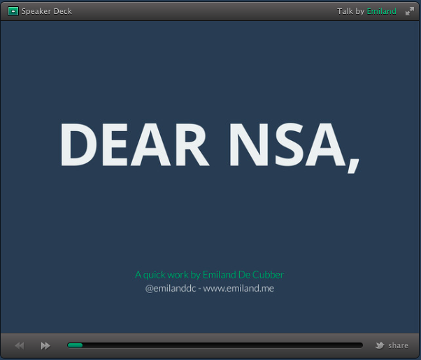
You don't need to be a professional graphic designer to create a killer presentation deck. Emiland de Cubber is a French presentation designer who is not a designer at all – he's an engineer – but knows how to create a beautiful and effective slide deck that gets noticed. He’s perhaps most famous for the redesign of NSA slides, which is a US government agency. He was not hired to design nor redesign these slides - it was a self-initiated project. He created a revised presentation, in a clean, accessible style, highlighting the before and after slides to make his point about the importance of communicating ideas clearly, and effectively.
 View the entire deck on SlidesShare. Can you believe how UGLY those "before" slides were!?! The "after" is an impressive improvement.
He posted the deck on Slideshare (which has received over 1 million views!) and on his own website, as well as sharing it on social media. The result was a lot of amazing press, as publications like FastCo Design and TechCrunch wrote about his project. The final slide was a CTA (call to action) saying he’s available for hire. Needless to say, this little “side project” help lead to more work, and more opportunities.
Capture the viewer's attention
According to Nancy Durate, you should only expect viewers to take 3 seconds to be able to understand each slide. So if you’re thinking about including tiny, detailed diagrams, you may want to think again to think about your audience. The ultimate goal for any presentation should be clarity, not confusion.
TED talk on "The Secret Structure of Great Talks" by Nancy Duarte [11:18 minutes]
If you're presenting in an auditorium you want to make sure your slides can be understood from afar. Viewers should clearly understand the message. The last thing you want is to leave the audience confused!
Ever considered an OpenClassrooms diploma?
- Up to 100% of your training program funded
- Flexible start date
- Career-focused projects
- Individual mentoring
Find the training program and funding option that suits you best
