Table of contents
- Part 1
Identify key design elements through wireframes
- Part 2
Apply the design process to create your own rapid prototype
Table of contents
- Part 1
Identify key design elements through wireframes
- Part 2
Apply the design process to create your own rapid prototype
Examine digital products through wireframes
Have you ever tried talking through an idea with someone but they get a blank, confused look on their face? Maybe you didn't have a bad idea - it just may have been hard to grasp without a visual. Designers have a useful tool for communicating their ideas: wireframes.

Why wireframe?
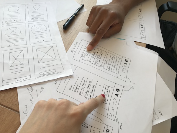
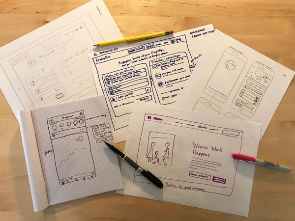
Wireframes become a blueprint for design and propose the underlying conceptual structure, or skeleton, of whatever you may be working on. The structure, content, information hierarchy, behavior, and functionality become apparent through wireframe sketches. In wireframes you don't need any real content. Instead key words like "headline" or "quote" can be used to communicate ideas, without distracting anyone with content choices – think of it as a placeholder.
Wireframes are a great, inexpensive way to create prototypes of your product as you work through ideas. You can share paper sketches with users to see how they react to different concepts and functionalities. Additionally, there are numerous online tools to help you create clickable prototypes to test your product with users (we'll get to this later). You can do all of this with users without having to design a single pixel!
Starting with a solid framework (expressed as a wireframe) will make your work smoother moving forward. Wireframes are another tool to help you fail early, fail fast, and fail often. If you can't express your idea in a simple sketch – even if it needs some annotations – you probably don't know what you're talking about.
Wireframes are also helpful for communicating with developers at the beginning of the design process. You can rapidly show them what functionalities you hope to achieve, and a developer can articulate any challenges or roadblocks the team may encounter just from looking at a quick wireframe. If they don't know how to implement code for the desired functionality, letting them see a sketch beforehand gives them time to either learn it or to recruit another team member before actual development starts. Developers will be very appreciative of having been "looped in" early in the process. Also, if something isn't possible, the person responsible for the UI design and visual interface will be thankful that they didn't waste their time working on something that is destined for the trash can.
Tips for wireframing
As we go through this course, we're going to learn about the nuances of interaction design by looking at real world examples. Rather than starting from scratch, go ahead and visit your favorite websites and apps and see which elements make them up, how navigation works, where elements fit on the page or screen, how much space they take, and how much information you can include without overwhelming the users.

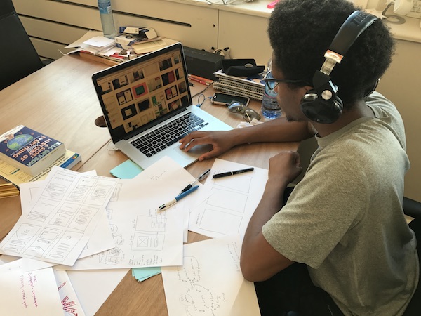
To get started, all you need are simple tools like paper and markers! Everyone has their own technique and their favorite tools (pen, pencil, marker), and even paper (inside a sketchbook, A4/letter, A3/legal for making ideas BIG!). Each sheet can represent one screen, or maybe you prefer to fit three or more screens on a page. Draw rectangles to represent the screen, or print out a template of the screen in order to be more precise. Sketch at scale (the actual size of the product) so that you have a realistic sense of how much how much can fit on each screen.
If the blank page is intimidating, you can download templates of devices online. For the perfectionists, there are options with line or dot grids as well or you can use a ruler or protractor. Sneakpeekit is a good place to find up to date templates with the latest models of devices available for download, but a simple search will give you lots of results.
The language of wireframing is simple:
A rectangle with an "x" through it symbolizes an image. (As an alternative you can doodle a quick sketch to represent something like a person or landscape.)
Titles can use actual words, such as "headline", or blocks to represent text. It is helpful to show these because it helps give hierarchy to the page. I like to capture strong taglines and categories in my wireframes, but otherwise I use lines for text.
Include navigation and buttons. Pay attention to which information is consistent on all screens, and how information is grouped. Look too for which elements repeat.
Wireframing from UXMastery [3:46 min]

As you sketch, some aspects of the user experience will be obvious, but others may be less apparent. Don't just wireframe the home page. Instead, sketch all the screens necessary in order for you to accomplish something (a task) on the website or app.
The more you draw wireframes, the more experience you'll gain working with design conventions and elements that are essential for creating good user experiences. Start comparing and contrasting different sites based on what you learn from sketching their framework.
How do products in different completely industries – such as travel and meditation – have similar functionalities?
How do two apps with a similar premise have a completely different approach to design?
Which apps accomplish the most with the least amount of design and features?
You'll start seeing things differently – and more critically – when you're not blinded by the visual design elements! There's also a cognitive benefit to doing things by hand.
Mini Challenge: Learn by doing
Pick a popular website and draw it as a simple wireframe.
Set a timer for 10 minutes and see how many screens you can sketch. You're not trying to capture every detail, but are looking for the underlying structure and framework.
Show your wireframe to your friends. See if they can guess which product or service it is! (Of course don't write the name of it in your wireframe 😉 ).
Ever considered an OpenClassrooms diploma?
- Up to 100% of your training program funded
- Flexible start date
- Career-focused projects
- Individual mentoring
Find the training program and funding option that suits you best
