Consider the first user experience
As you go through different interfaces, on different devices, start to take a close look at the "first user experience," or what the experience is like for a first time user. The first user experience is important because it is what grabs, attracts, and hopefully keeps the user coming back. You can also think of this experience as user onboarding.
Consider the moments after you download an app. Is the first screen a prompt for you to login or create an account? Is there an introduction to the brand? A tutorial or tips for using the product? A little bit about the brand?
Scott Belsky, founder of the portfolio site Behance, points out "in a world of moving fast and pushing out a 'minimum viable product,' the first mile of a product’s user experience is almost always an afterthought." The goal in this chapter is to get designers thinking about these experiences early in the process, which, in this context, means through wireframes. As you start to look for these initial user experiences, you'll likely notice their simplicity, so seeking these experiences out is a valuable experience to learn from.
User value and retention
As designers create experiences it's important to remember that with each step of the user flow there is a chance users will not return. Maybe they'll get bored, maybe they'll get stuck, maybe they can't figure out how to navigate "home," maybe a newer/better app launched, or maybe they think your app looks cool, but it doesn't bring any value to them. None of this matters if you can't get them onboard in the first place!
According to InVision, "on average, nearly half of the users never log into the app again. Their first-run experience isn’t successful, memorable, or pleasant enough—and they churn without even becoming customers."
User Value
One thing to look for in the opening screens of these first user experiences is how the brand or product is presented. Look in particular for the presentation of a value proposition. You always want to consider what, why, and how a product adds value to the user. This could be anything from making someone's life easier (like splitting a bill amongst friends), or in the case of a mindfullness app, helping a user disconnect through meditation. It's easier to achieve added value through the UI design, but the reality is that it all starts with wireframes for the onboarding experience.
It's easy to make assumptions about what people know about your product and how it works, as well as the context in which it may be used. Consider it this way: if a user doesn't understand your product, why should they sign up? Why do they care? In UX we often talk about the emotional connection, so you can consider how a product makes you feel. Another way of thinking about it is that "people don't buy products, they buy better versions of themselves." So, what benefit does the app offer?
Now reflect on these initial user experiences after you visit a website or download an app for the first time. Ask yourself how much do you actually pay attention to these onboarding tools? Are there any that are actually memorable or were a pleasurable experience? Then consider what kept you back? The service? How the app makes you feel? The humor? Gamification?
Retention
Your first challenge is getting users. Your second challenge is keeping them coming back. User drop off is a real risk. Sometimes design updates can greatly affect the user experience, and not always for the best. This is highly problematic when your business is impacted and you can lose users at any stage. Retaining and engaging users is crucial for the success and long-term sustainability (survival) of your product.
Here are some make it or break it moments with users:
Introduction to the product
Sign up (account creation)
First interaction with or use of the product
Return visitor/user
Freemium offer vs. paid version
Advanced user experience
Within these stages there are marketing efforts, custom service initiatives, and product development. There is user drop off at each level. Start looking for these moments and interactions in the products you use every day.
Scott Belsky points out that, "Having to explain your product is the least effective way to engage new users." He uses the formula Do > Show > Explain to break down how users can be onboarded. As much as users can do something for themselves rather than being shown or told how to do something, the experience will both be more memorable, and more effective.
First Impressions
Technology is constantly changing, developing and updating. The approach to this course is to learn from existing examples, but also realizing that one person's onboarding experience with an app may be completely different than someone else's a few months from now. It's also interesting to keep checking back with apps and sites to see any updates they have made as they "rebrand" or "relaunch" with a new look and style, or add new features.
Take a closer look and examine what content is on the screen:
Which images were selected? (Why do you think they were chosen?)
What text is included, and how much?
Is there a CTA (call to action) inviting the user to do something?
What is written on the buttons? (Sign up, login, let's go!).
Is there a chatbox to help answer questions?
Are there small bits of text (known as "microcopy")? Does it help communicate the essence of the brand?
Start looking at content critically in order to understand conventions, how concise text can be used to clarify, and more importantly, enhance the first user experience. Don't get bogged down too much in the content right now. Instead, observe how many images are on a screen, how much space they take up, how much text there is, how big (or small) the text is, etc. Capture the spirit of content strategy through your wireframes.
Tutorials for onboarding users
Tutorials are a popular technique for engaging the first time user in order to help them feel less overwhelmed by options. One simple design element per screen can often make a huge difference in the experience of the user. It also can be a way for designer's to help guide users through the app in the way they hoped it would be used.
As you examine apps with a closer eye, pay attention to style choices, and how users move through an experience that is in keeping with the spirit and look of a brand. The best user and onboarding experiences tend to be so well designed, you likely won't notice the details unless you're looking for them.

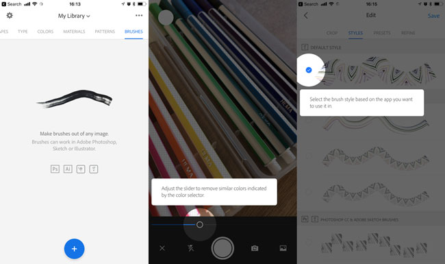
In three simple screens a lot of information can be communicated to the user. In the AdobeCapture example the left screen presents the user with the value proposition: Make brushes out of any image. The text and icons below it help communicate how the app is integrated with other software. In the middle and right screens, a round white highlight appears around the feature or function available to the user, inviting the user to try it. Additional information is presented to the user in the white box with rounded corners (rounded corners were probably an intentional design decision in order to feel welcoming to the user). In addition to presenting the user with a mini tutorial on each screen, it encourages interaction with the product at each step. One of the best ways to get a user coming back, is to give them an experience that is memorable, fun, and showcases how they can use the product in their own life or work.
Onboarding resources
Onboarding resources
User onboarding with Samuel Hulcik, user onboarding essentials, and user onboarding guide from InVision
Something to consider is what the return experience is like. Once a someone signs up for a service or platform, how does the user experience change? What features are you introduced to as you go? Does the homepage display change? Does the user now have access to additional information like a profile page or dashboard? All of these experiences can be wireframed as well.
Mini challenge
Try it yourself! Pick an app you've never used, preferably one which involves having an account. Take screenshots so you have a reference point for the future (and after there is a product update), and then redraw each screen as a wireframe.
Can't think of a good place to start for a first user experience? Ask your friends what their favorite apps are, then download the ones you've never tried or heard of. You can also search a random topic in the app store and try an app you've never heard of to see how the experience is for someone who isn't familiar with the product (like you).
