Table of contents
- Part 1
Identify key design elements through wireframes
- Part 2
Apply the design process to create your own rapid prototype
Table of contents
- Part 1
Identify key design elements through wireframes
- Part 2
Apply the design process to create your own rapid prototype
Break down the user flow
As you work through concepts for your app, it is important to keep your user in mind, and the path or journey they're going to take through your product. User flows are a great way to consider the essential elements you need when starting out. You'll later test it out with an interactive prototype to make sure you didn't forget any key steps. User flows are a more methodical approach than something like storyboarding, but as always, methods can be combined.
User flows
In spirit of task analysis and user journeys, user flows are another way to examine the path of the user. They are a tools that helps us experience a product without building it (John Koht on Improving UX with user flows). It's really easy to assume you know all of the steps it takes for a user to complete a task, but drawing a flowchart is one way to ensure you have considered each part of the journey, and the points where a user must make a decision.
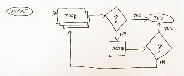
Flowcharts can be used to explore any process any aspect of business, but they're valuable for UX as well, as they become a visual representation of steps and decisions necessary to complete a task. There's a simple visual language for making flowcharts:
Oval: start/end of process (there should only be two of these for any flow)
rectangle button: process or task (key steps)
diamond: decision point (there will always be at least two options from these points)
line: flow of control (yes or now out of triangles)
This video isn't the most thrilling, but it's informative and helpful for looking at flow charts which are beneficial to business as well as UX. [6:53 min]

Flowcharts can get more complicated too, so be aware that different shapes have different meanings. The best tactic is to keep it simple. Flowcharts can be created by hand, but there are also online tools like draw.io, Lucidchart, Omnigraffle for diagramming flows.
As you feel more confident creating user flows, do them for existing sites in order to explore how they approach the same journeys. Don't worry if your first user flow isn't perfect. Often it's a process between wireframes, prototypes, and flows to test and determine the best approach.
Make a list of screens
If you're feeling stuck on user flows, another helpful approach is to create a list of all the screens you will need to sketch. Chances are you're going to start with a simple list and then say to yourself "Ahhhh, I totally forgot about X, Y, Z screen!".
For your primary screens make a list of the key information you need to include on each screen. These lists will help serve as a reference for you as you sketch, as well as a checklist.
Your turn: Chart the user flow
Set your timer for 10 minutes and attempt to draw the user flow for your app you're creating. Use the diagramming conventions of the shapes.
Ever considered an OpenClassrooms diploma?
- Up to 100% of your training program funded
- Flexible start date
- Career-focused projects
- Individual mentoring
Find the training program and funding option that suits you best
