Table of contents
- Part 1
Identify key design elements through wireframes
- Part 2
Apply the design process to create your own rapid prototype
Table of contents
- Part 1
Identify key design elements through wireframes
- Part 2
Apply the design process to create your own rapid prototype
Sketch your screens
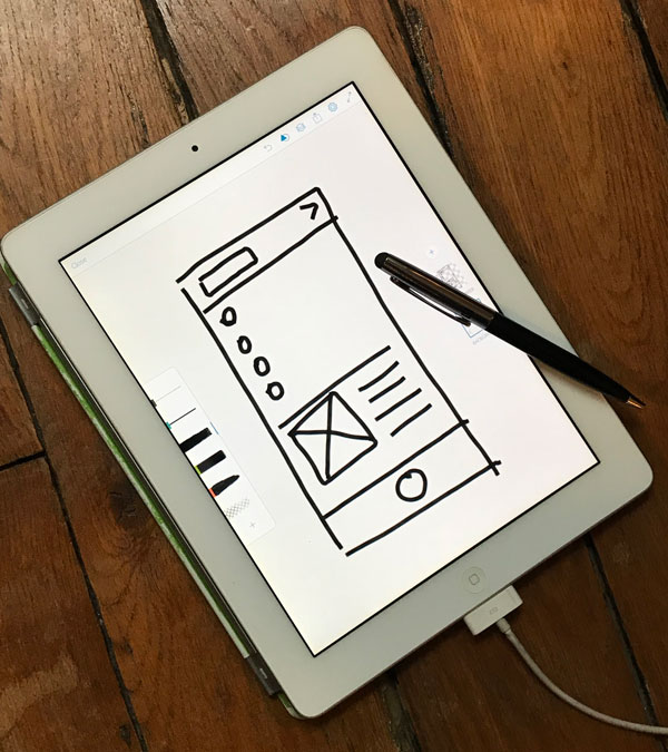
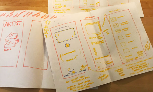
It's time to break down your app screen by screen and start sketching. NOW we're really focused on designing solutions.
Another thing you may want to do is examine competitors or similar apps that already exist. We don't have time to conduct a complete competitor analysis (also often called benchmarking, it enables you to see what else is out there) for this project because we're focusing on rapid prototyping, but you can always set a timer for 10 minutes and consider the pros and cons of what other apps are doing. You can do a feature inventory to see what key features and functionalities are being used, and consider how they add value to the product.
In the next chapter we're going to take these screens and make them into a clickable prototype, so make sure you draw enough frames to get you through a task. Don't stress too much, because you'll always be able to add additional screens you may have forgotten the first round. That's the beauty of these rapid digital prototypes. They're cheap, easy, and quick to update!
In your sketches you can experiment with different tools (pencil, pen, marker, stylus). Just make sure you only use one for the final sketches you incorporate into your prototype. If each screen sketch looks different the user is going to get distracted and focus on that instead of what your app is trying to do!

Your turn: Bring your concept to life through wireframes
You'll be introduced to digital tools and techniques soon enough. For now stick to simple sketches. We're trying to get basic concepts validated through these initial prototypes.
Set a timer for 45 minutes and start sketching out your screens. You'll likely discover that brilliant idea in your head didn't work how you expected on paper. That's why we sketch and test. By the end of the 45 minutes you should have at least 7-10 screens to create a clickable digital prototype. Don't worry if you don't nail them all on the first try. That's the point of prototyping, testing, and iterating; you're continually refining your experience.

Ever considered an OpenClassrooms diploma?
- Up to 100% of your training program funded
- Flexible start date
- Career-focused projects
- Individual mentoring
Find the training program and funding option that suits you best
