Table of contents
- Part 1
Apply metrics to uncover UX problems
- 1
Understand the value of quantitative and qualitative data
- 2
Decide which metrics to collect
- 3
Use Google Analytics or other BI tools to monitor user behavior
- 4
Measure user performance in usability testing
- 5
Learn about users from heat maps and scroll maps
- 6
A/B test to improve outcomes
- 7
Get some practice by using the HEART framework to determine metrics
Quiz: Think critically about metrics
- Part 2
Create simple data visualizations to communicate information
A/B test to improve outcomes
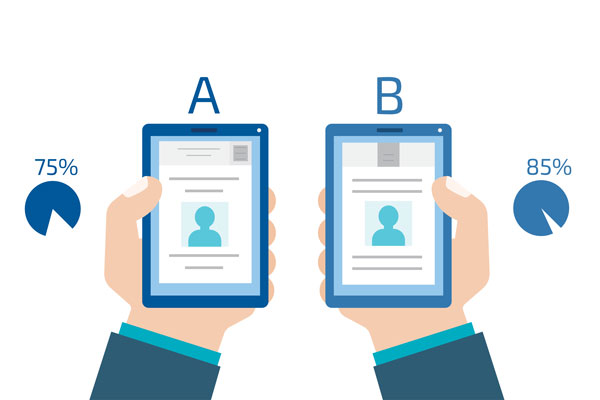
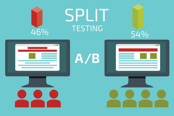
A/B testing tests different designs on actual users. They are online experiments used to explore options and design variations on a subset of users in order to validate the best solutions. A/B testing is most effective with a larger sample size and for a determined period of time (often a week or so).

Simply put, A/B tests put two (or more) variations of a design out into the world to see what happens. It's best to only change one thing at a time, so you can determine what caused the change. Aspects of design that you can A/B test:
Colors
Logo placement
Button text
Button placement
Layout
Images (imagery, size, placement)
Headlines
Content
Not all users will see the alternative design(s). Some users will see the "control" or design that is already being used that will serve as a baseline and point of comparison. Metrics can be used to measure which version was the "winner" based on the goals and objectives of the A/B test. A/B tests give you a better understanding of how designs will perform in the "real world" and also allow you to test on a larger group of users than with usability tests.
Make site improvements with A/B testing
A LOT of factors can influence UX design and every product, scenario and situation provide different challenges. As a rule of thumb, don't change something that's already working. Prioritize what will have the biggest impact on ROI (return on investment) instead. Your goal is to get your site or product working well so you can optimize it and make it as effective as possible. This is achieved by making small adjustments rather than major design overhauls
Let's say you have a webpage that is performing well, but you still want to see if it can do better. You take all the data you've collected from usability tests, Google Analytics, and your heat maps to make a few changes in how you're presenting the content on the page.
In order to validate your assumptions, you decide to A/B test before fully implementing the new page design. You run the test for one week to a small proportion of your user base. Even though the original design was more aesthetically pleasing, the redesign resulted in a 30% increase in purchases on the site.

The strongest A/B tests often involve small changes, like changing the placement of a button or another single aspect of a layout for each test. When you change too much at once, you won’t fully understand what specific change users are responding to.
Rather than a major redesign, incremental design improvements over time can have the largest impact in UX design. Even a 5% improvement in conversions can lead to millions of dollars in revenue in certain contexts. Once you find the area of a site you want to focus on, you can continue to optimize through watching metrics and testing subtle alternatives until you achieve a result that will satisfy both business and user goals.
One of the challenges with A/B tests is that you need a statistically significant sample size in order to have results you can trust. On a smaller scale you can test out ideas through usability testing. Don’t be afraid to use multiple methodologies to help you better understand users, and build better products.
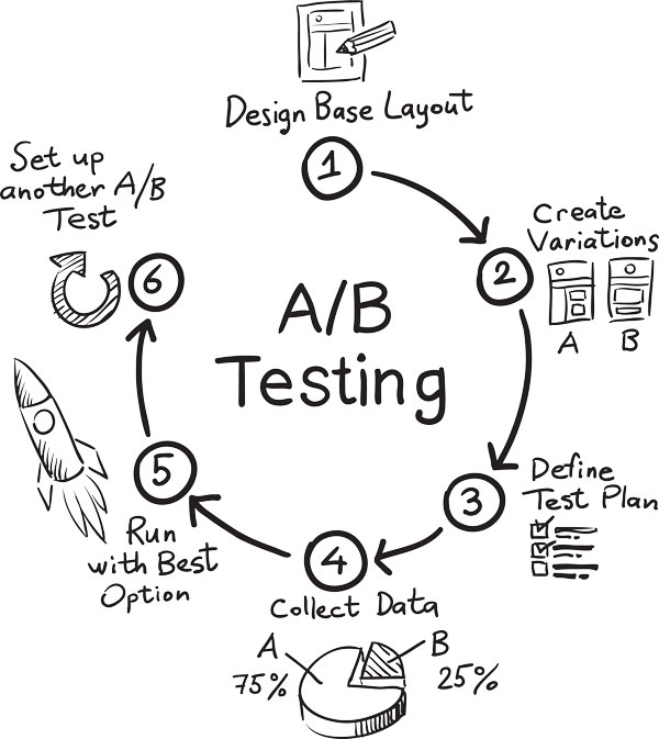
Also keep in mind that the rests from A/B tests may lead to additional tests. Design is ongoing and your job is never done! Keep making improvements.

Create and validate a hypothesis
Teams like Netflix rely heavily on data in order to learn about user behavior and inform their design direction. Designers may have a natural hunch, but it's also a good idea to get validation that what you're doing is actually working. Netflix has a tech blog on Medium and an entire website devoted to their research where they share insights into how they approach challenges.
"Observe what people do, not what they say." Navin Iyengar — Design like a Scientist: A/B Testing UX at Netflix [36:53 min]
In the video from the Push Conference, Navin Iyengar, Lead Product Designer for Netflix, presents a hypothesis Netflix has used as a baseline for their experiments:
Personalizing the content displayed on the home page will result in more people retaining their Netflix subscription.
For Netflix, there wasn't one obvious answer to the hypothesis. The idea is to examine different possibilities and develop a few variations for each. Each variation is assigned a random sample of users who aren't aware they're part of a test group and don't realize that what they see is different than what other users see. The existing design is used as the control group and point of comparison. The "winner" is the design that best reflects the objectives and metrics defined in the hypothesis.
The book Designing with Data: improving the user experience with A/B testing (parts are available on Google Books) also uses Netflix as a case study throughout the book, looking at different versions of the homepage that have been used over the years. The authors recommend one way of constructing a hypothesis with the formula:
For [ user group(s) ], if [ change ] then [ effect ] because [ rationale ], which will impact [ measure ].
Adapt your hypothesis as needed. Ultimately, keep in mind what your goals are for each A/B test. You may learn about other aspects of the user experience in the process, so don't ignore data just because you didn't get the results you expected.
Let's recap!
A/B testing is a way to compare two variations of a design in order to determine which is more effective.
A/B tests happen over a determined set of time for a subset of users.
A/B tests are looked at next to a "control" group in order to see if there was any improvement in the desired measure.
Creating a hypothesis is a way to articulate what you expect to happen, which is then compared to measurable results after the test is over.
Ever considered an OpenClassrooms diploma?
- Up to 100% of your training program funded
- Flexible start date
- Career-focused projects
- Individual mentoring
Find the training program and funding option that suits you best
