Explore the benefits of design systems
Design systems are style guides which dictate the colors, type, look, and feel of a product and are likely to include design principles, component library, code snippets, contextual guidelines, and even downloadable resources like Sketch files. They are useful resources for both designers and developers, as they save time from having to design from scratch all the time and help ensure more consistency across work. While design systems are a relatively new concept, they've been quickly adapted and adopted by many in the tech world.
Even if you don't need a full-fledged design system for the small-scale project you're working on, they're still useful for helping you think about what goes into building your product. Let's break down design systems to get a sense of their benefits.
Conduct an interface inventory
The need for a design system becomes more apparent once you see how a website has grown and all the multitude of styles that have grown with it (not in a good way). From the surface, everything may look pretty good, but if you take a closer look, any existing site may be a bit messier than you first expected.
An interface inventory (also referred to as a UI audit) is a way of examining all the unique instances a pattern or style appears. It's not uncommon to uncover dozens of different styles of buttons, different colors, or type sizes on a site.
Don't believe me? Use the website cssstats.com and plug in different websites to see get a sense of the different colors, type, and sizes they use. Of course, there may be hidden corners of websites that never got updated that factor into the numerous colors and type sizes. Ideally, you'll have a limited number of colors and styles on a website, and that's what a design system can help achieve.
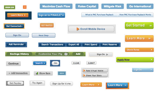
Brad Frost, the author of Atomic Design and advocate for design systems, suggests that interface inventories be conducted by teams and stakeholders. It's not until everyone involved fully gets a sense of the mess at hand that they'll understand the need and value of a design system. (If you need to get signed off by the person that approves your team's budget, be sure to include them in the process. 😉)
Building on style guides
Style guides were the first iteration of design systems on the web designed to set standards that ensure a consistent design and identity. They involved defining colors and typography in a way that would help define the look and feel of a product or organization. The biggest issue was that this documentation often lived with designers, and sometimes marketing teams or other departments could have benefited from the information as well.
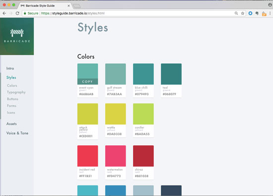
The Barricade style guide features basic design including color, typography, buttons, forms, and icons.
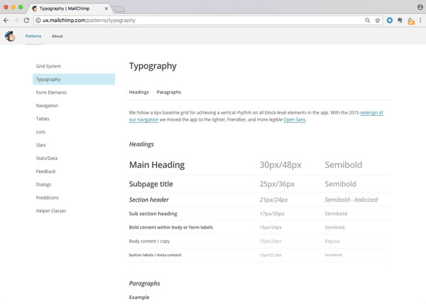
The typography guidelines from MailChimp's Pattern Library resource are applied to all MailChimp products. Lower on the page there are examples of type used in paragraphs.
As designing digital products has grown, so has the need for reusable components and patterns. Instead of having to rebuild or reinvent something for each new product or feature, the idea with systems is that you can reuse or adapt an existing pattern. When you're less focused on having to define the style each time, this also allows you to focus more on the user experience.
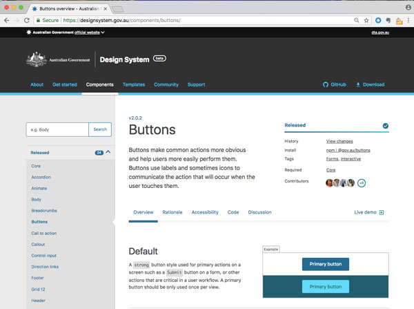
The design system from the Australian government defines the look and style of various button types, and when each is used.
The inclusion of usage guidelines that explain how and when to use certain elements through clear, simple text is another useful aspect often included in design systems. The ability to better understand the context in which a component is used (or not used), is highly valuable and saves time for everyone. (Check out the U.S. Web Design Standards as a strong example of design elements accompanied by helpful text.)
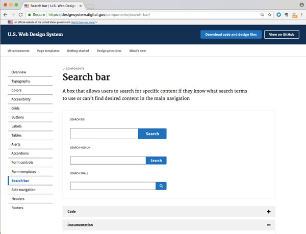
Search bar guidelines for U.S. Web Design System. More usability guidelines and code snippets are available lower on the page. The two lines of text defining what a search bar does may seem like common sense (yet can be quite challenging to write), but it is very useful to define various components so that everyone is speaking the same language on a project.
Brad Frost warns that a Sketch library is not a design system. However, if you're just starting out, looking to your Sketch (or whatever software you're using) library can be a good place to start defining your design elements. A style guide may be a PDF document that can be shared and then evolve to a digital version that is quicker to update (InVision tools such as Brand.ai and other platforms have tools built in to help facilitate style guides). Eventually, all this information may become a more robust resource with more than just graphic elements and have an entire website devoted to it—this is what we tend to call a design system.
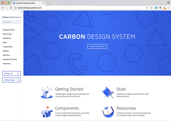
Carbon is IBM's design system. It is useful to look at to see how different elements of design are broken down into smaller parts.
Aligning designers and developers
It is more and more common to find integrated teams these days where designers and developers sit next to each other. A lot of communication needs to happen to make projects come to life.
When a design system is in place, it not only includes the visual component (design), but there often is the associated code as well. The idea is that design and development are together and not separated. What this means for developers is that they can copy and paste the code directly into the project. This adds not only to the consistency of the code of the site, but it also contributes to the look and feel. When it comes time to make updates, it's much easier, faster, and less time-consuming.
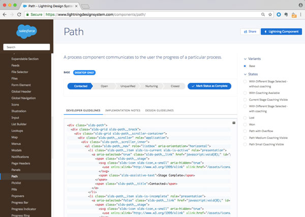
Salesforce's Lightning Design System includes the code to execute a UI component. The code above is for creating a path. A path is defined here as "a process component [that] communicates to the user the progress of a particular process." Under the visual of a sample path, the associated code is available for developers to copy.
As a centralized hub, design systems help align teams and lead to greater speed, efficiency, and consistency of work. They include big picture goals and the nuances to achieve them. You not only know what something looks like, but you also know when and how to use it. Not only is the typeface defined but also the sizes and style such as bold or italics as well as color and different states.
Design systems can benefit everyone working on a project. Rather than wasting time having to design the same component over and over, you can now spend your time working on high-level ideas. Once a design system is in place, making future changes is much easier as the new treatment can be applied across the platform.
Inspiration from existing design systems
As a designer new to the field, you can learn about what good design is and best practices by looking to existing design systems.
Lightening Design System by Salesforce (considered top of the line)
Carbon (IBM's design system)
U.S. Web Design Standards (who knew government websites could be so clean and polished!)
Gov.uk (the Brits have their own approach)
Adele (a repository of publicly available design systems and pattern libraries, curated by UX Pin)
You can find more in the final chapter of the course Manage Creative Projects
The other interesting benefit of design systems being shared publicly online is that they serve as a great recruitment tool for the companies that have created them. You can gain a lot of insight into how a company works. So, before a job interview, be sure to check to see if the company has a design system! (Note: they often have funny names, like Trello's Nachos.)
Let's Recap!
Interface inventories are a helpful tool to uncover the inconsistencies on a website or digital product.
Style guides are a useful way to define common elements on a website: typography, color, and basic components such as buttons.
Design systems are not limited to designers but are highly beneficial for developers and content strategists as well. They are useful for all team members collaborating and working towards a common goal.
Design systems help increase consistency across a project, save time from having to recreate existing elements, give teams a shared vocabulary for what they're working on, and make future updates to a project easier because everything is clearly defined.
