Table of contents
- Part 1
Examine the core foundations of UI
- Part 2
Bring digital products to life through visual design
Table of contents
- Part 1
Examine the core foundations of UI
- Part 2
Bring digital products to life through visual design
Use Material Design as a reference
Design patterns are a way of establishing UX best practices and understanding the relationships of design elements. When a user is familiar with certain ways of doing things (how a button works, where to click for menus, etc.), it is more intuitive, in turn lightening the cognitive load on users.
Patterns are created to be reusable in many different contexts. While there is structure within patterns, there is also flexiblity to be creative.
From skeuomorphic design to patterns
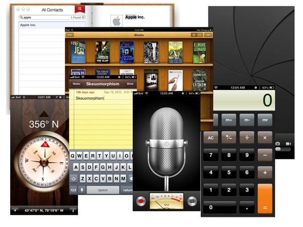
During the early days of digital products, particularly smartphones, the designs being used could be described as skeuomorphic, where the interface mimics the real world counterpart. For the iPhone the notes app resembled a piece of paper with lines on it. Similarly, the digital address book included tabs that resembled physical paper tabs and e-books were displayed on "wooden" shelves as if in a real bookstore.

Screenshots of early versions of iPhone apps that resembled the physical version of what they represented. This included notebook paper, a microphone, and a camera with a camera shutter. These designs can be described as skeuomorphic (from IXD.prattsi.org).
Since the time that smartphones hit the market in the early 2000s, not only has technology come a long way, but users have become far more savvy using digital interfaces. While design can still draw inspiration from physical objects, most apps don't need to resemble those counterparts in order to be user-friendly. It's a good idea to take note of examples you encounter that embrace skeuomorphic design and those that take design in another direction.
Today designers spend more time referring to pattern libraries, which are layout conventions that have become well established ways of how to display information.
Designing with patterns and components
In the words of Jakob Nielsen, "Consistency is one of the most powerful usability principles: when things always behave the same, users don't have to worry about what will happen. Instead, they know what will happen based on earlier experience."
Working with patterns and components are two ways designers are able to achieve more consistency when designing, particularly designing across platforms and devices.
Google is one group that's sought to frame how we approach and design interactions.
Material Design
Google's Material Design library is one of the most popular sources when it comes to components and patterns. Providing tools and open source projects, the goal is to help take product design to the next level.
Material Design is based on the principles:
Material is the metaphor
Bold, graphic, intentional
Motion provides meaning
These principles help guide their approach to design. There are material properties that help define the behaviors and characteristics.
"Design is more than pushing pixels. It should help solve problems." Introducing Material.io. [0:58 min]
Material Design is based on modular and customizable UI components presented in formats for Android, iOS, and web. They also include guidelines related to the visuals, interactions, and motion design that can be customized. The associated documentation communicates how the components can be implemented, along with the corresponding code.
Some of the components that you may find most useful are:
Buttons – communicates an action that will occur when a user touches them. (Different buttons serve different uses.)
Menus – a list of choices
Cards – an entry point for more detailed information, which usually includes an image, title or headline, and smaller text.
Lists – vertical indexes of text or images
Get to know all the different components. In addition to overall functionality, it also is important to pay attention to details such as sizing, spacing, and shadows. Each element adds consistency and polish to your design.
Some of the common patterns you may find useful are:
Search
Empty states – when there is no content to be shown (often when a user is new to a platform).
Errors – when an app fails to complete an action.
Launch screens – a user's first experience with your application.
Navigation
Another key aspect of Material Design is that it takes accessibility into account keeping users of all abilities in mind to be able to navigate, understand, and use your UI. This includes everything from considering visual cues, contrast in color, and the way sound and motion are implemented.
Material Design also communicates the do's and don'ts of web design from different styles of buttons and how interactions work to the way images are displayed and shadows appear to how to handle notifications and alerts. Many of their examples may seem like common sense, but the reason for including these are because bad design does exist in the wild world of the web.
In order to better understand Material Design, it is helpful to consider how it came to be:
The making of Material Design [6:50 min]
The major benefit of Material Design is that these patterns have been tested with users so they're proven to work, and they also take into account accessibility guidelines.
Let's Recap!
Digital products no longer have to be designed to look exactly like their real-world equivalents.
Consistency is crucial to user experience.
Patterns and components are elements that can be reused and that create more consistent designs.
Material Design by Google is a living document that brings together principles of good design, interactions, and innovation. It provides guidelines and specific layouts to draw from when working on your own projects.
Ever considered an OpenClassrooms diploma?
- Up to 100% of your training program funded
- Flexible start date
- Career-focused projects
- Individual mentoring
Find the training program and funding option that suits you best
