Look to usability testing and metrics to inform content decisions
Throughout the design process, we're not just talking to users. It's essential to actually LISTEN to what they have to say. We also have to be aware of the biases we carry to make sure we're putting users first, and designing for them, not for ourselves. Usability tests are a great way to learn from how users interact with a product through their own voice. Similarly, we can learn a lot about user behavior and interests by digging into product metrics. We can use what we learn from users to inform not only design decisions, but content decisions as well. It's important to write copy in a way that will resonate with, and motivate, users and customers.
Listen to the voice of users
You can learn a lot that will inform content choices through usability tests. These tests can help you better understand user priorities, as well as the language of they use. This can inform everything from how you approach an onboarding experience, to the way sections of a page are divided, re-think the messaging and communication throughout an experience, or features and products name choices.
Conducting usability tests allows you to listen closely to the language that participants use when speaking aloud. The design team may have named a feature something like "pivot feature," but as you listen to the user describe what they're doing as they work through the task scenario they were presented, you hear them repeatedly say "change key." You discuss with the rest of the design team and realize the term the user coined was actually far more effective in communicating that step in the flow than what you initially came up with. Not only do you decide to rename that feature in the product itself, but you also integrate it into the product update release notes that describe the new feature.
Jared Spool shares a story of a button that raised revenues by $300 million! During usability tests for an e-commerce site, it was discovered that the UX team's assumptions were wrong about first-time shoppers. What they learned from these tests inspired them to change the "register" button to say "continue" with a simple message below it that read, “You do not need to create an account to make purchases on our site. Simply click Continue to proceed to checkout. To make your future purchases even faster, you can create an account during checkout.” The result? A 45% increase in customer purchases! Over the course of a year, this added up to $300,000,000!
One more place you can look to inform your content decisions is on online communities, forums, and social media. Reading what users and customers are saying about you is an excellent way to gain a better understanding of the words users are using to talk about the product and features.
Users and customers likely won't use the same terminology as professionals, so pay attention to how users talk about your product. This is a great way to learn about users without having to leave your desk.
As much as possible, use language that is familiar to the user. Designers and developers are so close to the product they often forget that what's obvious to them, isn't always obvious to those using the product. Usability testing not only helps you get into the brains of users to better understand their mental models but you can get a good sense of the voice and perspective of users that can be used to inform content decisions.
What metrics and analytics can teach you about content
You can learn a lot about terminology from looking for the search terms people use to land on a website. This can be accomplished by looking at Google Analytics if you want to be product specific, or you can check Google Trends to have an understanding of terms being used on a wider scale.
In his Medium articleDesign Words with Data, UX writer John Saito examines how data can inform writing. The screenshot of Google Trends shows how looking to trends can help you decide which term is best to use.
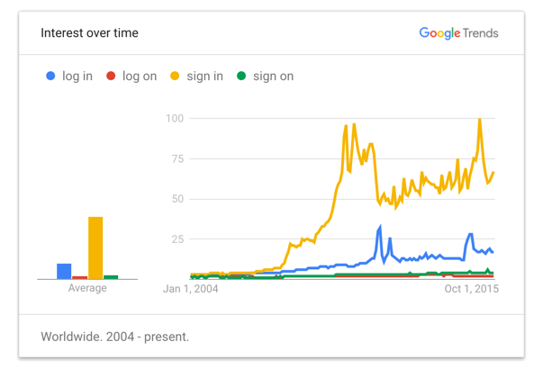
This Google Trends graph clearly shows that "sign in" is the most used term by users when wanting to complete this action. Google Trends allows you to search any set of terms and compare them.
It's easy to fall into the trap of thinking you're speaking like users, but it's always good to keep an eye on the words they use. Take the example of someone who is looking for a master's degree: they may search "graduate degree," or "masters diploma," or "advanced studies" as ways to land on what they're looking for. Terms may also vary by region or language.
In addition to making room for longer words, sometimes content must be adapted for different audiences because not all concepts make sense for different audiences.
Use headlines to guide the way
SEO, or search engine optimization, refers to how sites become more searchable (or easily found) due to the key terms embedded in a website. By optimizing results, it makes your site more likely to rise to the top of search engine results. When your site is in the top three of Google search results you're much more likely to click the link than if what you're looking for is on page three of search results.
Search is informed by everything from the names of pages to keywords embedded in text and headlines and titles throughout a page. The concept of "chunking" encourages you to divide information in a way that is more digestible for viewers, and hence making it more enticing for them to read. Headlines, sub-headings, and section headers help break up the text as well as giving the viewer an idea of what they can expect to learn from this page. Rather than having long paragraphs, consider making them shorter, along with sections. By using a bold or bigger type treatment, it also helps the information stand out.
Eye tracking studies show that users scan the page in an F-shaped pattern. People read from the left side to the right, and then down and over, each time reading a little bit less, as if to form the letter "F." An alternate way of reading is the "layer cake" where the reader's eye jumps between different headlines (like layers of frosting). 🍰
F-Pattern in Reading Digital Content [2:40 min]
If you need to convince stakeholders that no one is reading long pages and text, you may want to show them a scroll map (which we explored in the course Apply metrics to design decisions) to make a case for text that is more user friendly. When you are dealing with a lot of text, you may also want to consider how you can break it up across multiple pages.
Even for blog posts, it's important to consider how you can write the opening lines of text in an engaging way. This is often the text that appears in social media previews and can entice people to click the link and read more. This is part of the metadata which is the descriptive data that helps people find what they're looking for.
When writing on the web in addition to "chunking" information and using headlines, you also may want to consider how you can use bullet points to help get your point across, making the content more appealing to read.
The more you consider how users are approaching your content, the easier it will be to determine your next steps.
Let's recap!
Listen to users and be open to integrating their language into your product.
Usability tests and user research are great tools for understanding the language of users.
Examine what search terms users are using to land on your website.
Integrate headlines to help break up information and make it easier for the user to know what they're looking at.
