Create general page structure
In this chapter, you'll see the structure of a web page in HTML with some added color via CSS. Creating the overall structure of a page will give more context to the HTML elements you've already learned in part 2: text, lists, images, and more.
When you build a house, you start by building a structure first, and then filling in the smaller elements, right? The same is true when building a web page!
Web page structure
What do the New York Times, Wikipedia, Airbnb, and Lady Gaga's website have in common? They can all be broken down into predictable blocks.
I could actually name almost any website, and you could break down the site into remarkably predictable sections. Developers write HTML in a way that permits consistent content structure across the entire web. This reduces cognitive work for users and makes different sites display reliably across browsers, screen readers, and search engines.
Check out the following examples that I've annotated to show their different sections:
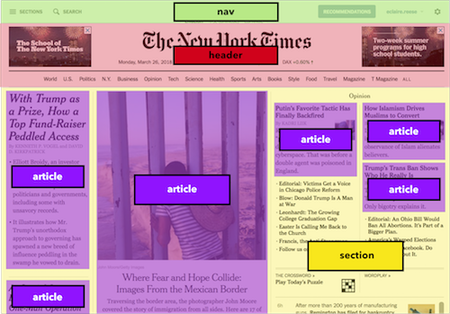
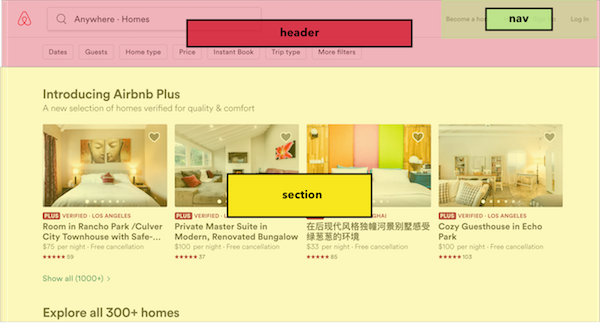
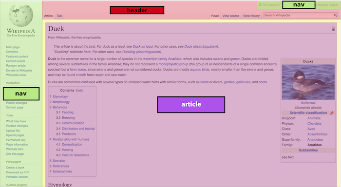
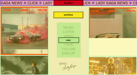
We have four wildly different sites, but they all use the same structural elements, or zones: headers, navigation areas, sections, and articles.
For example, if you look at the New York Times, they use the nav for browsing sections, searching for an article, or accessing membership options and account settings. On Airbnb, the nav allows you become a host or access your account settings. The navigation bars are suited to each site's content but are not fundamentally different.
Additionally, websites often rearrange their content blocks when viewed on mobile devices and tablets. You'll often notice articles or smaller content pieces stacking vertically on smaller screen sizes.
Structural elements in HTML include:
<header>: the section at the top of a web page that often includes a logo and sometimes a nav
<nav>: a set of menu items that allow a user to navigate to different pages on a site
<section>: a general section of related content
<article>: a piece of content that can be independently shared, like a blog post or newspaper article (even if you don't display the full article text, like you just show a preview, you can still use an article tag to delineate this content)
<footer>: the section at the bottom of a page that often has additional links and perhaps social sharing icons
<aside>: content that is complementary but not crucial to the page's main content (this could be an informative side section on a related subject)
<figure>: a grouped image and caption that create an informative visual of some kind
Let's look at a very generic desktop page structure first:
The page is pretty wide. Now let's look at a real-life example. You can see that on the website Etsy, content does indeed have a layout that spreads out from left to right:

On the other hand, mobile views often "stack" elements vertically so they take up less horizontal space.
On this mobile view of Etsy, content indeed stacks more vertically than in the previous screenshot of the desktop view.

This is the core of semantic HTML: your code should match your content! The sooner you start thinking in terms of content zones as presented above, the better your HTML will be and the more you can adapt your CSS to make your site look differently on desktop, mobile, and more.
Structural HTML tags
Earlier in this course, you saw that to create an HTML element (like a heading), you use a set of opening and closing tags. For example, the following tags will create a heading ("h1"):
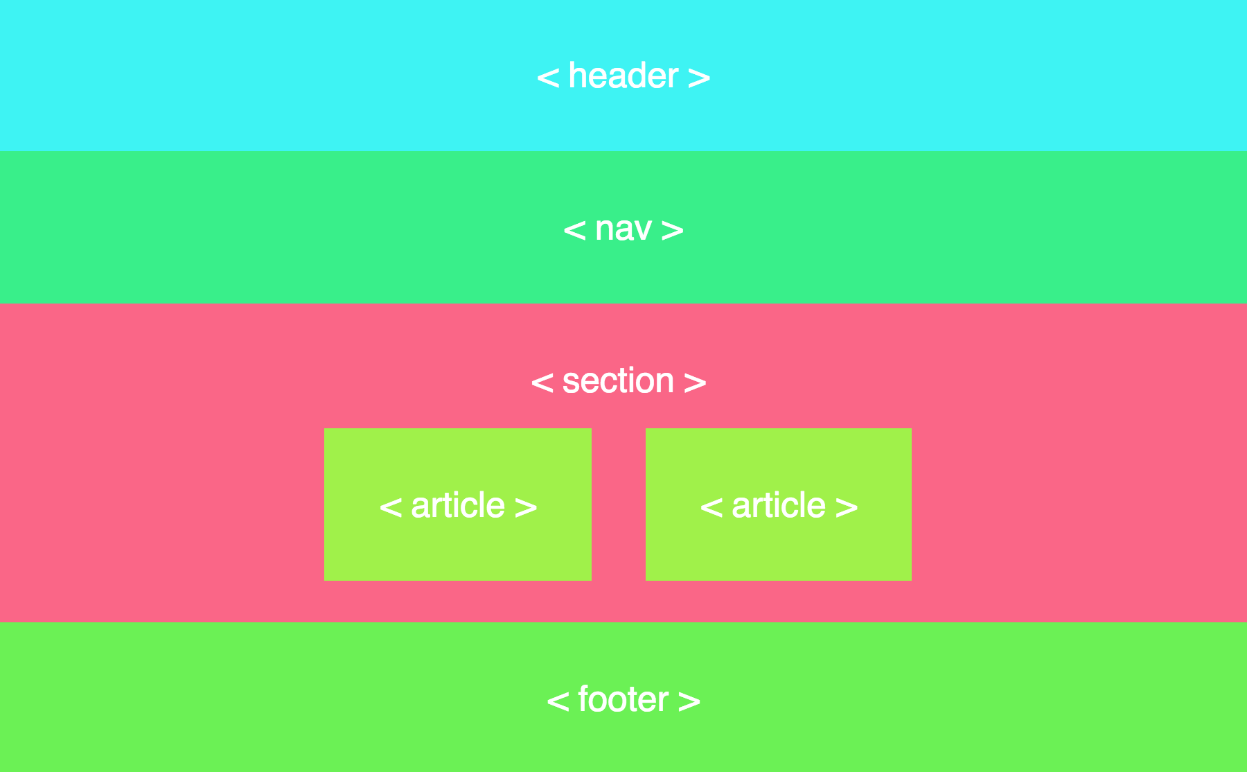
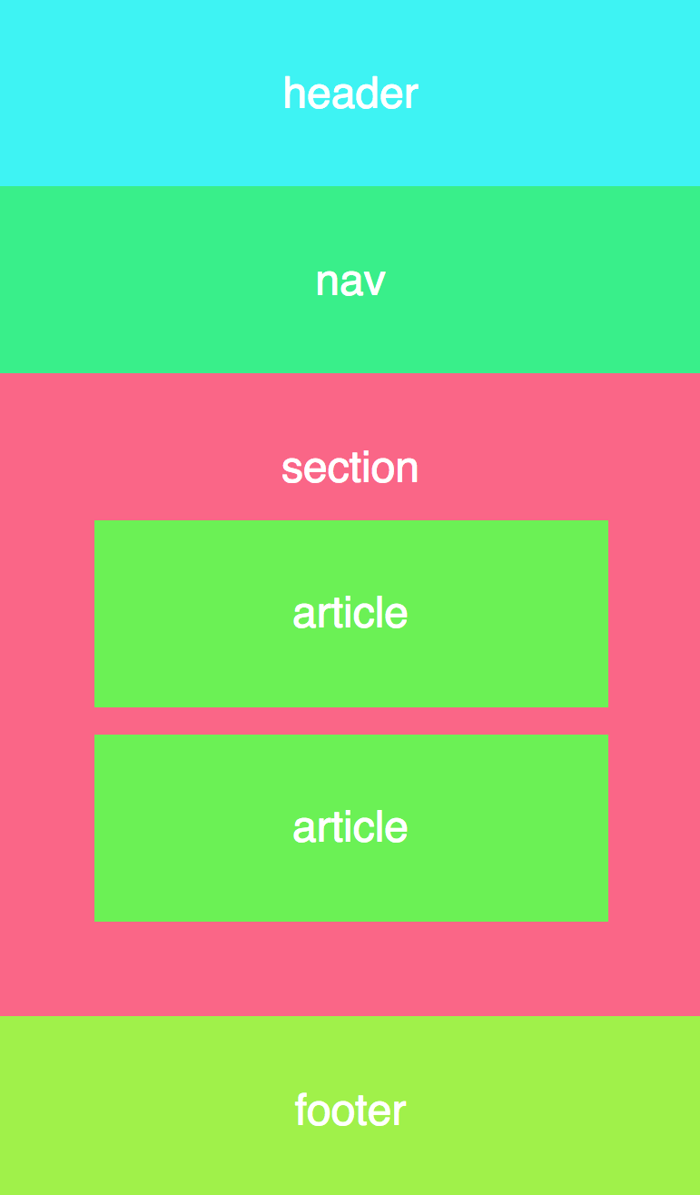
<h1>Camping essentials</h1>The format is exactly the same for creating structural elements like sections or footers. The following tags create the structural elements in the website examples above:
<header>
    <!--content-->
</header>

<nav>
    <!--content-->
</nav>

<section>
    <!--content-->
</section>

<article>
    <!--content-->
</article>

<footer>
    <!--content-->
</footer>
Open up the following code exercise and explore the different tags inside. You'll notice each element contains its name in white text. You're not obligated to do much in this exercise: simply explore the HTML, its indentation, and the way the code blocks play together.
If you want to go further in the optional exercise, though, adapt the text in each section to show text of your choice.
Practice!
Discover page zones using structural HTML tags with this CodePen Exercise.
That way, when we start talking about other structural page elements in HTML, you'll already be thinking in terms of zones!
