Set fonts
Fonts can make your site look unique and attractive. CSS offers you several ways to set fonts; the way you ultimately do so will depend on your needs.
You probably already know a bunch of fonts you might've used in presentations or at work, like Times New Roman, Arial, Verdana, etc. Let's even take a step back from there to look at fonts more basically.
The most common general font types you see online are:
sans-serif fonts
serif fonts
monospace fonts
What do these terms mean? Serif fonts have little ticks ("serifs") on the edges of each letter. Sans-serif fonts do not. Monospace fonts feature letters that are all the same width.
Compare the three main font types below:
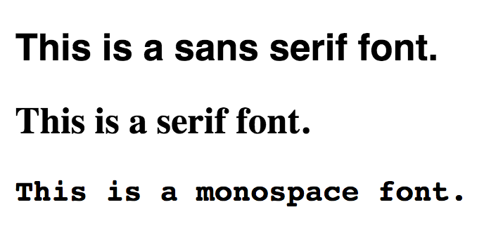
Pay particular attention to how the first font has smooth edges, whereas the second font has little feet on the wide of ends of each letter. Comparing the capital T's is a good way to see the difference.
With these differences in mind, let's see how to set specific fonts.
Font-family property
The most fundamental CSS property to know for setting fonts is font-family.
However, you can't just set its value to any font and assume it'll work for every user. A font will only display correctly if the user already has it installed on their computer.
That's why the font-family property will often contain multiple values that serve as fallbacks if a user doesn't have a certain font installed.
To set all the HTML body text (including headings, paragraphs, and everything else) to Helvetica, you might write this:
body {
    font-family: Helvetica, Arial, sans-serif;
}
What's Arial doing in there? Or sans-serif? I thought we just wanted Helvetica!
Helvetica will display just fine if the user has it installed on their machine. Specifying additional fonts allows for a similar font to be used if the user doesn't have Helvetica installed.
Therefore, the above line of code says, "If the user has Helvetica installed, show that. If they don't have Helvetica installed, but they DO have Arial installed, show Arial. If not, show whatever the default sans serif font is on their computer."
Font combinations
Some distinctive web aesthetics come from combining different font types, like a sans-serif font with a serif font.
There are some general design rules to follow when combining multiple font types on one page.
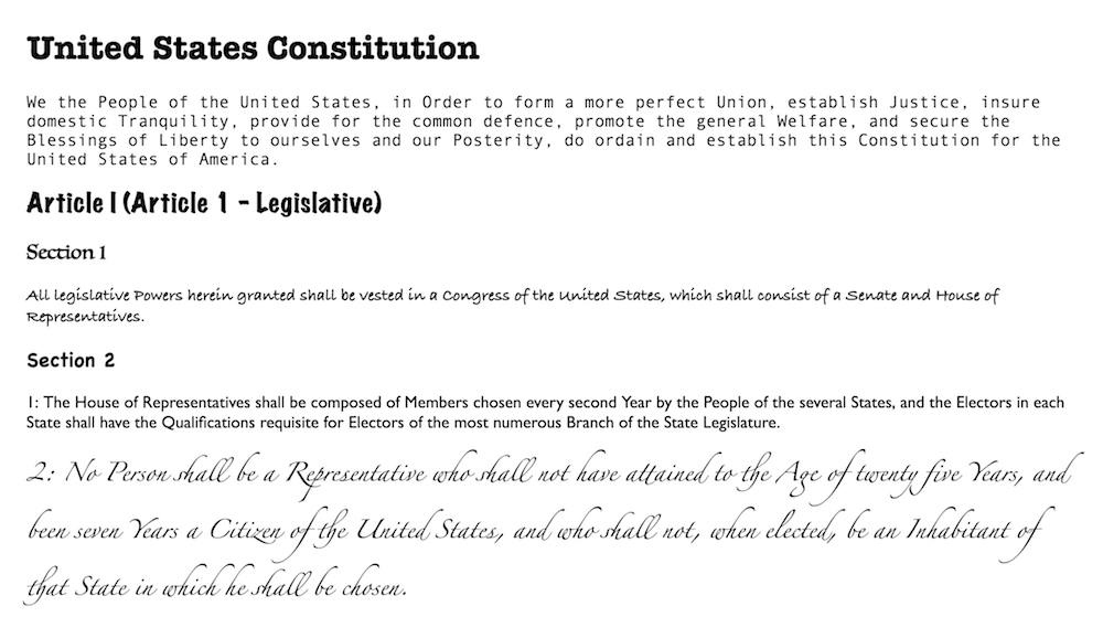
1. Don't use more than three different fonts per page. This font combination looks a little ridiculous because there is just way too much going on:
That's why it's best to stick with no more than three fonts per page, and it's important to use them consistently. This brings us to our next rule.
2. Use the same fonts consistently for content types. For example, make all your headings use the same font, all of your paragraphs use the same font, all your image captions use the same font, etc. This allows a viewer to follow a pattern of fonts instead of being mentally jarred every time they see the same content type in a different font.
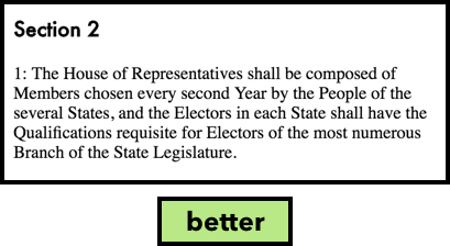
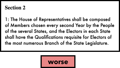
3. Combine a sans-serif headline with a serif paragraph. Serif fonts allow the eye to travel easily between letters, since the little ticks ("serifs") guide the eye from one letter to the next. Sans-serif fonts are more stark and attention-grabbing. That's why a sans-serif headline can complement a serif paragraph, but using the opposite combination can fatigue your reader.
In this example, you can see that a sans-serif headline with a serif paragraph is more readable than its opposite:
Installing your own fonts
Sometimes, you'll want to use fonts besides the standard ones that are installed on most peoples' machines. In that case, you'll need to install a custom font and include the font file as part of your project files.
Nearly an infinite number of fonts are available for download on various websites, such as:
Font Squirrel: https://www.fontsquirrel.com/
Google Fonts: https://fonts.google.com/
Urban Fonts: https://www.urbanfonts.com/
There are also many more websites that offer fonts for a paid download (the above are, in theory, free).
You'll just want to make sure the fonts you choose are licensed for commercial use. Otherwise, you can get into intellectual property trouble! Usually, this will be indicated clearly on the font page.
To include an installed font as part of your project, you need to define a font-face rule (starting with an @ sign) that defines the font family and the location of the downloaded font file:
@font-face {
    font-family: 'Milkshake';
    src: url('fonts/milkshake.otf');
}

h1 {
    font-family: Milkshake;
}
As you can see, our special font is called Milkshake. We've saved the downloaded font in a file called "fonts" and told the CSS file to go find it there.
Different font file types can work differently depending on the user's browser. If you're interested in exploring this route, check out this article that explains the difference between font file types like .eot, .otf, and more: https://creativemarket.com/blog/the-missing-guide-to-font-formats
Practice!
First exercise
Start out by experimenting with this CodePen exercise.
Second exercise
Now head to this second CodePen exercise and try setting fonts yourself. In the CSS code, add a font-family property to either the body element that's already defined or select one of the other elements and add a font-family property to it. Set it to the values of your choice. Just make sure you're specifying multiple font families in case the user doesn't have the first font choice installed on their computer, i.e.,
h2 {
    font-family: Helvetica, Arial, sans-serif;
}
In the next chapter, you'll see how to take your font customization even further with differences in font sizes, letter spacing, and word spacing.
