Trick out your text
In addition to the spacing options introduced in the previous chapter, there are other text-related properties to change your text's appearance.
We'll go through properties to make your text bold, italicized, underlined, or all in uppercase or lowercase.
font-weight
Adapting the weight of your font via CSS will cause your text to appear bolder or lighter than normal.
Hey! In part 2 of this course, didn't we learn that wrapping content in HTML <strong> tags is enough to make text bold?
True! However, remember that HTML is semantic markup for your content, and CSS controls its appearance. <strong> elements are bold by default but should only be used when the content you're writing is emphatic. Sometimes, you'll want a heavier font weight just for the sake of appearances — not for emphatic content. Use the font-weight property instead!
In this chapter, we'll use a navigation bar as our example.
<nav>
    <ul>
        <li><a href="#">Home</a></li>
        <li><a href="#">About</a></li>
        <li><a href="#">Blog</a></li>
        <li><a href="#">Contact</a></li>
    </ul>
</nav>font-weight can be set in several different ways. It can be:
a word like "normal" or "bold"
a numerical value like 400 (for normal weight), 700 (for bold), or a number in between
By setting a font-weight of normal, the font will appear at its default heaviness.
a {
font-weight: normal;
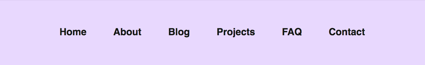
}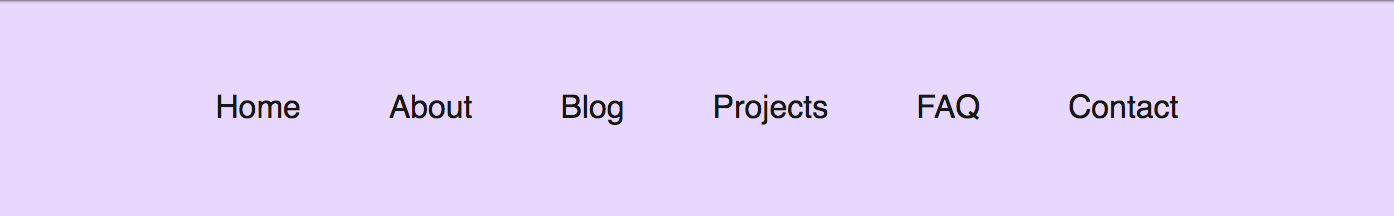 By setting a font-weight of bold, the font will appear at its default boldness:
a {
    font-weight: bold;
}
As mentioned above, you can also set a numerical value for your font weight (where 400=normal and 700=bold). You can also set a font-weight of less than 400, which often gives a nice result but depends on the font you're using:
a {
    font-weight: 200;
}
font-style
We can't talk about bold text without talking about italics! To italicize text, you'll use the font-style property. It can also be combined with a font-weight property if you like:
a {
    font-style: italic;
    font-weight: 200;
}
text-decoration
We've gone this whole course without talking about how to underline text. The <strong> HTML tag produces bold text by default, the <em> HTML tag produces italicized text by default, but no HTML element produces underlined text by default.
You must use CSS to accomplish this, no matter what. The text-decoration property will help you out.
It can take multiple values:
underline
none
line-through
a {
    text-decoration: underline;
}
<a> elements are underlined by default, so you'll often find yourself setting text-decoration: none on them to get rid of an unwanted underline.
Draw a line through text by using a property called line-through (fancy that!):
a {
    text-decoration: line-through;
}
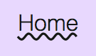
You can also add wavy or dashed effects to lines (text-decoration: underline wavy or underline dashed), but they look a little goofy. Use sparingly!
a {
    text-decoration: wavy underline;
}
Another useful visual trick is to change all your letters to uppercase or lowercase. This can be accomplished without changing your HTML. Handle it in CSS using the text-transform property.
When used, the text-transform property will most often take one of the following values:
capitalize
uppercase
lowercase
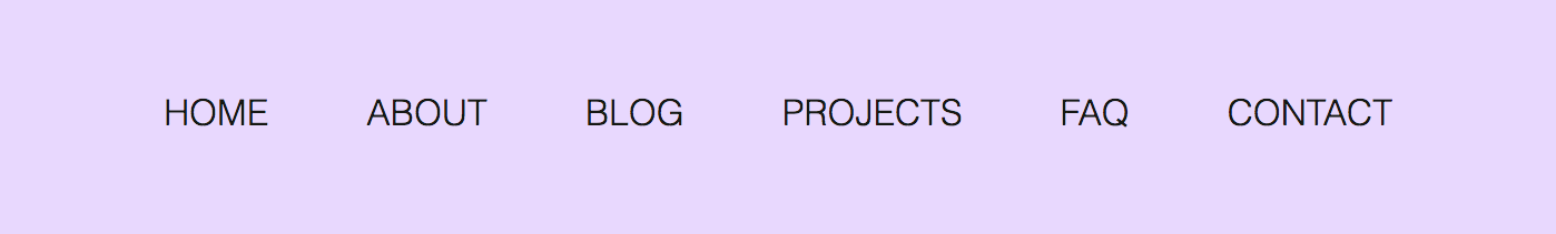
Creating letter-case harmony in navigation bars can be a pleasing visual effect:
a {
    font-weight: 200;
    font-family: Helvetica;
    text-decoration: none;
    text-transform: uppercase;
    color: #151814;
}
a {
    font-weight: 200;
    font-family: Helvetica;
    text-decoration: none;
    text-transform: lowercase;
    color: #151814;
}
Styles based on status
You'll sometimes want to apply styles when an element has a particular status, like when a link has been visited or when the user is hovering over an element with their mouse.
Enter CSS pseudo-classes. Despite the sci-fi-sounding name, their syntax is simple! Just add a colon and the name of the pseudo-class onto your selected element.
We'll cover only a few pseudo-classes in this chapter that are commonly applied to links:
:visited
:hover
:active
You can find the full list of pseudo-classes here: https://developer.mozilla.org/en-US/docs/Web/CSS/Pseudo-classes
:visited
Web links are blue by default and purple when they've visited. You've probably seen these colors before:
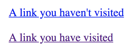
The generic blue and purple are not very awe-inspiring, and you'll often want to change them. You can change the blue by changing the color property on the a tag directly, but what about that bummer purple?
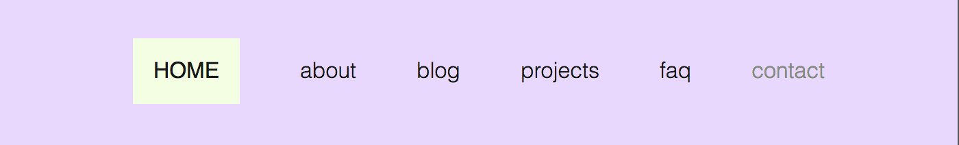
Let's apply a new visited link color to the navigation example above, where a user has already clicked on the "contact" link:
a:visited {
    color: #858C7B;
}
This isn't a dramatic visual effect but nonetheless helps users orient themselves around your site by making it clear which links they haven't clicked yet.
:hover
When a user hovers over elements like buttons or links, it can be helpful to have a visual change take place on the element. Use the pseudo-class "hover" to apply this change to any element!
In the following navigation bar example, when a user hovers over a link, its background color will change, and its text will be uppercase (the screenshot is from when I was hovering over the "Home" button):
a:hover {
    color: #151814;
    background-color: #DFFFD6;
    text-transform: uppercase;
    font-weight: normal;
}
:active
When an element is clicked, it's nice to show a little visual effect to increase the sensation of interactivity. A light visual effect can be pleasant when an element is clicked. In this case, the clicked element is an "active" element only while the mouse button is pressing down on it.
When a link is clicked in our navigation example, I've made it so the background color changes from the light green in its hovered state to a light yellow in its active state:
a:active {
    background-color: #F3FFE1;
}
Practice!
Exercise 1
First, experiment with this example in CodePen!
Exercise 2
Here's one final interactive exercise for this course before you do a larger activity -- building a page from scratch -- yourself! Head to this CodePen exercise and follow the instructions below:
In the CSS code, add a
text-transformproperty to thelielements to either make all the text uppercase or lowercase.Add a
font-weightof your choice to thelielements. It must be different than the normal font weight, i.e.,300ornormal.
Go further with forms and tables
You've reached the end of this course, but if you're itching to take your HTML skills to the next level, we recommend learning about forms and tables, two highly useful HTML elements. 😎
