Align multiple lines of content
The examples we have seen so far involved a single row or column. Sometimes, though, you'll have multiple lines of content. You can control how to distribute them with a property called align-content.
I know, all these properties kinda sound the same. Just remember:
justify-content: align items along the main axisalign-items: align items along the cross axisalign-content: align multiple rows or columns along the cross-axis
Because this property only applies to multiline content, I'll add a bunch more elements to our HTML.
<div class="container">
    <div class="item">1</div>
    <div class="item">2</div>
    <div class="item">3</div>
    <div class="item">4</div>
    <div class="item">5</div>
    <div class="item">6</div>
    <div class="item">7</div>
    <div class="item">8</div>
    <div class="item">9</div>
    <div class="item">10</div>
    <div class="item">11</div>
    <div class="item">12</div>
    <div class="item">13</div>
    <div class="item">14</div>
    <div class="item">15</div>
    <div class="item">16</div>
    <div class="item">17</div>
</div>
Here's the accompanying starter CSS for the container element. Note that the elements are set to wrap, which is important! Otherwise, they'd all try to cram onto one line:
.container {
border: 2px solid black;
display: flex;
flex-direction: row;
flex-wrap: wrap;
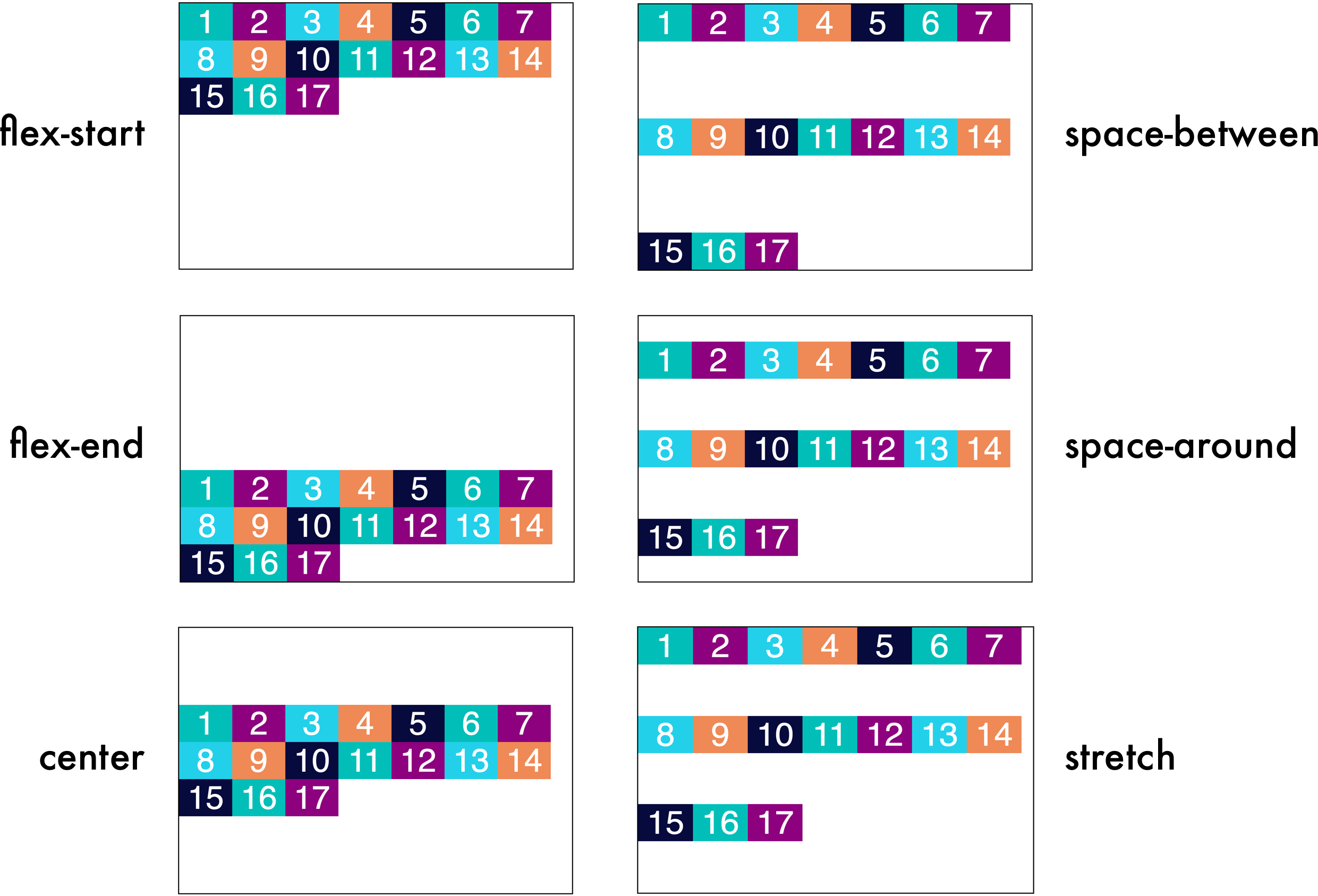
}Now, we can add an align-content property that can take the following values:
flex-start: elements are placed at the beginning of the containerflex-end: elements are placed at the end of the containercenter: elements are placed in the centerspace-between: elements are separated with space around themspace-around: elements are separated with space around them, as well as space between the elements the container edgestretch: this is the default. Elements stretch to take up the whole container.
Your Turn
Try out aligning multiple rows of content yourself in the following interactive exercise!
In
style.css, find thedivwith a class ofcontainer.Align multiple rows of content along the cross axis (
align-content) using the value of your choice. It could beflex-start,flex-end,center,space-between,space-around, orstretch.
Feel free to play around with a bunch of them.
Recap:
Use
align-contentto align multiple rows or columns along the cross-axis.
