Write selectors with BEM
Write with intent
The truth of the matter is that you will spend more time reading your code than writing it. You’ll need to scroll through your code, looking for an element to revise or poke around to remember how something works.
It’s important that when you are writing code, you do so with the future in mind. Your future self may not remember why you named that selector .btn-alt , and even what it does.
Being able to look at a class name and know what it does and how it interacts with other elements will save a lot of time and energy in the future. Enter BEM, a CSS naming methodology that will help you do just that.
BEM is an acronym for block, element, modifier. By assigning each selector you write to one of those three categories, you are able to define their functionality and hierarchical relationships, while naming them appropriately.
Cool, right? But what, exactly, are blocks, elements, and modifiers?
Building blocks: blocks, elements, and modifiers
A block is a component, or section, of a page that can stand alone and function independently from the rest of the page. This could be a header, container, menu, or button. The key is that you could strip away all of the surrounding website and it would still make sense.
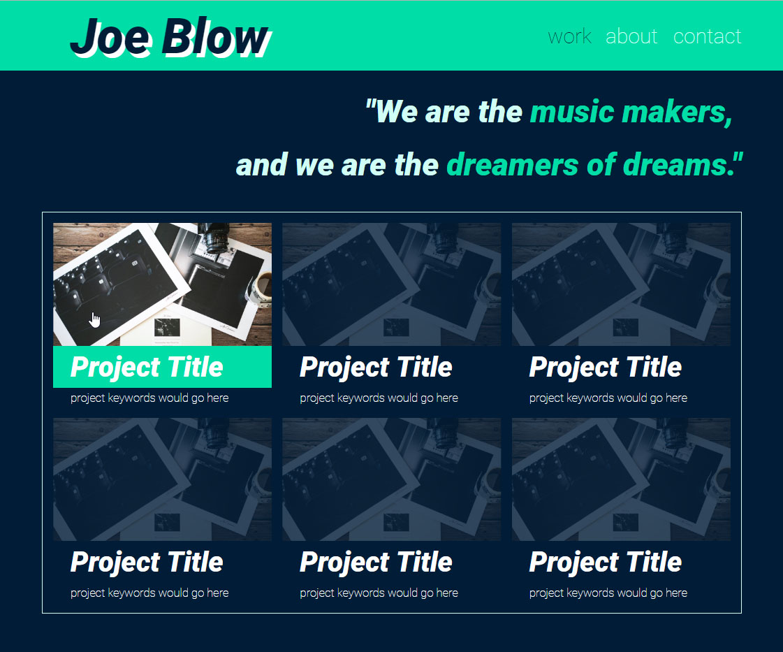
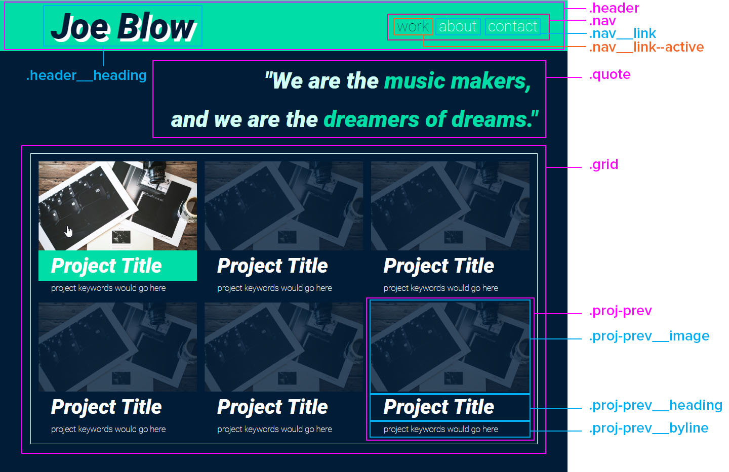
Let’s take a look at a portfolio site that we will be building throughout this course. We have a logo, navigation, quote, and project grid:
Now, if we removed everything but the Project Title, it wouldn’t make much sense on its own; there’s nothing to give a title to, instead, it's just a snippet of text.

But if we were to isolate the project preview, it still works; there's an image with a title and descriptive text. It makes sense on its own. That means that, in BEM terminology, our project preview is a block!
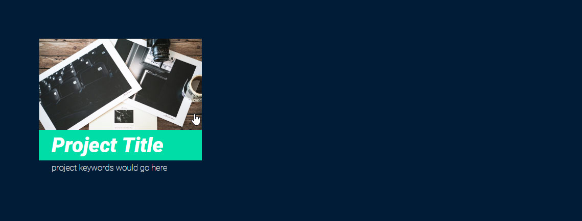
You name a block by describing its purpose. Let’s name the block selector for our project preview .proj-prev, and only assign rules that are specific to the setup of the block. Don't worry about giving the title its padding or the opacity of the image.
Instead, we can set the font to be white which all of the elements in the block use. By assigning it to the block, its elements will inherit the color. We also need to apply a margin to the bottom of the block:
CSS
.proj-prev {
    color: #fff;
    margin-bottom: .25rem;
}
We’ve used the .proj-prev block selector to establish the shape: it has a bit of a margin on the bottom and uses a white font. No matter what you fill the project preview with, it will need to use a white font and have a margin at the bottom. We have a recyclable block of code, which allows us to keep a tidy codebase, while also providing graphical consistency.
Now, remember that text for the project title that wouldn’t work on its own? Since it doesn’t function independently, but rather forms an integral part of the block, it's an element of the block.
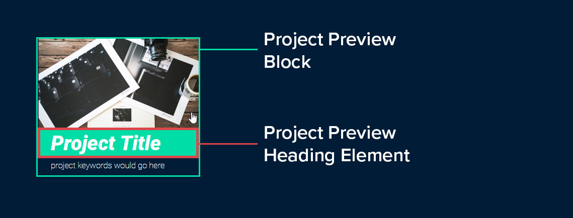
The name of an element should identify its parent block, followed by double underscores (also known as “dunders”), and then the element’s purpose. Since it's the heading for the project preview, we'll name it .proj-prev__heading and assign the following rule set:
CSS
.proj-prev__heading {
    font-size: 4rem;
    padding-left: 2.5rem;
    margin: 0;
    line-height: 6rem;
}
That leaves us with modifiers which, as its name indicates, changes the appearance of a block or element. Think of them as selectors that produce different versions of blocks and elements. Need to change the size, color, typography, etc., of an element, but otherwise, leave it as it is? That’s what modifiers are for!
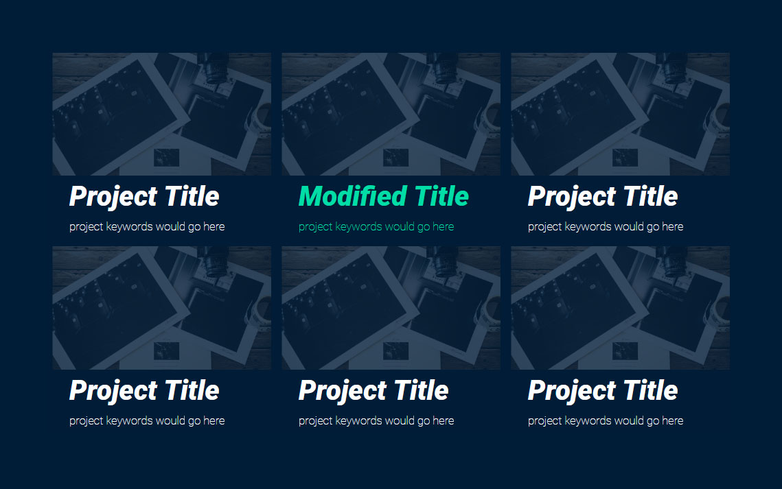
Say you want to do something a bit different for some of the projects to make them stand out. The standard font color for the block is white, but for certain projects, you want to highlight them by using a minty color instead.
To do this, you’ll create a modifier for your .proj-prev block. To name the modifier, first identify what it’s modifying, followed by two dashes, and then the visual style of the modifier. Since you are modifying the .proj-prev block to have a mint font color, you can call it.proj-prev--mint, and style it as follows:
CSS
.proj-prev--mint {
    color: #15DEA5;
}
And apply it to the HTML block:
HTML
<section class="proj-prev proj-prev--mint">
    <div class="proj-prev__image">
        <img src="/public/img/photography_1280w.jpg" alt="project title goes here" >
    </div>
    <h1 class="proj-prev__heading">
        Project Title
    </h1>
    <p class="proj-prev__byline">
    project keywords would go here
    </p>
</section>
And when we check out the rendered HTML, you see that there is a special project highlighted by its mint text 🎉:
Here is our entire contact page, broken down into its blocks, elements, and modifiers:
Putting it all together: creating our navigation using BEM
Now that we’ve covered the basics of BEM, let’s put them to use by building and styling a nav bar with the created selectors. 🤘
<nav class="nav">
    <ul>
        <li class="nav__link nav__link--active">work</li>
        <li class="nav__link"> <a href="/about.html">about</a> </li>
        <li class="nav__link"> <a href="/contact.html">contact</a>  </li>
    </ul>
</nav>
It’s important to note that BEM selectors are always implemented as classes.
Why is that? 🤔
To be able to apply modifiers with consistent results, you need to ensure that your selectors have as low a specificity as possible. If you were to assign the block selector as an ID, rather than a class, its specificity would inherently trump all the modifying selectors assigned as a class.
Remember from the last chapter that when the browser is rendering your elements, first it looks for inline styles, then IDs, then classes, and so on down the line. If it encounters a selector attached to an element ID, it will take precedence over any conflicting rules from classes. And the entire purpose of a modifier is to introduce a conflicting rule, such as color, size, etc., and have it cancel out the original rule, which is why you always use classes when implementing BEM selectors!
And now let’s have a look at the accompanying CSS:
CSS
.nav {
    padding-right: 6rem;
    text-align: right;
}

.nav__link {
    display: inline;
    font-size: 3rem;
    padding-left: 1.5rem;
}

.nav__link a {
    text-decoration: none;
    color: #D6FFF5;
}

.nav__link--active {
    color: #001534;
}

.nav__link a:hover {
    color: #fff;
}
While we are attempting to keep the selector specificity low, pseudo-classes, such as :hover and combinators, like the descendant combinator, are perfectly acceptable to use. It’s true that they will increase the specificity of the selector, but they can help yield cleaner, more legible code by reducing the need to assign a class to every single element on the page. 😱
In CSS, combinators select elements based on their relation to a defined element. Let’s take an unordered list,<ul> , and its list items,<li> . Rather than creating a class selector for the <li> and applying it to each, you can implement a child combinator, which will select all of the direct children of the <ul> :
CSS
ul.list {
    list-style:none;
}

ul.list > li {
    font-weight: 100;
    color: #001534;
}
Which yields much cleaner HTML than applying a class to each <li> :
HTML
<ul class="list">
    <li>List Item</li>
    <li>List Item</li>
    <li>List Item</li>
</ul>
BEM has helped to make our styling more organized and efficient, and our HTML cleaner and more readable by clearly defining the function of selectors. But our CSS is still just a long, amorphous blob of code. The next chapter will introduce you to tools that will bring more visual structure to your CSS, and make your life a whole lot easier in the process. Get ready to dive into the world of CSS preprocessors and Sass!
Try it out for yourself!
Another interactive exercise coming your way - we’ve created poll, where we can vote whether a puppy is adorable, or just flat-out awwwwwww. But now that we’ve learned all about the awesomeness of BEM, our CSS feels a bit messy.
Let’s go back and refactor our code by converting the classes that make up our “poll” block, using the BEM methodology:
Identify the block class and use it as the base in the naming for the elements/modifiers
Convert the name of the other classes to fit as elements and modifiers within the block poll block.
Update the HTML document with the new class names.
Think you've got it? Compare your solution to mine with this CodePen.
Let's recap!
BEM stands for block, element, modifier.
Blocks are comprehensive units of code.
Elements are the parts that build the block.
Modifiers change the appearance or behavior of a block or element.
Blocks are named by their purpose: form
Elements use the parent block’s name, followed by a dunder ( __ ) and the element’s purpose: form__label
Modifiers use the name of the block or element that they are modifying, followed by double dashes ( -- ) and what the selector is modifying: button--green
You don’t need to give every single element on a web page a class selector. You can take advantage of combinators to help keep your HTML cleaner and leaner.
