Create multi-property CSS transitions
Bridging the gap
You’ve just learned about some cool techniques for strengthening and enhancing your animations. But it may seem pretty tough to picture pulling off some of those principles with your transitions though.
You can make things grow and shrink…. but…. how on earth are you ever going to achieve those more organic and interesting animations that you’re after?
Complexity is the key to making animations more compelling; they aren’t simply moving from point A to point B. Instead, they’re layering in other, smaller, bits of motion to create a movement that feels more authentic to the viewer.
That's nice, but that doesn't answer the question. HOW? 🤔
Up until now, we’ve only used the most minimal elements to create transitions. There are more properties that you can add, which will allow you to create more refined and complex animations.
Two for the price of one: combining transitions
The keen observer may have noticed that some of the principles, like secondary action, require animating more than one property. I mean, it’s right there in the name. secondary. But not to worry, you can animate two properties with a single transition, or three, or as many as you want, really.
Previously, we built a button that grows when hovered over. It's built as a <div> with the class of .btn assigned to it:
<body>
    <div class="container">
         <div class="btn">
            Hover over me!
         </div>
    </div>
</body>
Within Sass, we've added a pseudo-selector for the :hover state with a transform property that scales it up by 13%, and a .45 second transition:
.btn {
    background-color: $cd-btn;
    border: 4px solid $cd-btn;
    border-radius: 10rem;
    cursor: pointer;
    font-size: 3rem;
    overflow: hidden;
    padding: 1.85rem 3rem;
    position: relative;
    transition: transform 450ms;
    &:hover {
        transform: scale(1.13);
    }
}
Let’s spice up the button a bit and layer in some secondary animation by creating a :hover state that fades in the background as the button expands. Something like this:
 There's a few ways to go about animating opacity, and we'll talk about a more performant (but complex) solution in a bit. But for the sake of simplicity, let's transition the
 background-color between two different rgba() values, which we'll define as Sass variables:
$cd-btn-start: rgba(1, 28, 55, 0);
$cd-btn-end: rgba(1, 28, 55, 1);
They both have the same RGB values, but $cd-btn-start has an alpha value of 0, making it transparent, whereas $cd-btn-end has an alpha value of one, making it opaque, so that the transition will effectively animating the opacity of the color.
Now, to add a transition for our opacity change, we need to add new color variables to the .btn selector and its :hover state:
.btn {
    background-color: $cd-btn-start;
    border: 4px solid $cd-btn;
    border-radius: 10rem;
    cursor: pointer;
    font-size: 3rem;
    padding: 1.85rem 3rem;
    &:hover {
        transform: scale(1.13);
        background-color: $cd-btn-end;
    }
}
Now we have a button with a functioning :hover selector, but we still need to add in the transition properties:
When you want to transition multiple properties at once, rather than typing the name of the property that you want to transition:
transition: transform 450ms; Instead use the all keyword in its place:
transition: all 450ms;By using the all keyword, you are telling the browser to transition all of the properties you have changed within the :hover pseudo-selector, rather than a specific property. So let's add a transition to the .btn selector to animate both the scale of the button and its background opacity:
.btn {
    background-color: $cd-btn-start;
    border: 4px solid $cd-btn;
    border-radius: 10rem;
    cursor: pointer;
    font-size: 3rem;
    overflow: hidden;
    padding: 1.85rem 3rem;
    position: relative;
    transition: all 450ms;
    &:hover {
        transform: scale(1.13);
        background-color: $cd-btn-end;
    }
}
Now let's check out how our button behaves now:
Wooo! Two things happening at once!
You do your thing, I'll do mine: separating transitions
Using the all keyword is perfect for when you want multiple things to happen at the same time, and for the same duration, but there's another way to add multiple properties to a transition. Rather than using all, you can list out the animations for each property that you'd like to transition, separated by commas. So, in the case of our transitions for transform and background-color, we could split them like this:
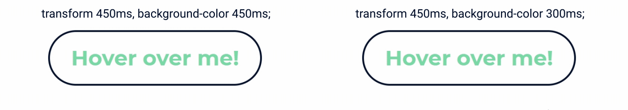
transition: transform 450ms, background-color 450ms;Now that they're separate, you can give them different durations, which can help break up the uniformity of the animation, creating something more visually interesting to engage the user. Let's make the background-color transition a little faster than the scale by shortening its duration to 300ms:
transition: transform 450ms, background-color 300ms;Now the background-color will be fully opaque before the button has finished scaling up. The difference isn't huge, but those few fractions of a second help make it feel a little less perfect and give it some texture:
By separating the transitions, you can do things to add complexity to your animations, which makes them more interesting and engaging for the user. Notice what I did there? I said things, plural. That's right, there's more!
After you... delaying transitions
Right now we are transitioning two properties, with two separate durations, but both begin simultaneously, so the background-color is fully opaque before the transform transition finishes. What would be nice is if the background-color transition waited 150ms before starting so that they both finish their animations at the same time.
We need to use the transition-delay property, which, as you might have guessed, delays the start of transition animation by however much time assigned as its value. To delay a transition by 150ms, write the code like this:
transition-delay: 150ms;Since there are two transitions occurring, you need to specify a value for each, in the order that they are declared in the transition property. In our case, we don't want to delay the transform animation, while we delay the background-color animation by 150ms:
transition: transform 450ms, background-color 300ms;
transition-delay: 0, 150ms;
Now the transitions will start 150ms apart and finish simultaneously. But, just like transition-property and transition-duration, you can write the same thing more concisely by adding transition-delay values to the transition property itself, after the transition-duration values:
transition: transform 450ms, background-color 300ms 150ms;In the case of an absence for a delay value, the transition property will assume a zero delay, so you can omit it from the transform transition. Let's take a look at our transition within the context of its Sass block:
.btn {
    background-color: $cd-btn-start;
    border: 4px solid $cd-btn;
    border-radius: 10rem;
    cursor: pointer;
    font-size: 3rem;
    overflow: hidden;
    padding: 1.85rem 3rem;
    position: relative;
    transition: transform 450ms, background-color 300ms 150ms;
    &:hover {
        transform: scale(1.13);
        background-color: $cd-btn-end;
    }
}
And here is the end result for our button:
 Things in life don't happen simultaneously. If you were to watch ultra-slow-motion footage, you would see that things happen as part of a cascade. One thing leads to another, and another. And our brains have come to expect there to be separations between events, even if they are only fractions of a second.
By creating differences in the timings of animations, both through the durations as well as offsetting their starts through delays, you can create more authentic, interesting, and entertaining visuals.
Coming up next, we'll integrate slow-in and slow-out, the sixth principle of animation, into our transitions, using the transition-timing-function property to manipulate the velocity of animations over the course of their durations.
Let's recap!
Transitions can contain animations for as many properties as you'd like.
Use the
allkeyword to transition all properties simultaneously.Separate the animations with commas, which allows you to set different values for each.
Offset the start of transitions by using delays.
