Use CSS transitions for simple animations
Let the good times begin!
Alright. Enough talking, let's start animating!
To create animations with CSS, you use either transitions or keyframes. While keyframes require a bit more to get set up and running, transitions only require a few bits of info to create. They are perfect for quick, simple animations, such as changing the appearance of a button when the user hovers over it.
Let's start with transitions which allow you to change the value of a property over a set amount of time. When you think of the word "journey," what comes to mind? Probably a traveler who follows a route from one point to another, taking a few minutes, hours, or days to complete the trip. These are the most basic components of an animation.
The traveler represents the CSS property you'd like to change. The starting point is the initial value of the animated property, the endpoint is its final value, and the time to complete the journey is its duration. Let's say you want to increase a button's scale by 15% over the course of a second:
To create a transition, the first thing you need to do is pick out your traveler: the property that you want to animate. Since you want your button to grow when a user hovers over it, the transform property and its scale() function is a good choice to achieve the effect:
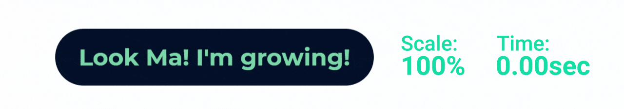
transform: scale(1.0);Let's take a quick look at the HTML we've used to build the button:
<body>
    <div class="container">
         <div class="btn">
             Look Ma! I'm growing!
         </div>
    </div>
</body>
It's made of a div with the class .btn applied to it, filled with text for the button's contents. Here's the Sass used in the .btn class to define its color, padding, and sizing:
$cd-btn: #011c37;
$cd-txt: #15DEA5;

.btn {
    background: $cd-btn;
    color: $cd-txt;
    font-size: 3rem;
    cursor: pointer;
    padding: 1.85rem 3rem;
    border-radius: 10rem;
}
Now that we've chosen the transform property as the traveler, we need to send it on a journey, where we start with a scale of 1.0 (100%) and grow it to a scale of 1.15 (115%) when the button is hovered over.
Getting from point A to point B: transitions
So, let's add transform and it's scale() function to the .btn class:
$cd-btn: #011c37;
$cd-txt: #15DEA5;

.btn {
    background: $cd-btn;
    color: $cd-txt;
    font-size: 3rem;
    cursor: pointer;
    padding: 1.85rem 3rem;
    border-radius: 10rem;
    transform: scale(1);
}
Since the button was already at its default scale of 1, nothing much has changed:

That's because we haven't given our trip it's destination yet. Since we want the button to increase in size when hovered over, let's add a :hover pseudo-selector, with the transform's scale() set to 1.15:
$cd-btn: #011c37;
$cd-txt: #15DEA5;

.btn {
    background: $cd-btn;
    color: $cd-txt;
    font-size: 3rem;
    cursor: pointer;
    padding: 1.85rem 3rem;
    border-radius: 10rem;
    transform: scale(1);
    &:hover {
        transform: scale(1.15);
    }
}
Transitions need to be triggered by a change of state, which is typically done through the use of pseudo-classes, such as :hover. Now, when we demo the button, we see our starting and ending points, but there's no animation happening; the button just jumps between the two scales:

We need to tell the browser that we want the change in scale between the inactive and :hover states to animate as a transition. We can do by adding the transition-property property to our .btn selector, naming transform as the property that we want to transition:
$cd-btn: #011c37;
$cd-txt: #15DEA5;

.btn {
    background: $cd-btn;
    color: $cd-txt;
    font-size: 3rem;
    cursor: pointer;
    padding: 1.85rem 3rem;
    border-radius: 10rem;
    transform: scale(1);
    transition-property: transform;
    &:hover {
        transform: scale(1.15);
    }
}
Okay! Now we've added a transition to the button. Let's check it out!
 Gah! We've added the
 transition-property, but it's still not animating! What are we missing? Remember, animation is a change over time. We haven't told the browser how long to make the transition, so it assumes a duration of 0 seconds, which isn't much of an animation.
Are we there yet? — timing
Let's give our transition a length by using the transition-duration property and assigning it a value for the amount of time we'd like to take to complete the transition:
transition-duration: 1s;Within CSS, you can write time in two different ways; in seconds, as we've done above, or with the number of seconds, followed by the letter "s" to denote seconds. But you can also write it in milliseconds, where 1000 milliseconds is equal to 1 second, followed by the letters "ms" to denote milliseconds:
transition-duration: 1000ms;Both methods will produce the same results, so it's a matter of personal preference as to which format you use. Let's go with milliseconds and add a duration of 1000ms to our .btn selector:
$cd-btn: #011c37;
$cd-txt: #15DEA5;

.btn {
    background: $cd-btn;
    color: $cd-txt;
    font-size: 3rem;
    cursor: pointer;
    padding: 1.85rem 3rem;
    border-radius: 10rem;
    transform: scale(1);
    transition-property: transform;
    transition-duration: 1000ms;
    &:hover {
        transform: scale(1.15);
    }
}
And now we have motion!

Perfect! At least it's growing. But it might take longer to run its course. While there are always exceptions, you generally want interactive animations to be short enough that they feel seamless to the user. Right now, you have to hover and then wait to finish the transition. So, let's reduce the transition-duration to something like 400ms, and see how that feels:
$cd-btn: #011c37;
$cd-txt: #15DEA5;

.btn {
    background: $cd-btn;
    color: $cd-txt;
    font-size: 3rem;
    cursor: pointer;
    padding: 1.85rem 3rem;
    border-radius: 10rem;
    transform: scale(1);
    transition-property: transform;
    transition-duration: 400ms;
    &:hover {
        transform: scale(1.15);
    }
}
Let's test the button again:

Perfect! The button is growing 15% over the course of 400 milliseconds. You've just built your first CSS animation!
*Virtual High Five*
I'll be brief: shorthand properties
Now, remember when I said this?
Which we can do by adding the
transition-propertyproperty to our.btnselector
I used a keyword there: can. As in there are other ways of declaring a transition. Rather than typing out each property individually:
transition-property: transform;
transition-duration: 400ms;
You can merge them all into a single, more concise property called transition, that contains all of the transition properties as a single list, starting with the name of the property, followed by a space and the duration:
transition: transform 400ms;Both formats produce the same result, but writing out transitions via the transition property and its shorthand is much more common, and what we'll be using from here on out. It's more concise and keeps the various properties grouped in a single location.
So, let's refactor the .btn code using the transition shorthand rather than individual properties:
$cd-btn: #011c37;
$cd-txt: #15DEA5;

.btn {
    background: $cd-btn;
    color: $cd-txt;
    font-size: 3rem;
    cursor: pointer;
    padding: 1.85rem 3rem;
    border-radius: 10rem;
    transform: scale(1);
    transition: transform 400ms;
    &:hover {
        transform: scale(1.15);
    }
}
Now we've tightened up the code, and everything still functions as it did before:

We've just used the:hover pseudo-selector to trigger button-growing transition, but there's a bunch of other pseudo-classes you can use with transitions. We'll dive into those next!
Let's recap!
The 4 ingredients to a transition are:
A property to animate.
The before and after values of the property.
The duration of the transition.
A pseudo-selector to trigger the animation.
Apply the before value to the element that you want to transition and the after value to the pseudo element that triggers the transition.
Write the duration in either seconds:
.4sor milliseconds:400ms.Write out the transition properties individually, ex:
transition-duration: 400ms.Or combine them into a single transition property:
transition: transform 400ms.
