Use timing functions to create more natural animations
Easy come, easy go
Every object that has ever moved and ever will move does two specific things. To begin moving, they have to accelerate, and before they can stop, they have to decelerate.
A bullet fired from a gun accelerates more rapidly than a thrown ball, but they both accelerate and it’s those rates of acceleration that our brains use to estimate an object's mass and momentum, not to mention where it’s going to be and when.
If you want your animations to feel grounded and authentic, then it’s vital that you pay attention to how objects accelerate and decelerate, or, in animation terminology, how they ease in and ease out.
Let's say that we want to animate a box to move 1000 pixels in 1000 milliseconds:
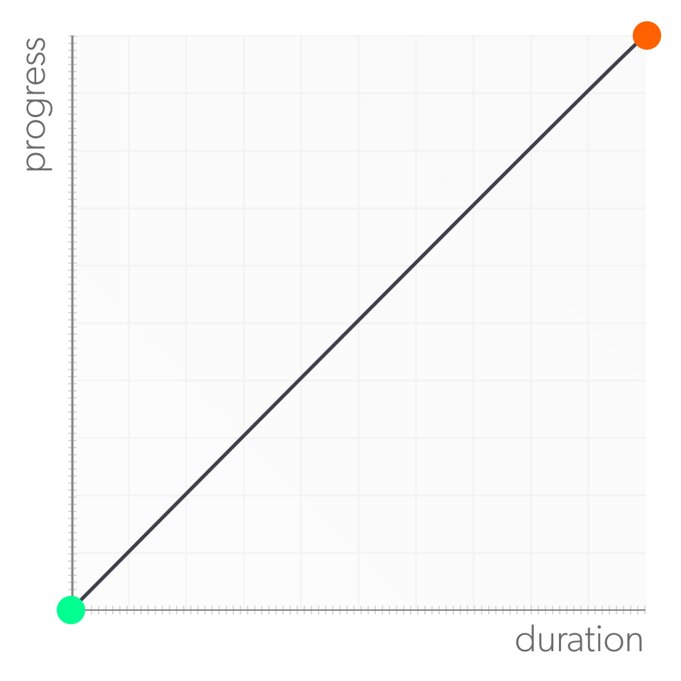
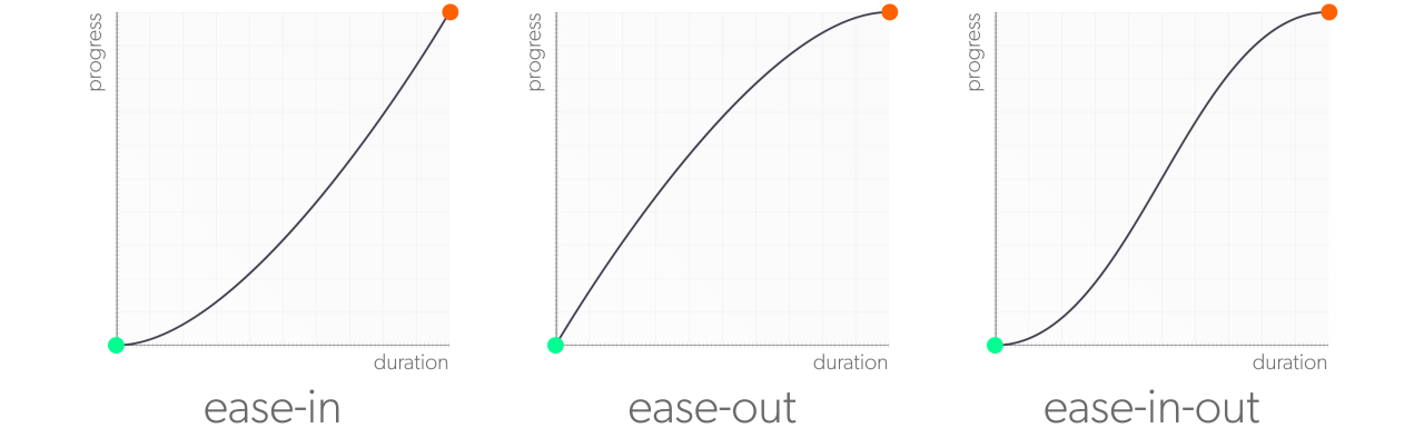
Let's talk about how we'd like our box to accelerate and decelerate, but since we're talking about a highly visual topic, a picture can be worth a thousand words. So let's break down an animation's velocity on a graph:
The X-axis represents the percentage of the duration completed, and the Y-axis represents the percentage of the motion completed. Start at 0% duration and 0% progress in the lower left corner, and finish in the upper right corner, where both the progress and durations have reached 100%.
With the starting and ending points, you can connect them with a path that represents the velocity of your animation:
Notice that the velocity isn't a straight line. Instead, its slope changes as the box accelerates at the beginning and decelerates at the end. In the beginning, the box isn't moving very quickly yet, so it hasn't completed as much progress as it has duration, making the line flatter. At around 20% into the duration-axis, the box has gotten up to speed, and it is completing its progress at a faster rate, so the line gets steeper.
But then the box needs to hit the brakes and begin decelerating, reducing the rate of progress, allowing the amount of duration completed to overtake the progress and flatten the slope of the curve as it approaches the finish. When you look at the graph, you can see the velocity of the animation at any point by the steepness of the curve. The steeper the slope, the higher the velocity; the flatter the slower.
Let's look at the box again, keeping in mind its acceleration curve:
Notice how it gets up to speed pretty quickly out of the gate, but slows down more gradually? In CSS, these acceleration curves are called timing functions, and you can use the transition-timing-function property to set the acceleration curves for your transitions.
Locked and loaded
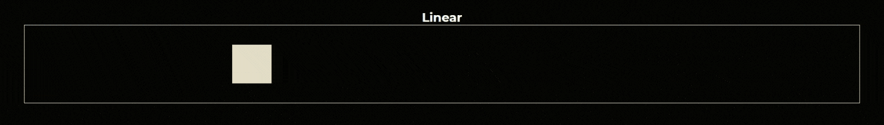
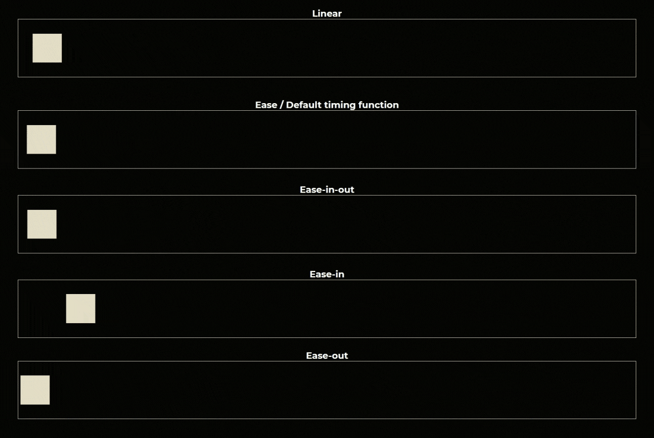
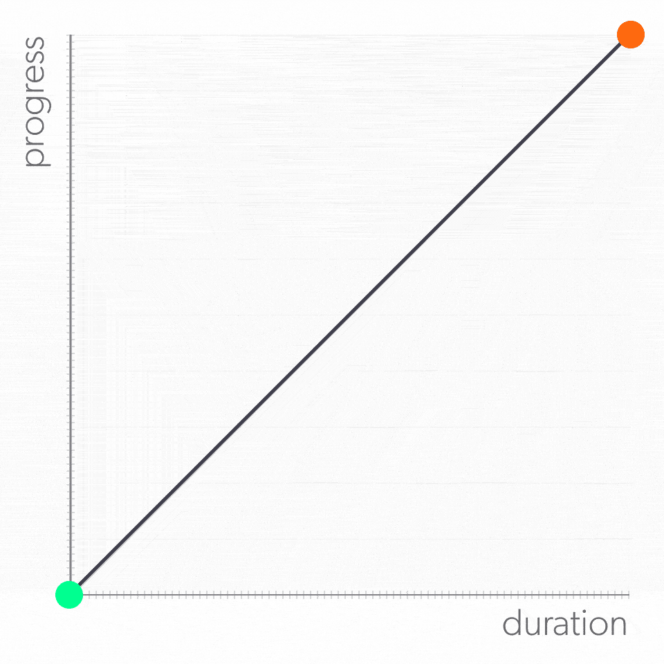
CSS comes preloaded with a variety of its own curves right at your fingertips. Let's begin with the curve that wasn't. A linear timing function has no acceleration or deceleration to its velocity. Instead, the value goes straight from point A to point B:
To apply a linear timing function to our box animation, we add the transition-timing-function property and set its value as linear:
transition: transform 1000ms;
transition-timing-function: linear;
Or add it to the transition property's shorthand by including the linear keyword in its value list:
transition: transform 1000ms linear;And when you check out our box in motion with a linear acceleration curve, you see that it's traveling at a constant speed from start to finish:
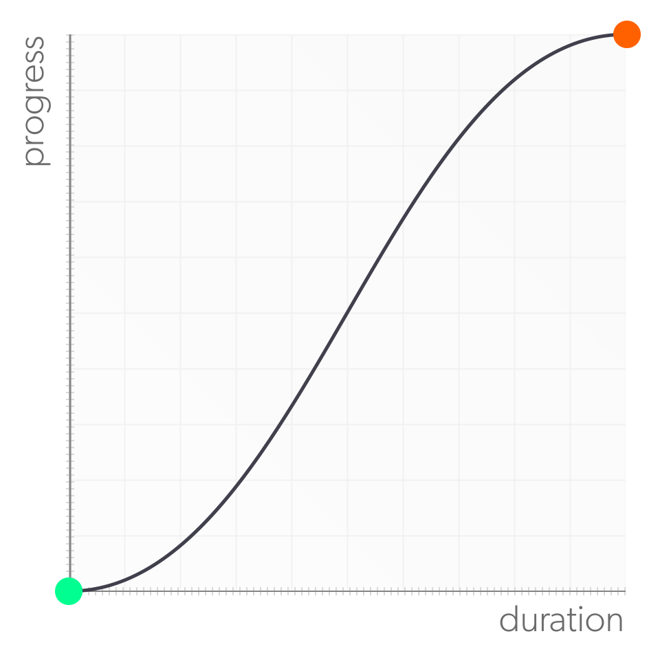
Next in the arsenal of built-in timing functions is ease-in-out. This is many animator's go-to timing function because it has subtle acceleration and deceleration curves, which you can see in its graph:
Let's swap ease-in-out into our box transition:
transition: transform 1000ms ease-in-out;And take a look at it in motion:
It might take a moment or two or staring at it, but eventually you can see speed ramping up and down, but it's subtle enough to sort of disappear into the motion. In other words, it looks and feels natural. And natural is good!
You also have the option to just ease in, or ease out of motion with the ease-in and ease-out keywords, respectively.
// ease-in timing-function
transition: transform 1000ms ease-in;


// ease-out timing-function:
transition: transform 1000ms ease-out;
When you compare their curves to the ease-in-out graph, you see that the ease-in graph is essentially the start of the ease-in-out graph, with a linear ending. And ease-out is just the opposite, with a linear start and ease-in-out's deceleration curve:
And when you check them out in action, you can see that ease in is slower out of the gate, while ease out hits the brakes earlier:
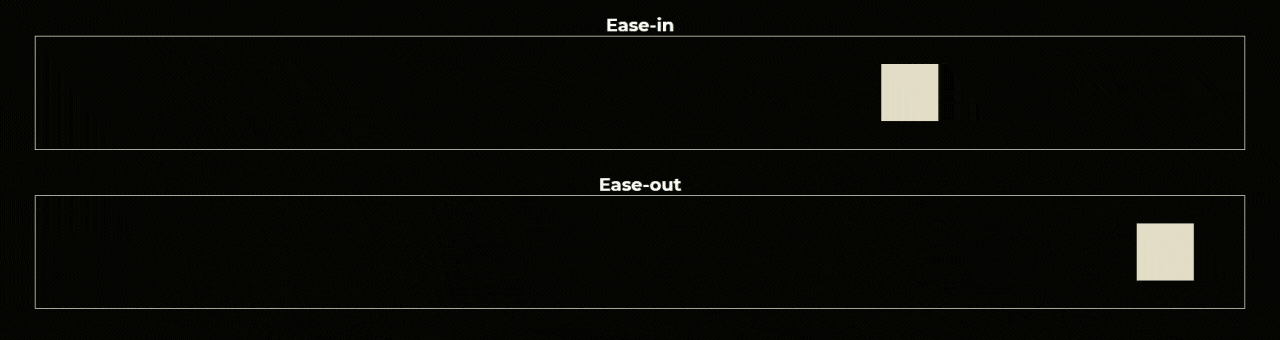
When you see the two functions side by side, it becomes apparent how much the timing-function of the animation influences the perception of motion. They both take exactly the same amount of time to complete the trip, but thanks to their different curves, the motion, and even duration, don't feel the same.
And for all of the transitions, we've made so far? What kind of timing function is being applied to them? If you don't manually choose one, the browser will apply the ease timing function, which sounds a lot like the other curves we've just covered. However, it has its own distinct profile, featuring a sharper acceleration profile, while the deceleration ramp is more pronounced:
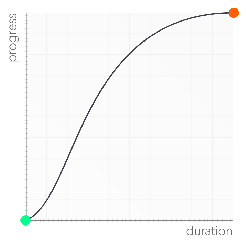
If ease 's curve looks a bit familiar, that's because it is! It's the curve our box was using at the start of this chapter. Let's take a look at it in context with the rest of CSS's built-in timing functions:
Roll your own
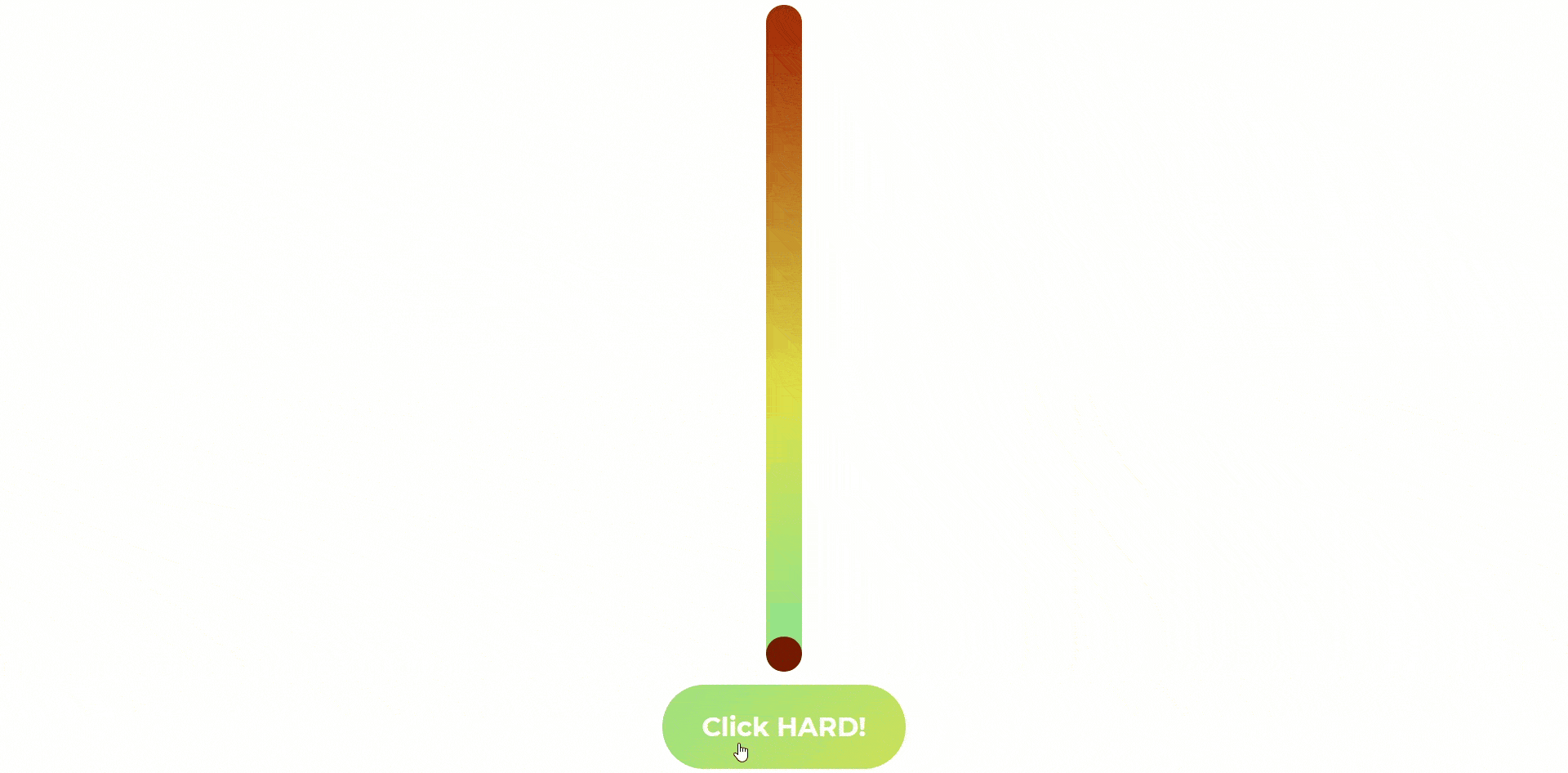
CSS' built-in timing functions give more flexibility with the velocity of transitions, but sometimes you might want a little more control over your acceleration curves. Think back to the lessons you learned from our ball-growing button. Hey, this is serious stuff. No jokes... 🧐 We've taken our ball-growing rig from earlier and transformed it into a strength-o-meter:
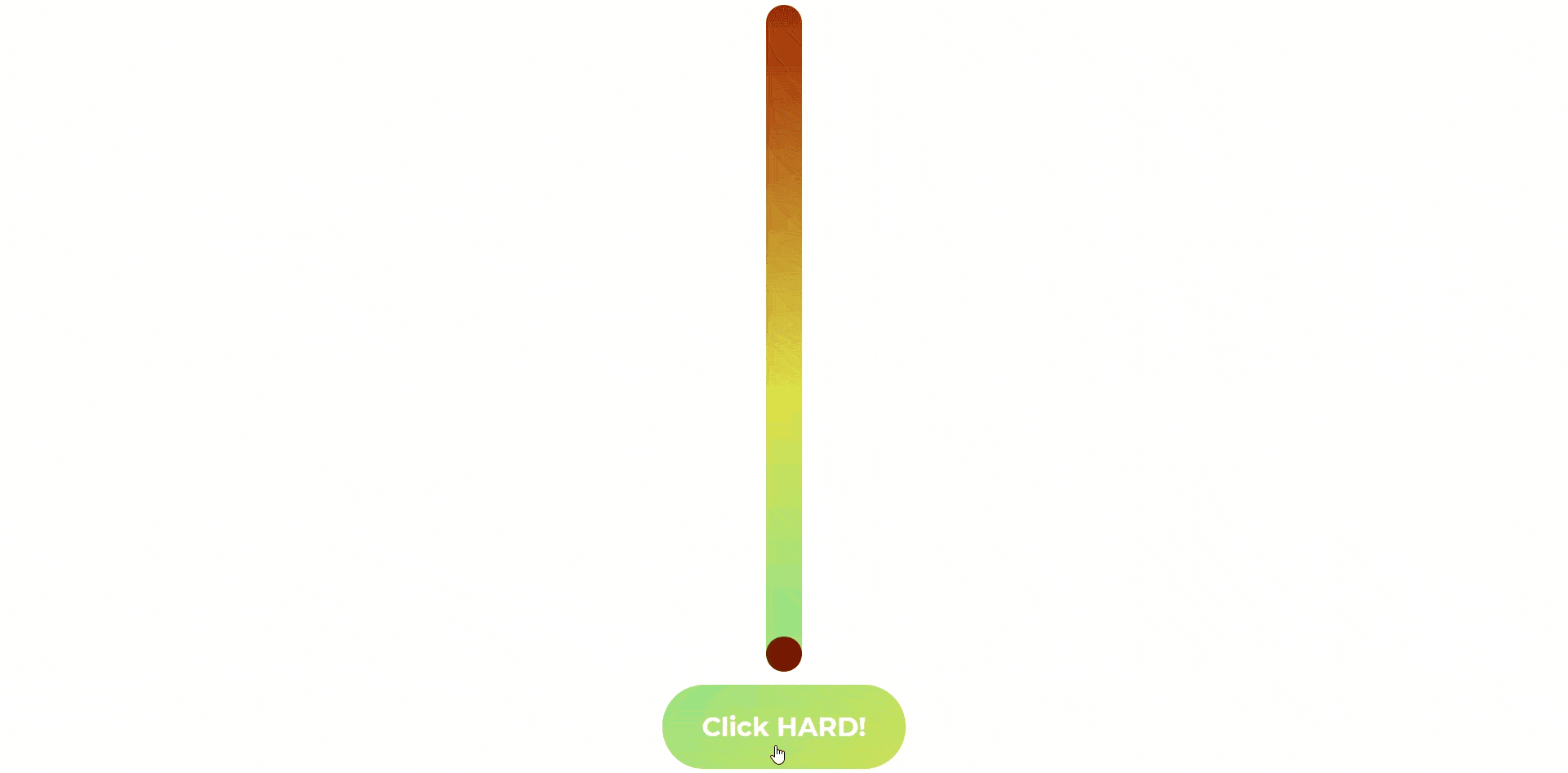
When you click and hold on the button, the ball shoots to the top of the meter. It works fine, except... it lacks any sort of tension or suspense. There's never any doubt that the ball will reach the top, so there's nothing to really engage the user.
What could help is to change the velocity of the ball, so that it feels like less of a sure thing. Right now the transition is the default ease timing function:
$trans-dur: 2000ms;

transform: translateY(100%);
transition: transform $trans-dur;
ease has a slight ease in and a bit stronger ease out. If you made the ball shoot like a rocket, only to go slower and slower as it approaches the top, then getting the ball all the way up becomes a feat of patience, encouraging users to mash their mouse buttons, willing it to reach the top. To plot out this acceleration on a curve, it might look something like this:
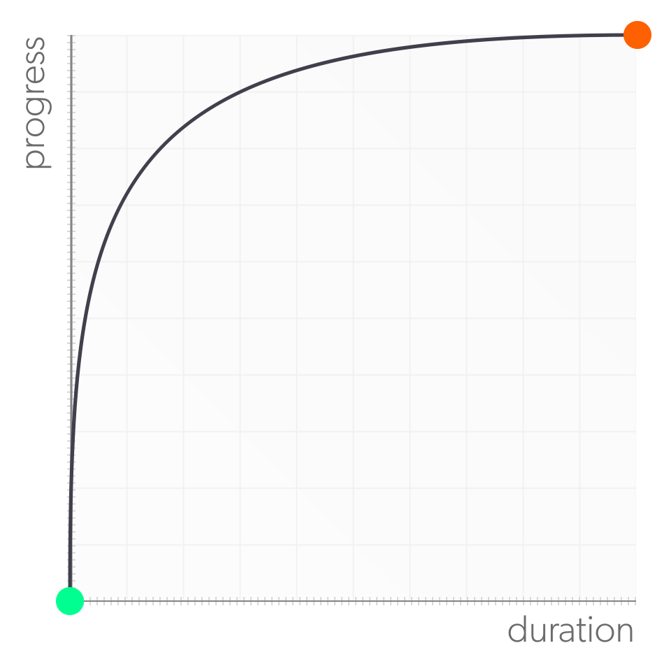
That curve doesn't look remotely like any of the presets we've covered... and that's because if you want the ball to follow this curve, you'll have to make it yourself. CSS' built-in timing functions are really just shorthand for cubic-bezier functions.
The cubic-bezier function is just like the rgb() function, where you enter a list of numerical values, but rather than turning those numbers into a color, the cubic-bezier function turns them into an acceleration curve. For example, ease-in-out can be written as:
.selector {
    transition-timing-function: cubic-bezier(.42, 0, .58, 1);
}
Cool! But... how do you turn an acceleration curve into a cubic-bezier() function?
cubic-bezier() requires a list of four numbers as arguments, which are actually the coordinates for two points that live on the plane of the graph. The first two numbers are the X and Y coordinates for the point that determines the ease in of the acceleration curves, and the second pair determines its ease out:
.selector {
                                            /*(X1,Y1)(X2,Y2)*/
    transition-timing-function: cubic-bezier(.42, 0, .58, 1);
}
Now, imagine that an acceleration curve is a rope, tied taut between two trees. If you grabbed that rope in two different spots and pulled in two different directions, you would force the rope to deflect from its line in those directions. The coordinates that you enter into cubic-bezier () represent the force and direction that you want to the deflect the line of your acceleration curve.
Let's plot the coordinates of ease-in-out onto the graph and look at how they create its acceleration curve:
Neat! ...Buuuuut... how do we turn this:

Into this: cubic-bezier(0, .75, .08, 1)???
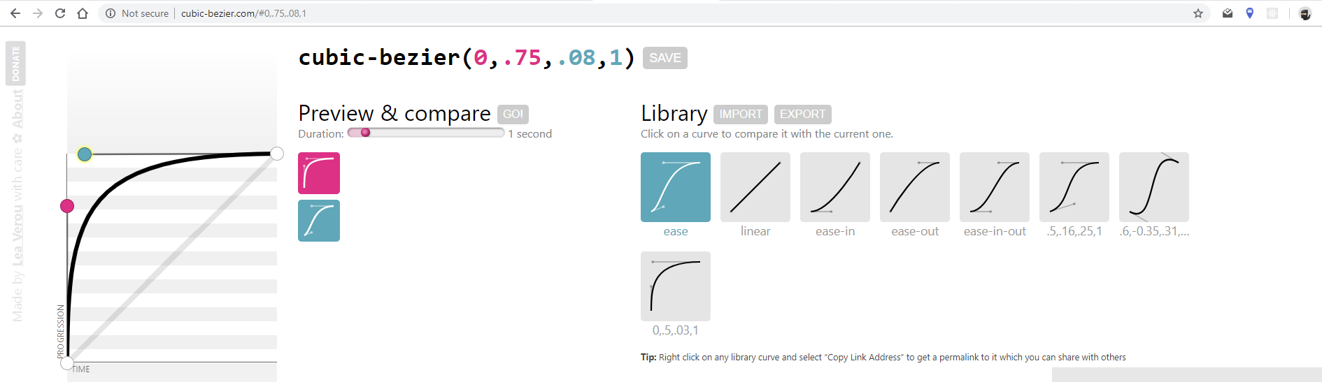
You could just take a guess at the coordinates and go from there. Or, you could use an online tool to help build it, such as the aptly named cubic-bezier.com.
When the site loads, you'll see a graph to the left of the page with a preloaded curve, along with a pair of handles that you can drag around to manipulate the acceleration profile:
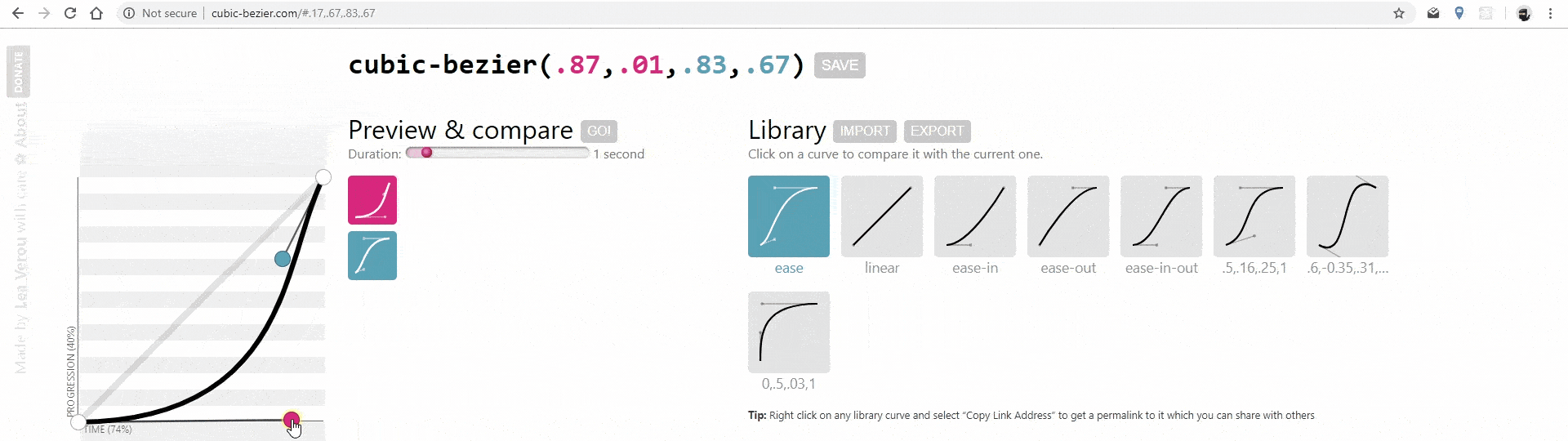
Notice how the values of the cubic-bezier function update as the handles are dragged around? To create a custom curve, drag the ease-in and ease-out handles until you've created a curve that you like, then use the generated cubic-bezier values in your code base.
Here is the curve that I've generated for our strength-o-meter:
Let's plug those cubic-bezier() values into our transition and take it for a spin!
$trans-dur: 2000ms;

.strength {
    transform: translateY(100%);
    transition: transform $trans-dur cubic-bezier(0, .75, .08, 1);
}
Now our transition has more tension! The ball shoots out of the gate, but creeps into its finish:
The assigned timing function not only helps to make them seem more natural, but they can also be used to tell a story. And while one of the presets may work well a lot of the time, sometimes a custom curve is necessary to create the desired effect.
Let's recap!
The acceleration and deceleration of transitions is controlled using the
transition-timing-functionproperty.If no timing function is declared, the transition will default to using the
easefunction.Other keyword timing functions include
ease-in,ease-out,ease-in-out, andlinear.When a preset timing function doesn't fit the animation, custom animation curves can be declared using the
cubic-bezier()function.
